In my first research book I researched a lot about young adults and the way they abuse diet pills to get a quick fix. I had to find why and the reasons behind why us girls, young adults and women think bad of our own bodies. Yet through the research I opened up soooooo many options and paths to tackle.
I found that the problem is within the social media, advertisement and role models that are paid to promote products. The pressure comes from them and the way advertisement is setting unrealistic expectation for women to be a certain size and look a certain way.
The purpose is to encourage people to be healthy and think positively and be proud of who they are in their own body and not focus on celebrities on Instagram who have money to make themselves 'this' and 'that'.
Young adult and teens mental health matters. The information and the message about all sorts of body types and shapes that women have. To encourage people to exercise and maintin a healthy lifestyle without having to take diet pills for a quick fix.
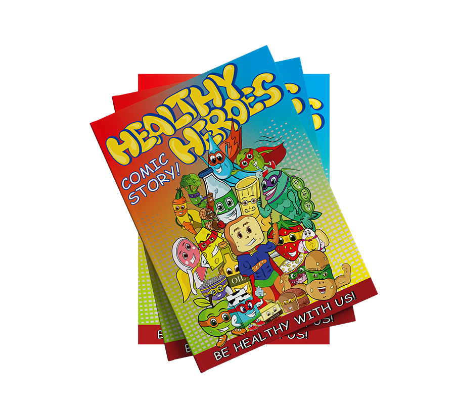
My project will stand for HEALTH and EDUCATION and INSPIRATION hope the audience will be inspired and educated on women natural figures and curves and educate the young children on what each group of food does to your health and body by creating a mini cartoon book for primary schools.
Who? - People, Everyone, Society.
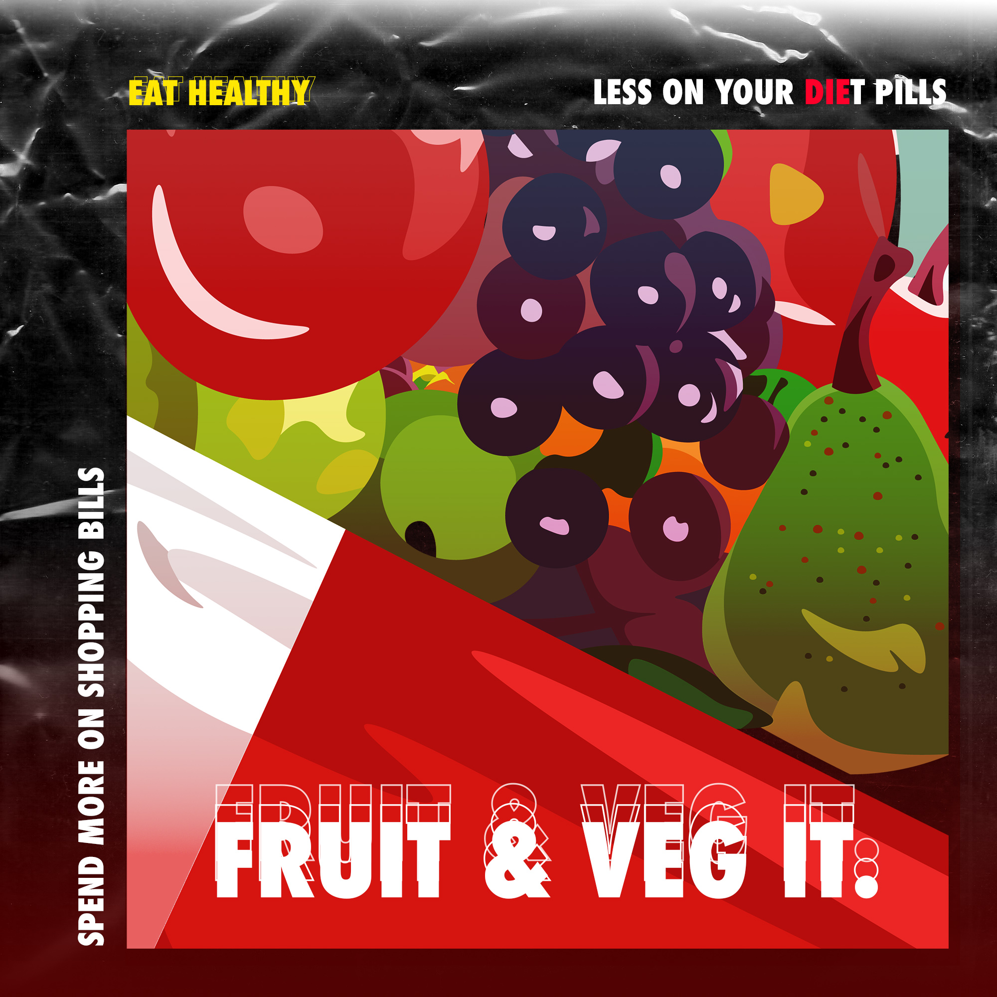
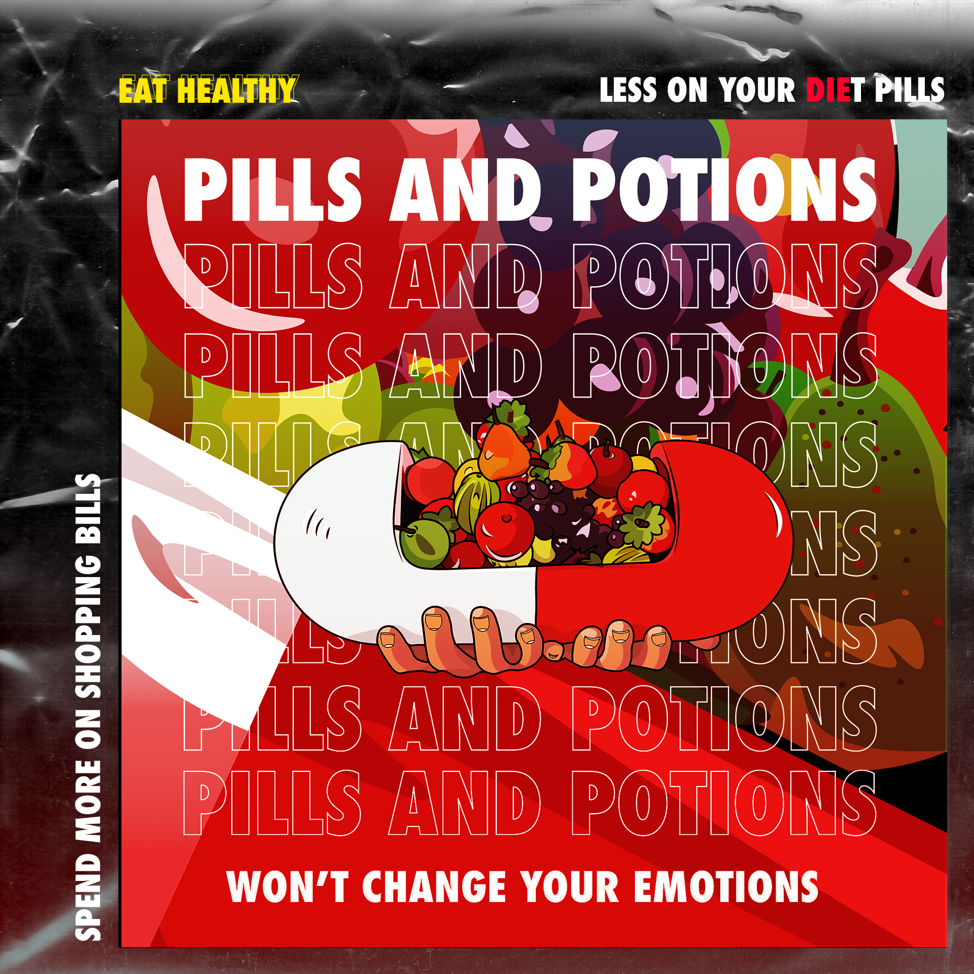
What? - The aim is to steer people away from diet pills and direct them towards a healthy lifestyle and teach about body image.
Where? - The problem comes from social media and false advertisement setting unrealistic expectations and pressure on women.
Why? - I am doing this because I want to divert the attention away from diet pills and inform young people about healthy eating and exercise and to show that women are beautiful in their own shapes and sizes. We as graphic designers should inform and teach and my aim is to inform about body types and build confidence, advertise realistic normality not unrealistic expectations.
Eating disorders can affect young children and teenagers. The rates of eating disorders among young girls and boys under 12 have been growing in recent years, so it is important for parents and anyone who works with young children to recognize the signs. Physical growth is such an important component of childhood, and eating disorders can cause significant damage to a child’s body.’
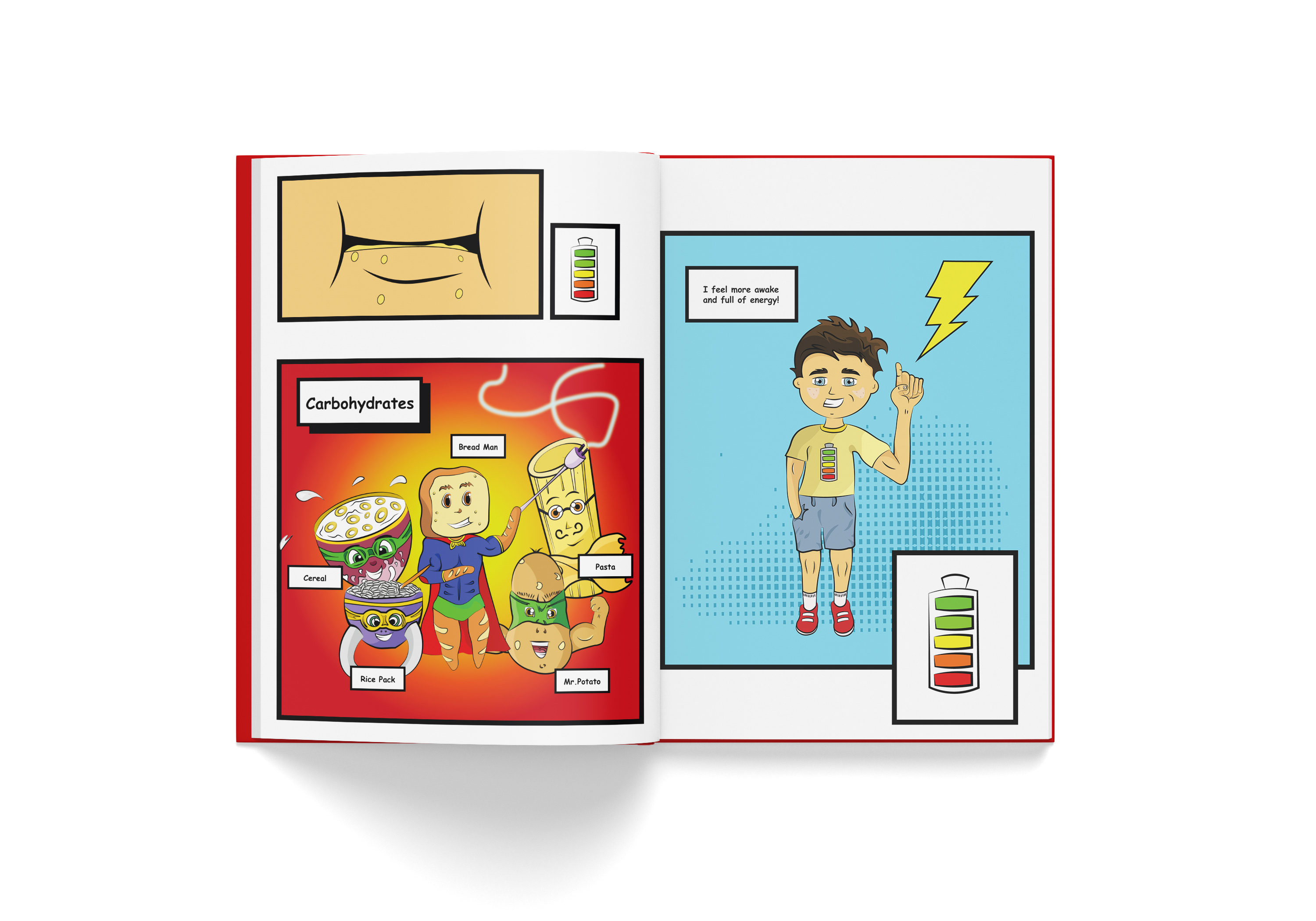
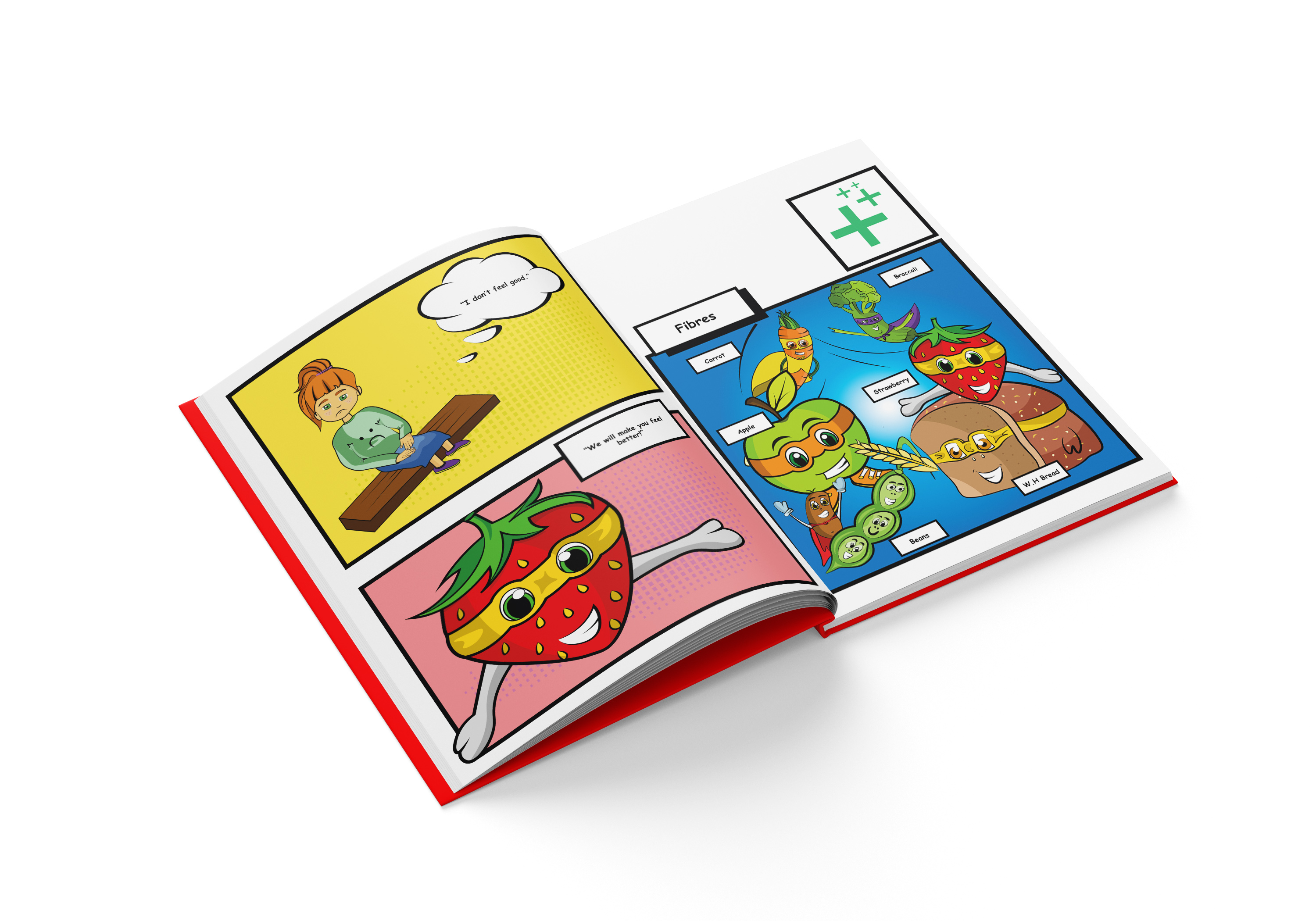
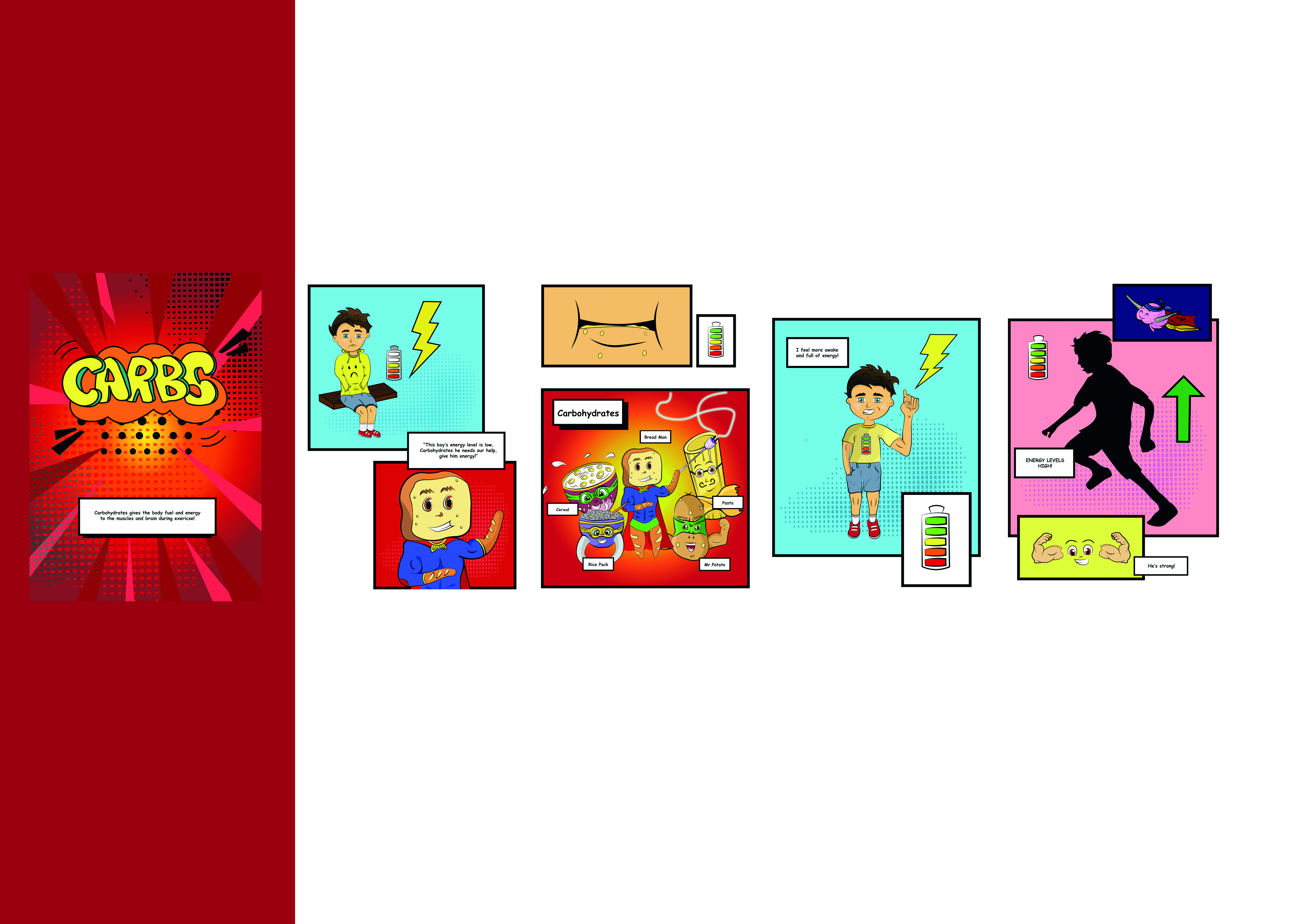
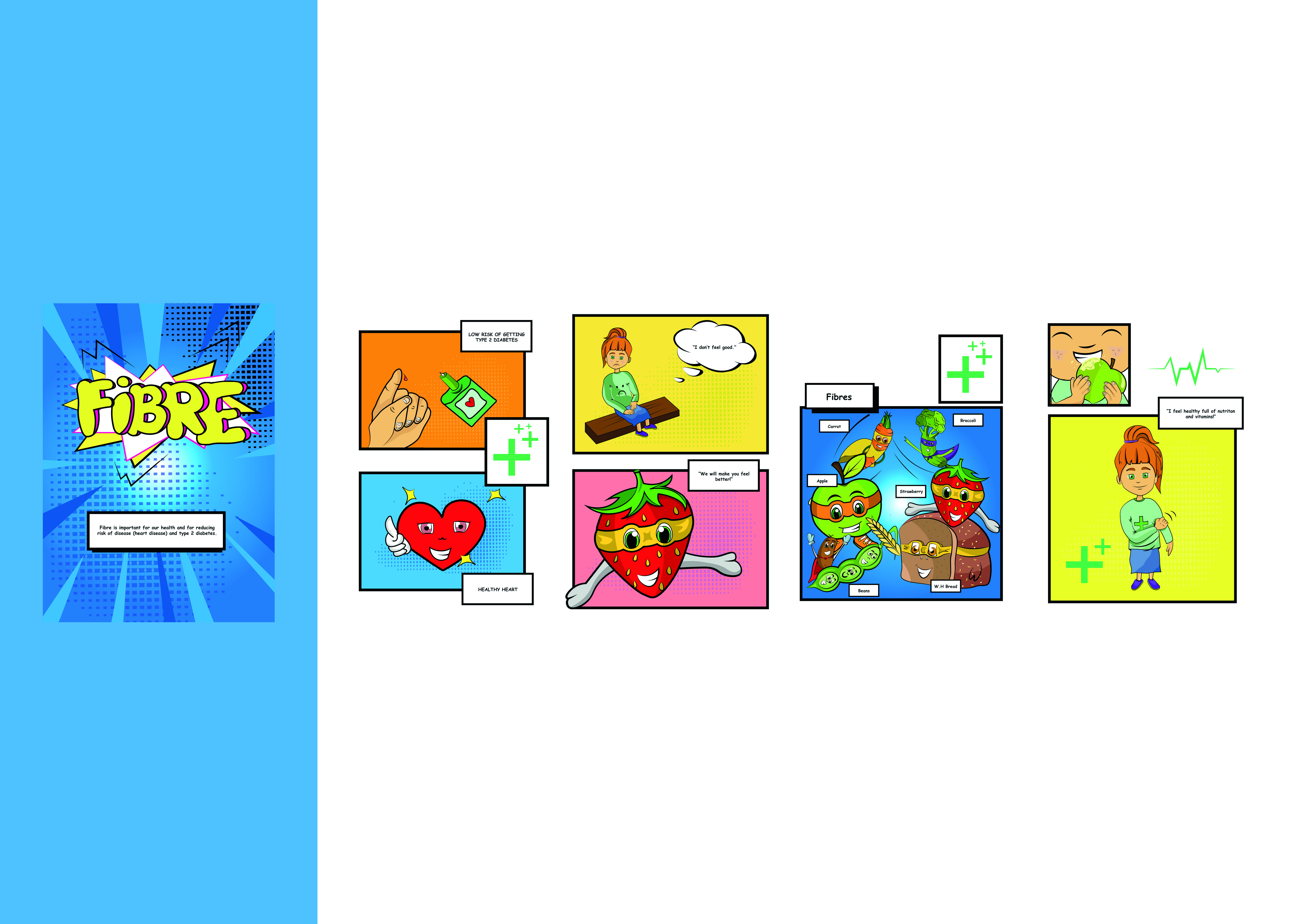
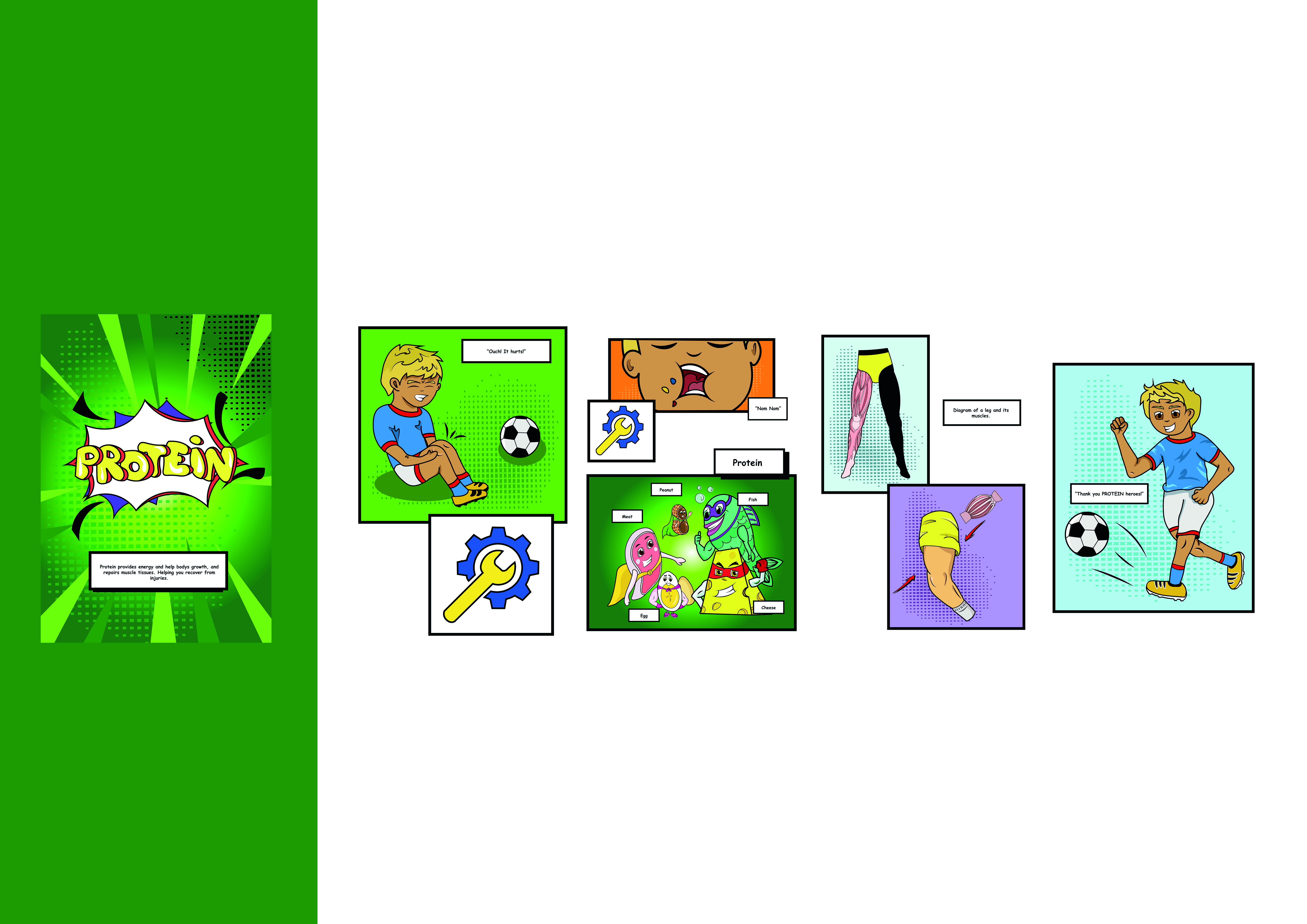
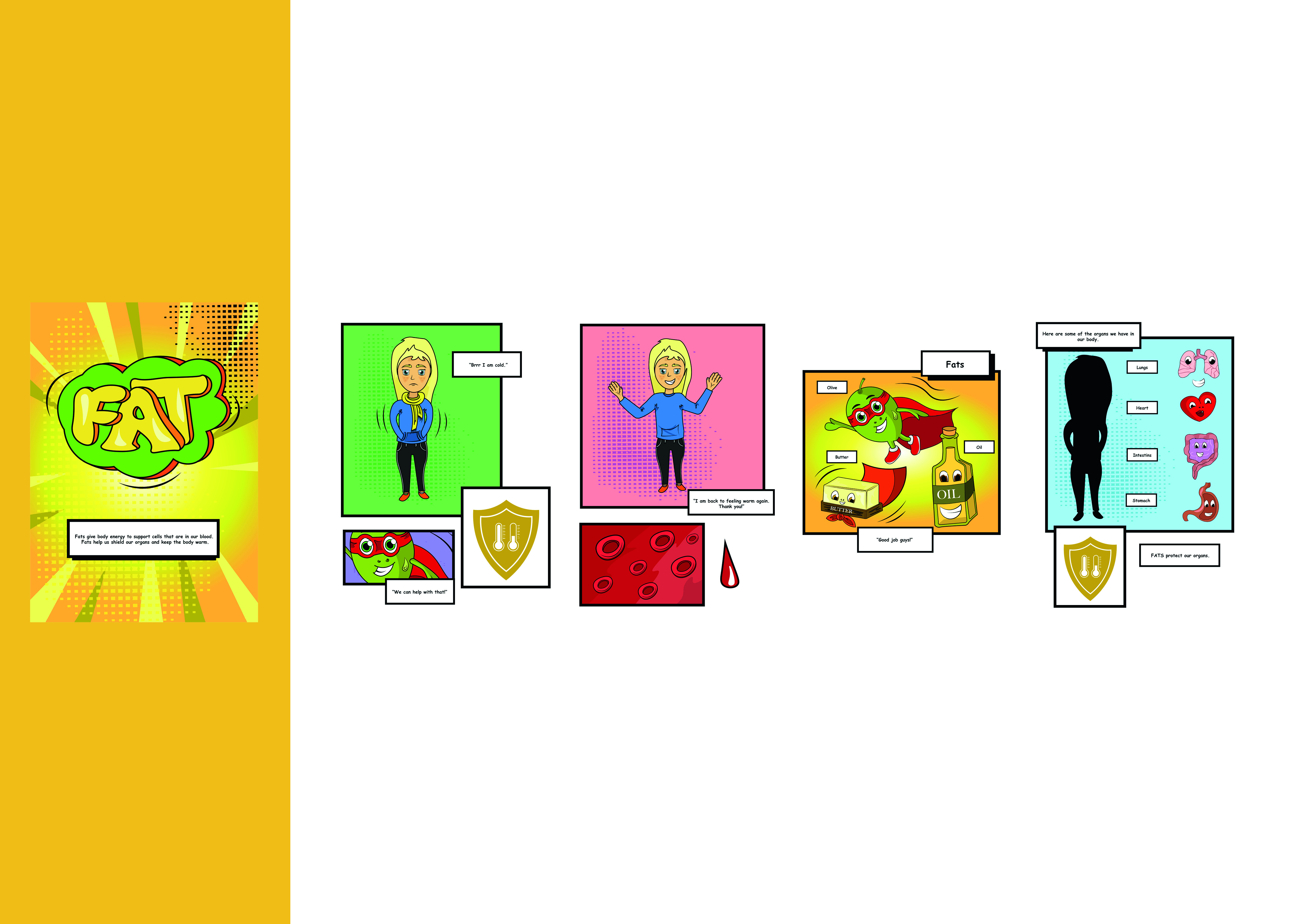
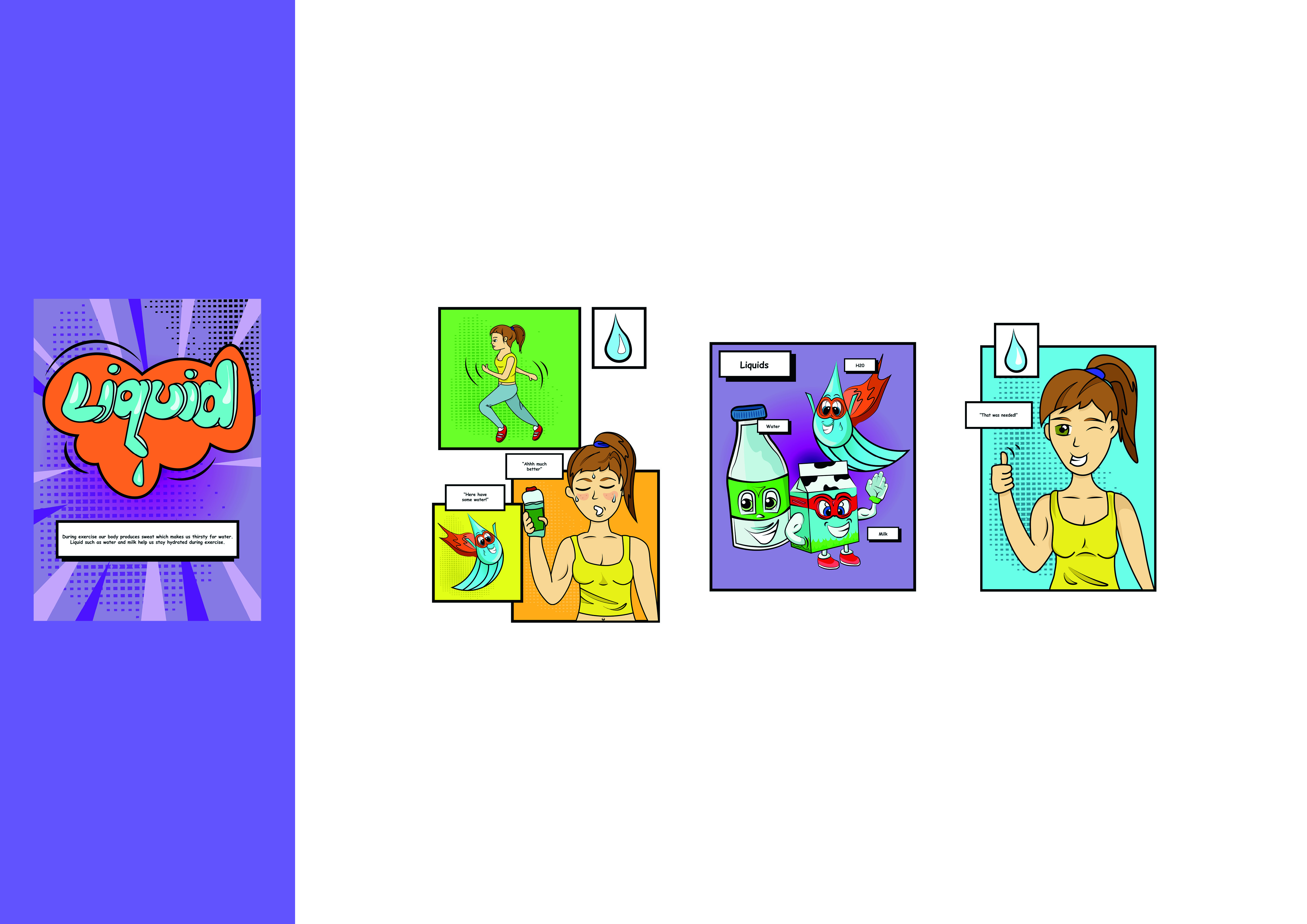
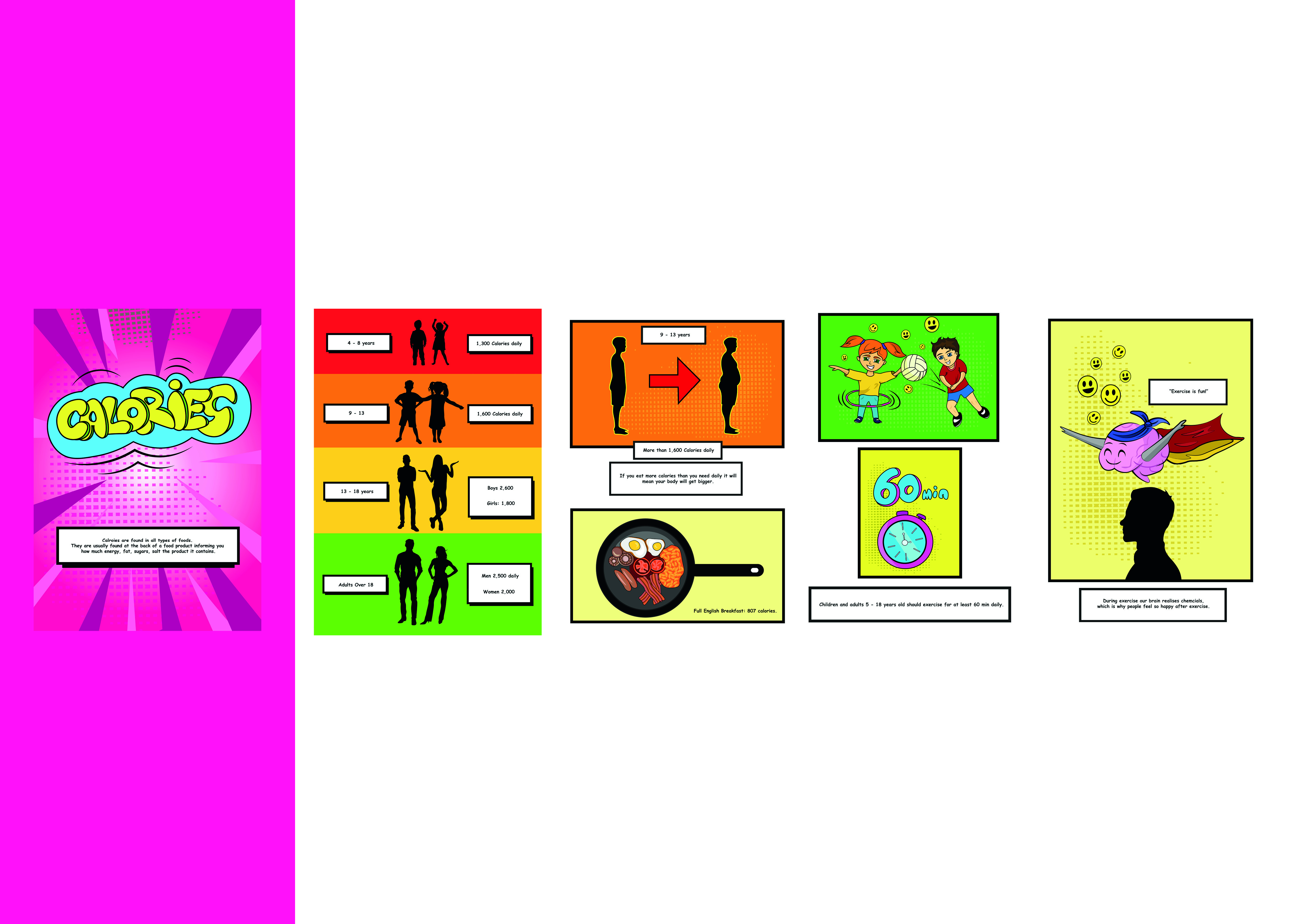
The process of making this book was very enjoyable and time consuming but so worth it. The books is full of vibrant colours and the super heroes food groups deliver the message of what they have to provide for the body and why it is so imporatnt to eat all types of food and how many calories you should have at what age and stage of life.
All of the characters displayed are included in the comic book. Each of them has a mission to encoruage exercise and healthy eating throughout the book, showing what each fruit and veg has to provide for us and represent them as heroes. It was a very long process full of patience and time to draw and create this outcome. I am pleased with it and you can see more clearly how it looks in the mock ups.
“A large body of research indicates that visual cues help us to better retrieve and remember information. The research outcomes on visual learning make complete sense when you consider that our brain is mainly an image processor (much of our sensory cortex is devoted to vision), not a word processor. In fact, the part of the brain used to process words is quite small in comparison to the part that processes visual images.”
Haig Kouyoumdjian Ph.D.
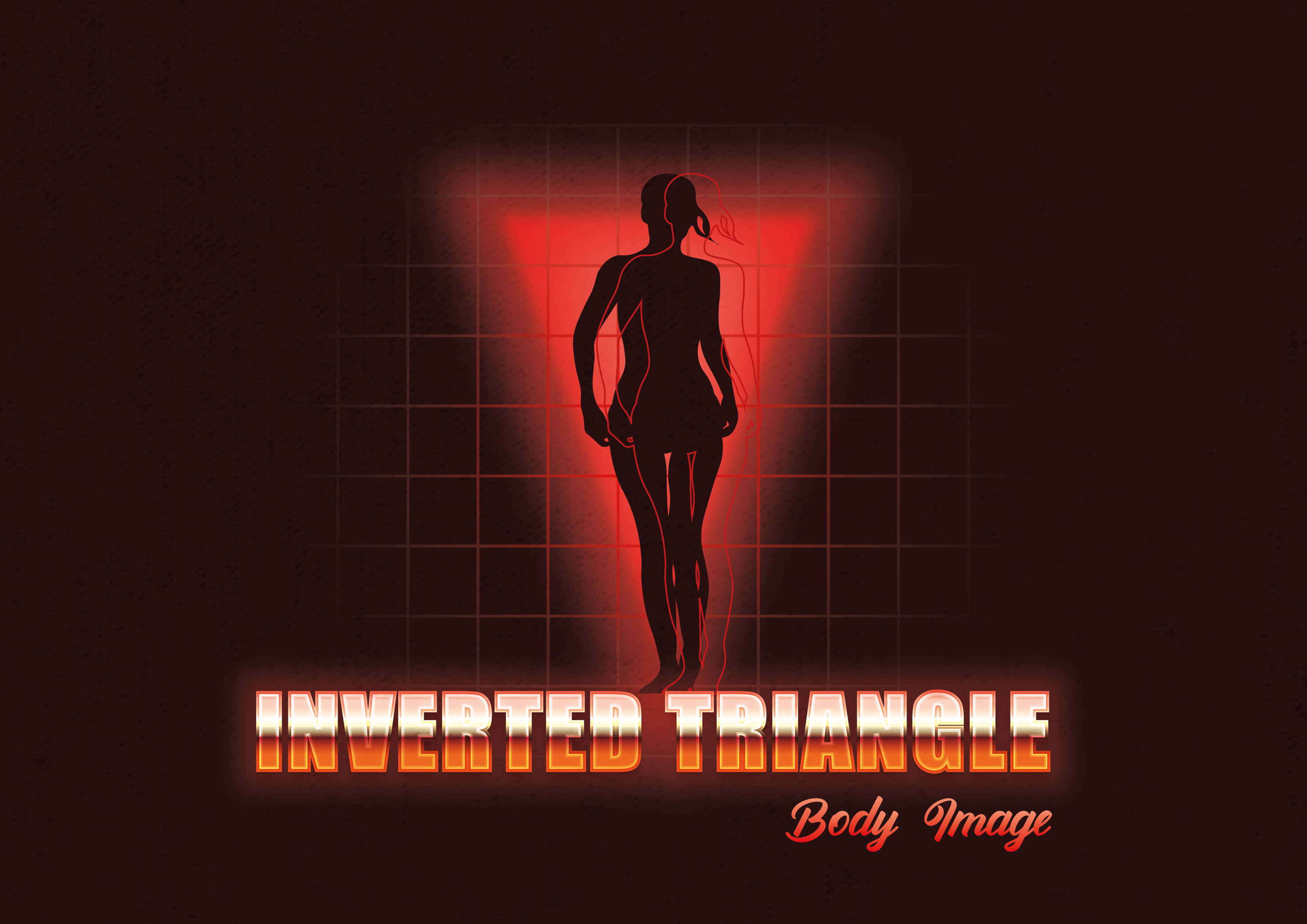
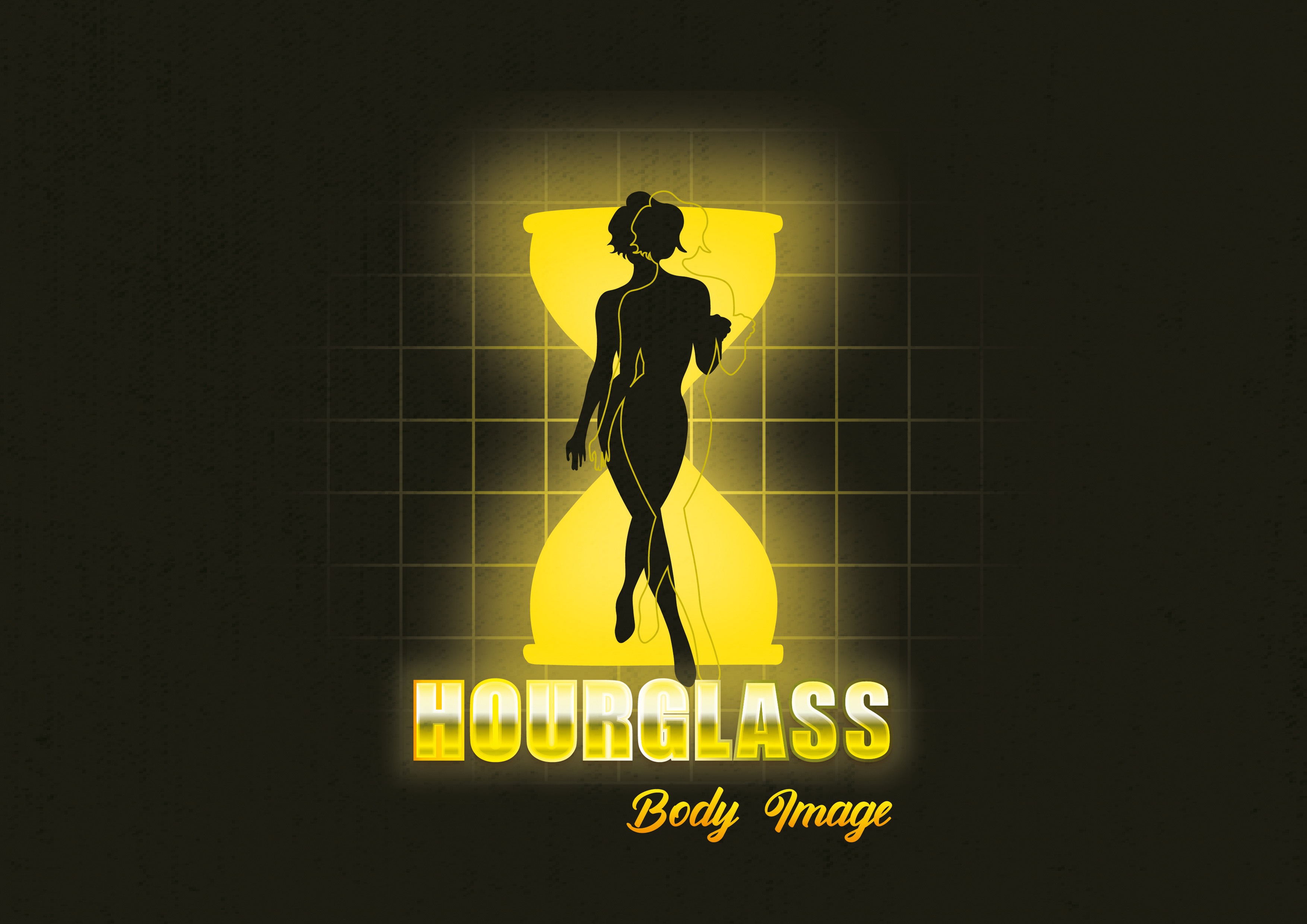
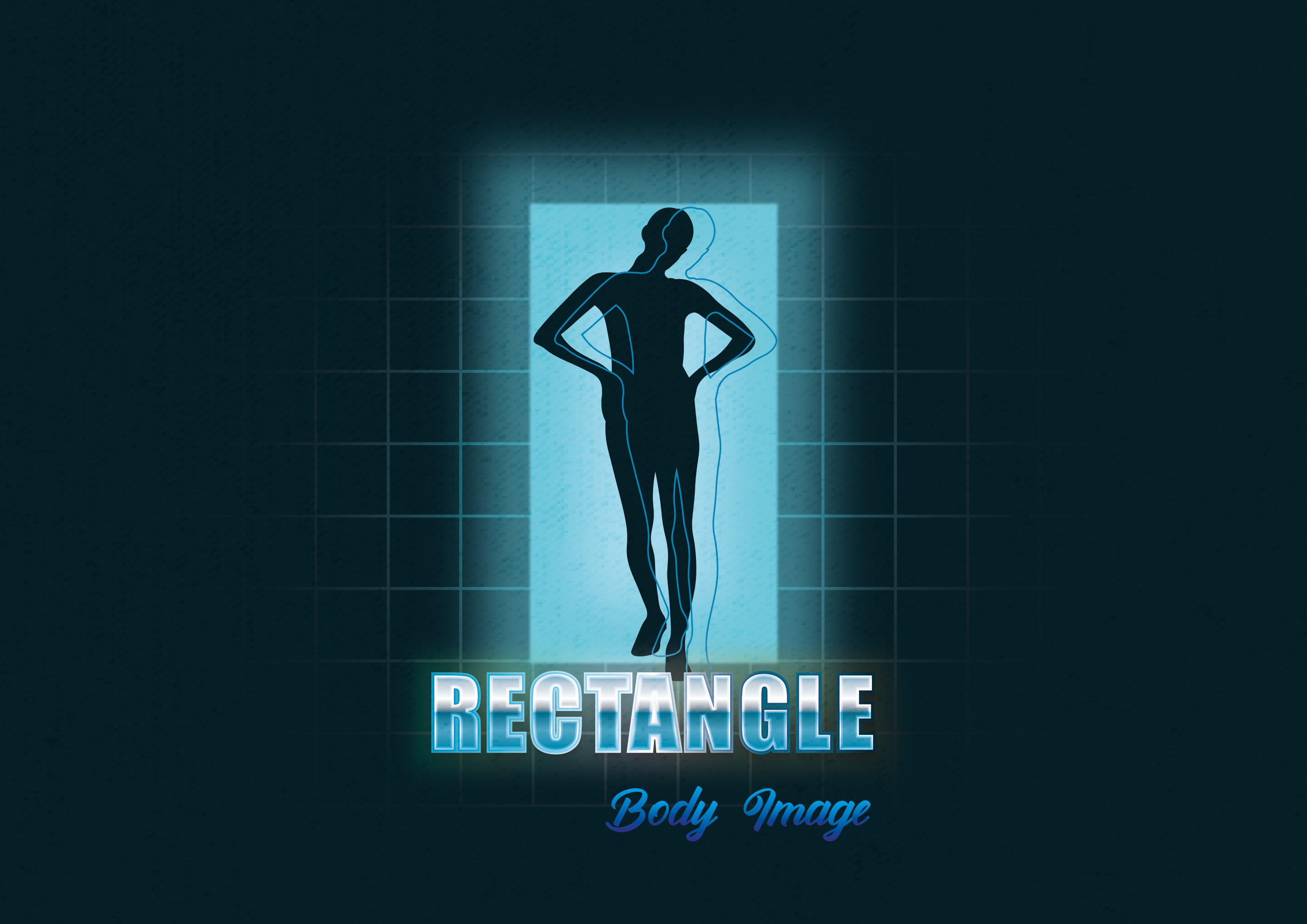
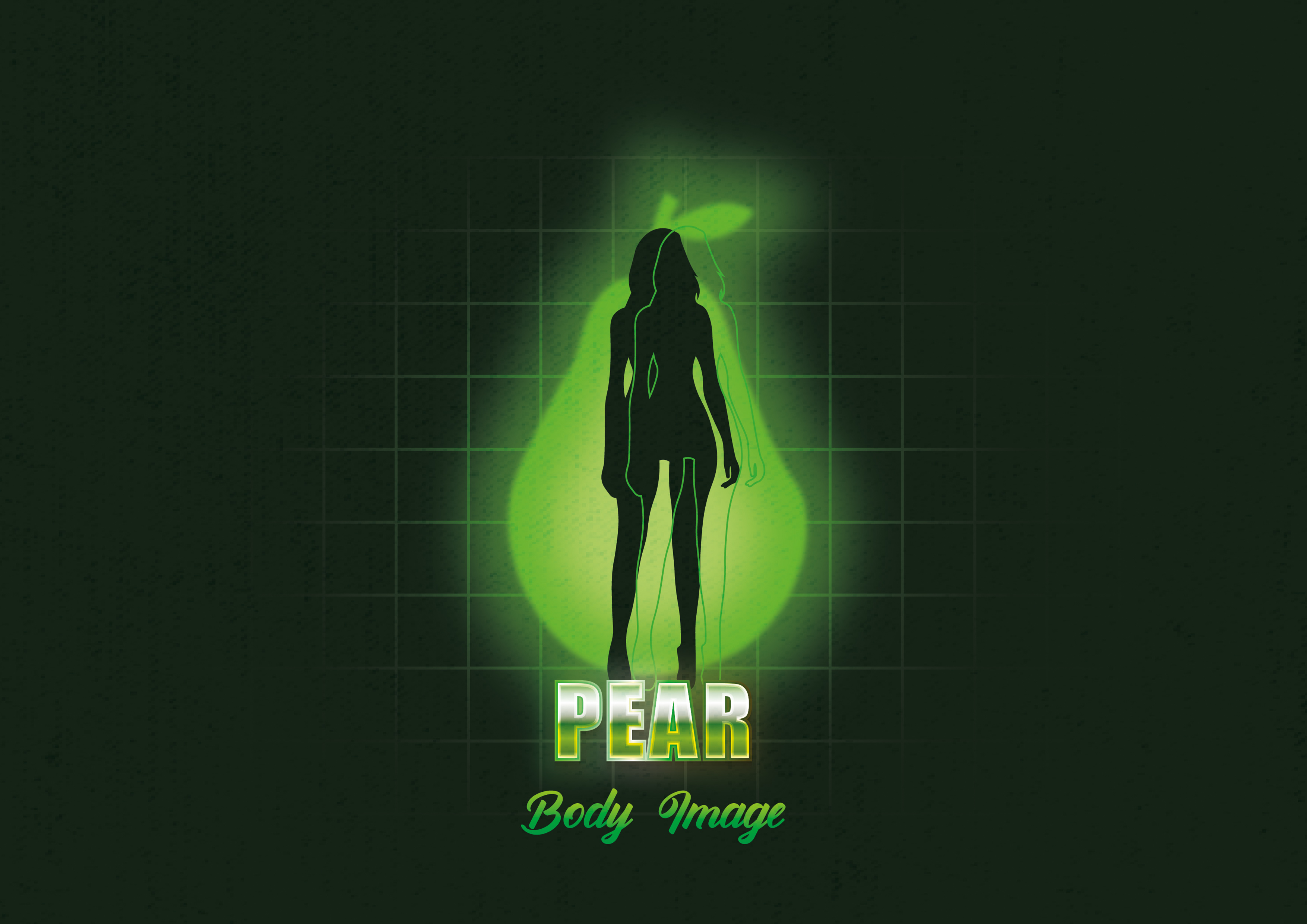
A series of posters focusing on body image shape and sizes in a comic - hero - retro style film posters. Trying to improve body confidence by showcasing body figures using sillouette illustrations.
With these posters I wanted to portray women in different figures in natural beauiful body types.
Inspired from my moodboards I thought about primary colours linking to heroic power rangers from comic books and films. I categories the figures seperatly with colours to show that all women are different and unique with their shapes and that is normal.
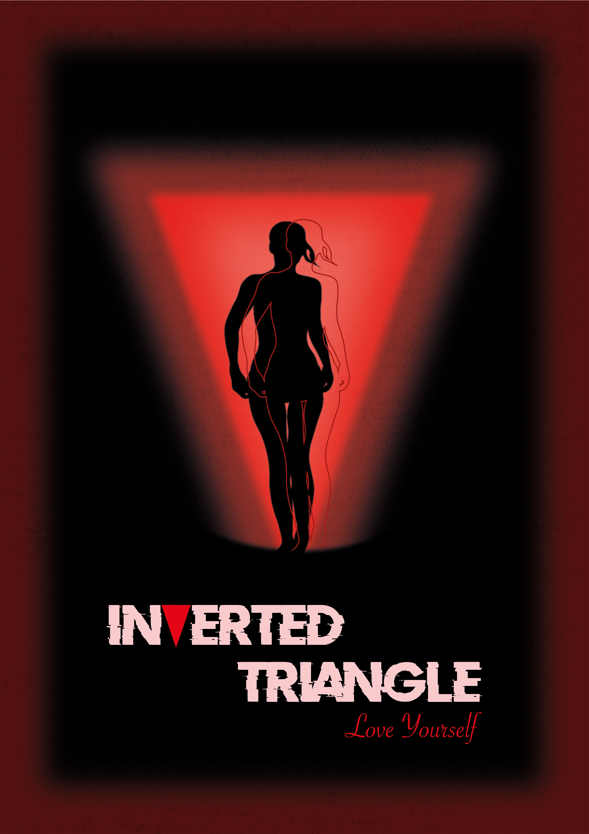
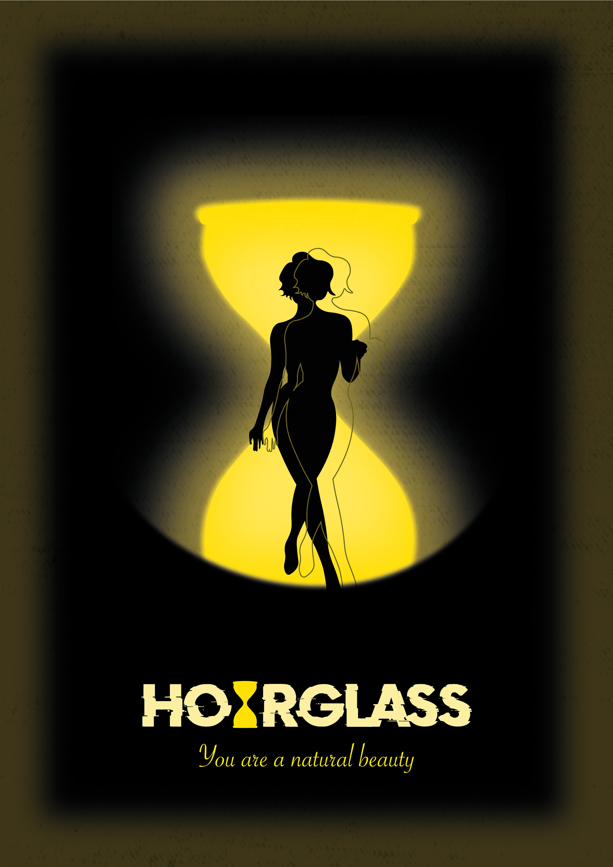
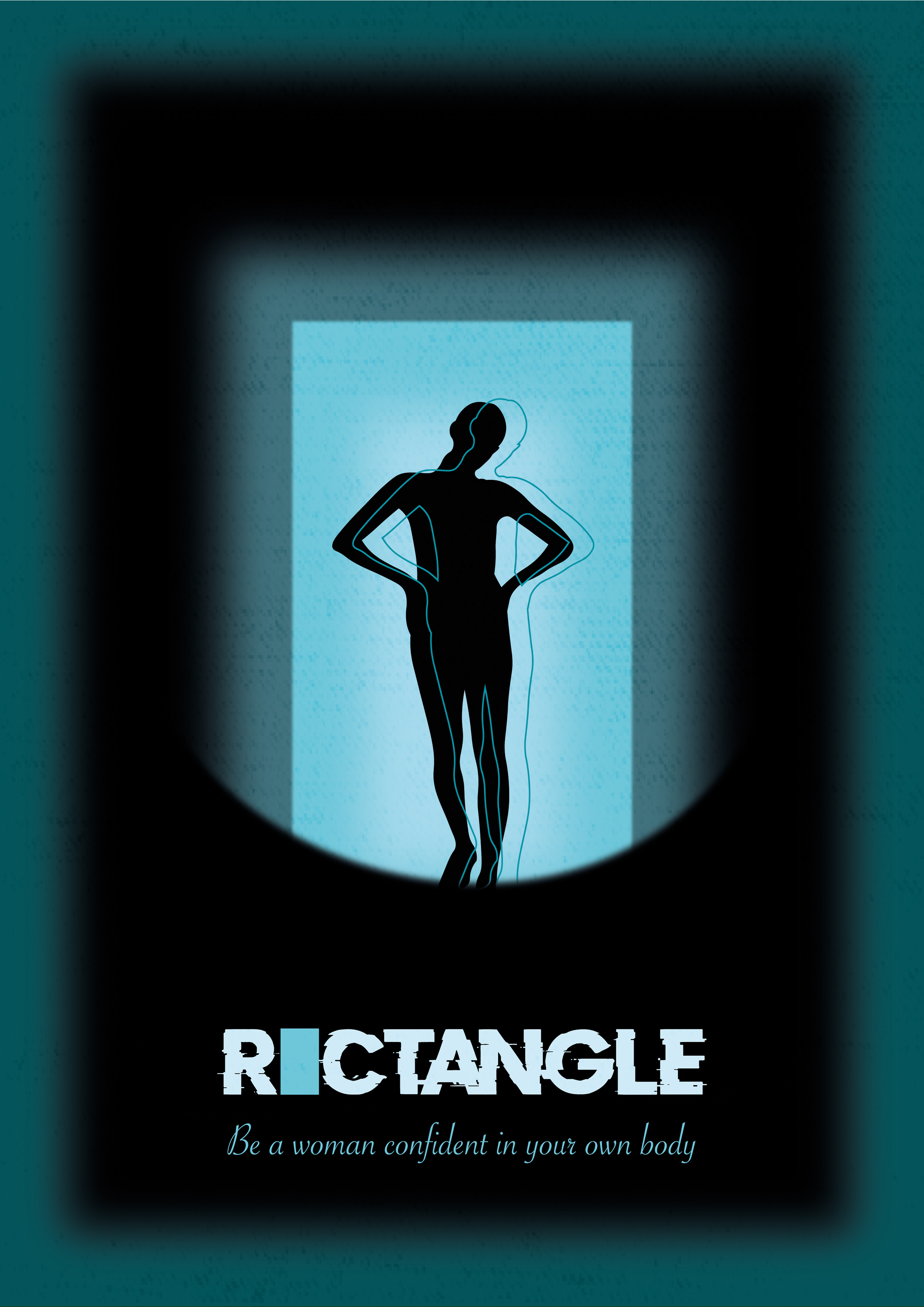
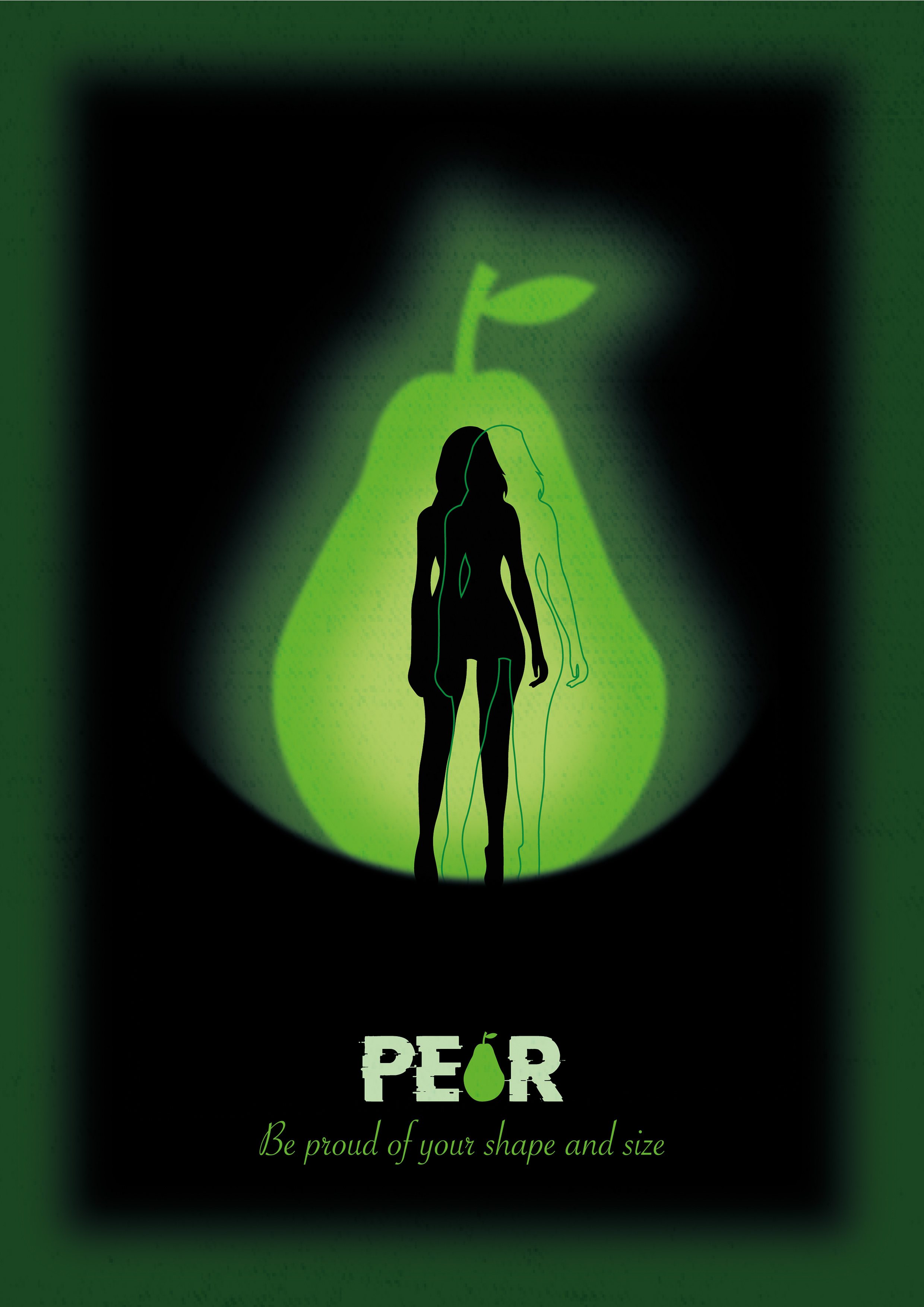
Using sillouettes to highllight body image and different body types is very effective tied in with bold striking typography and textures making it vintage like the films from the 80s, 90s.
I wanted to bring some nostalgia and connect these women to superhero film style followed on from the comic book. I made the typography on Illustrator as retro shiny with chrome effect to give that old school cinema effect with a textures.
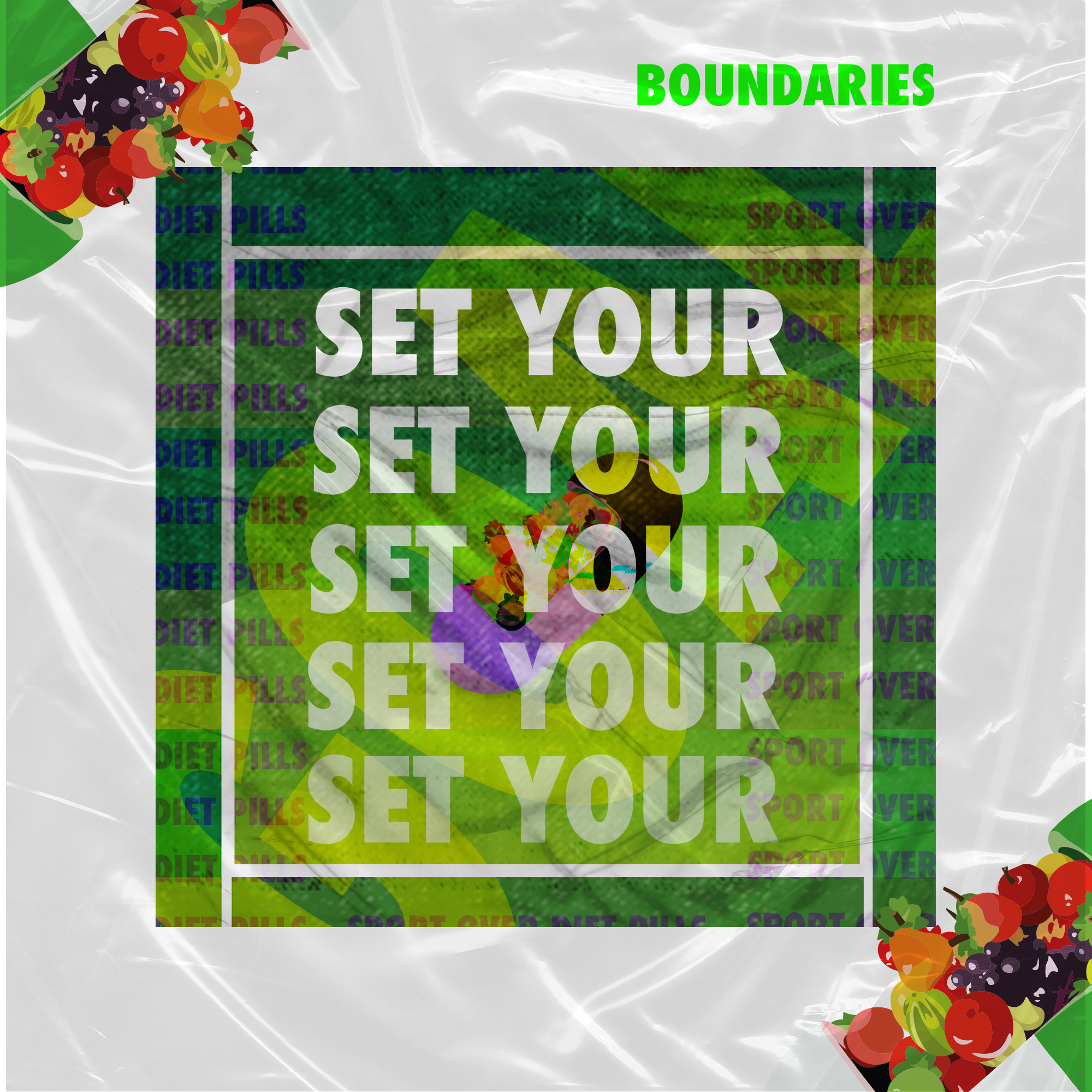
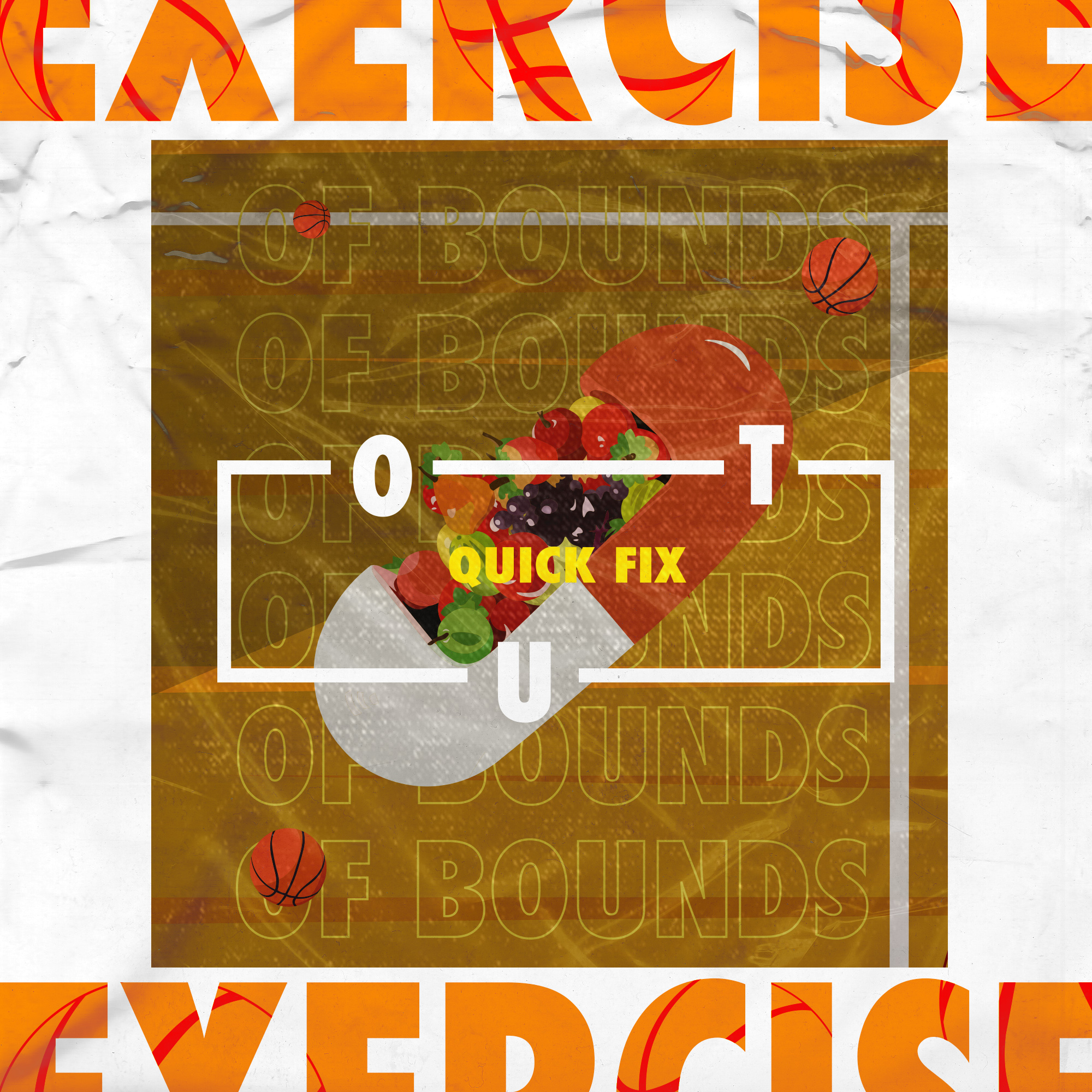
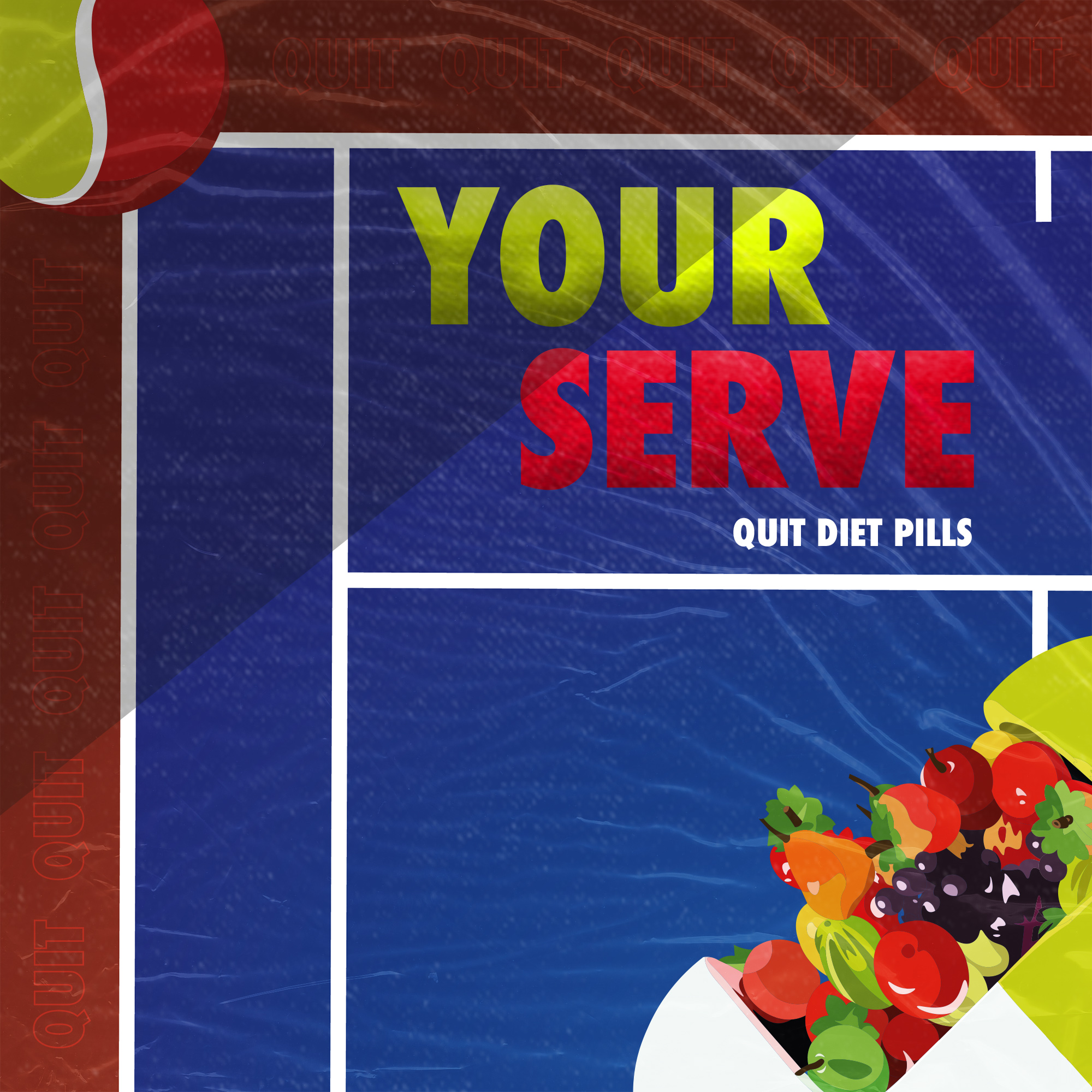
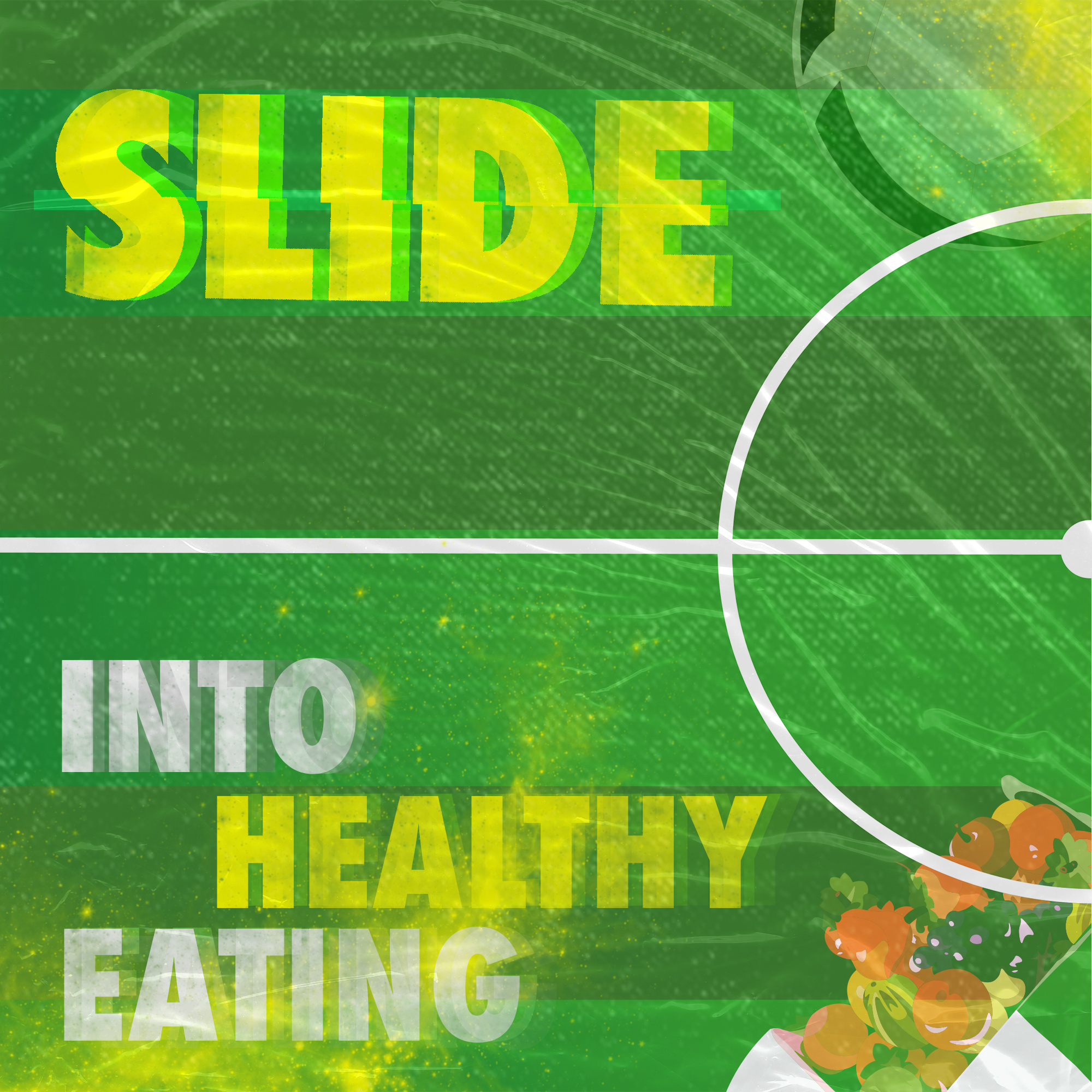
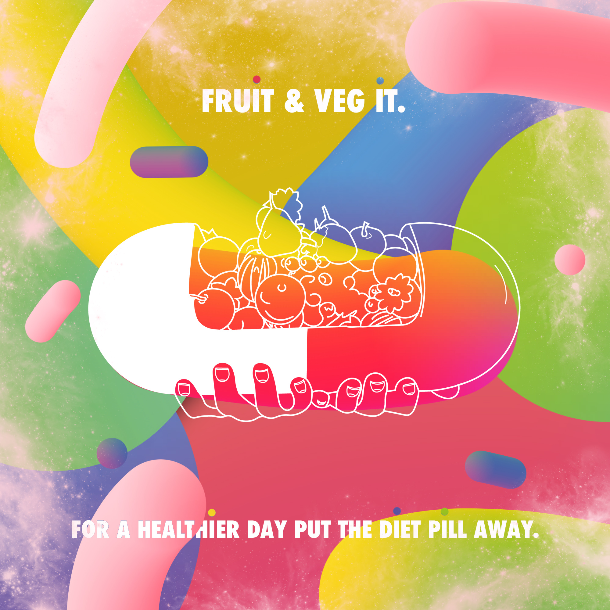
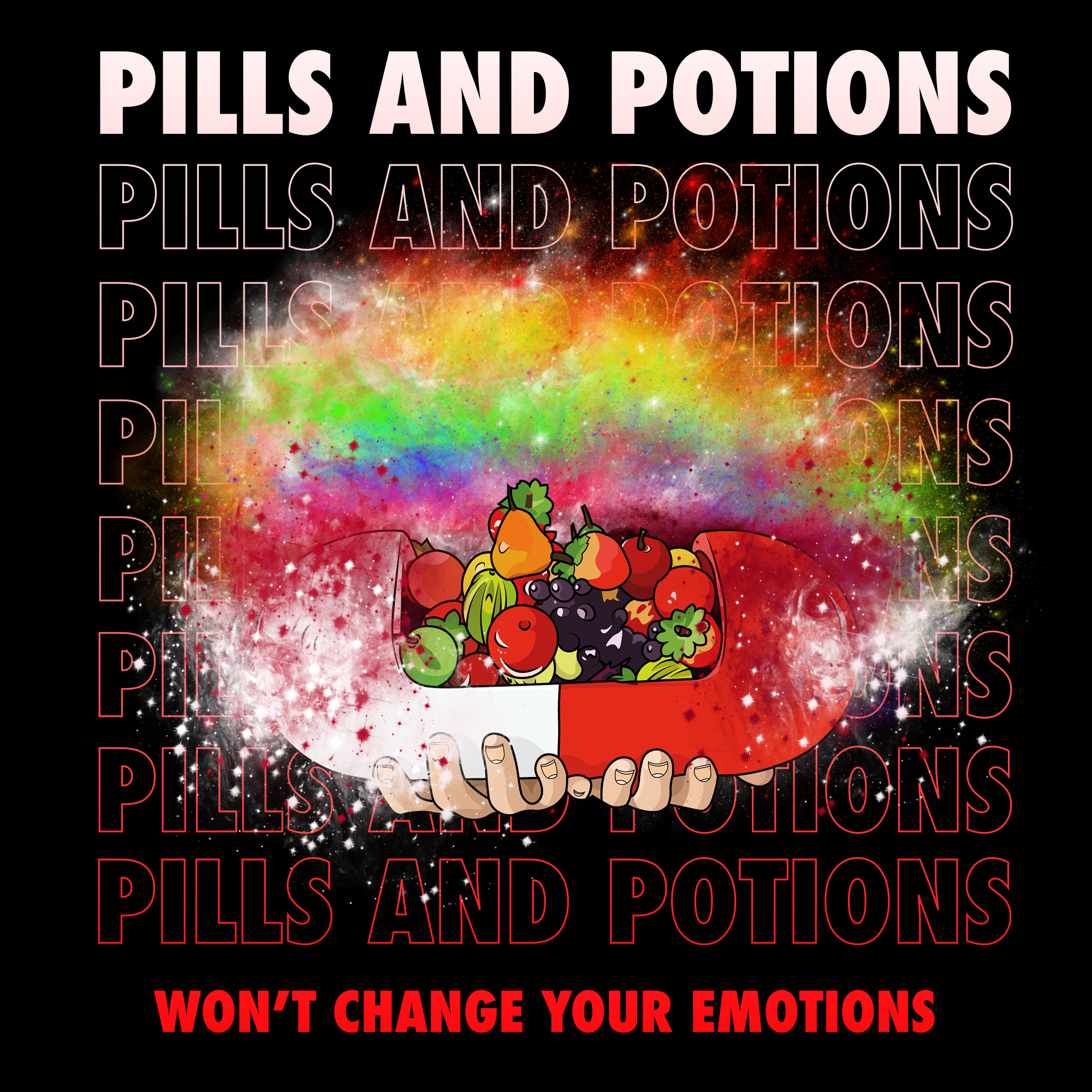
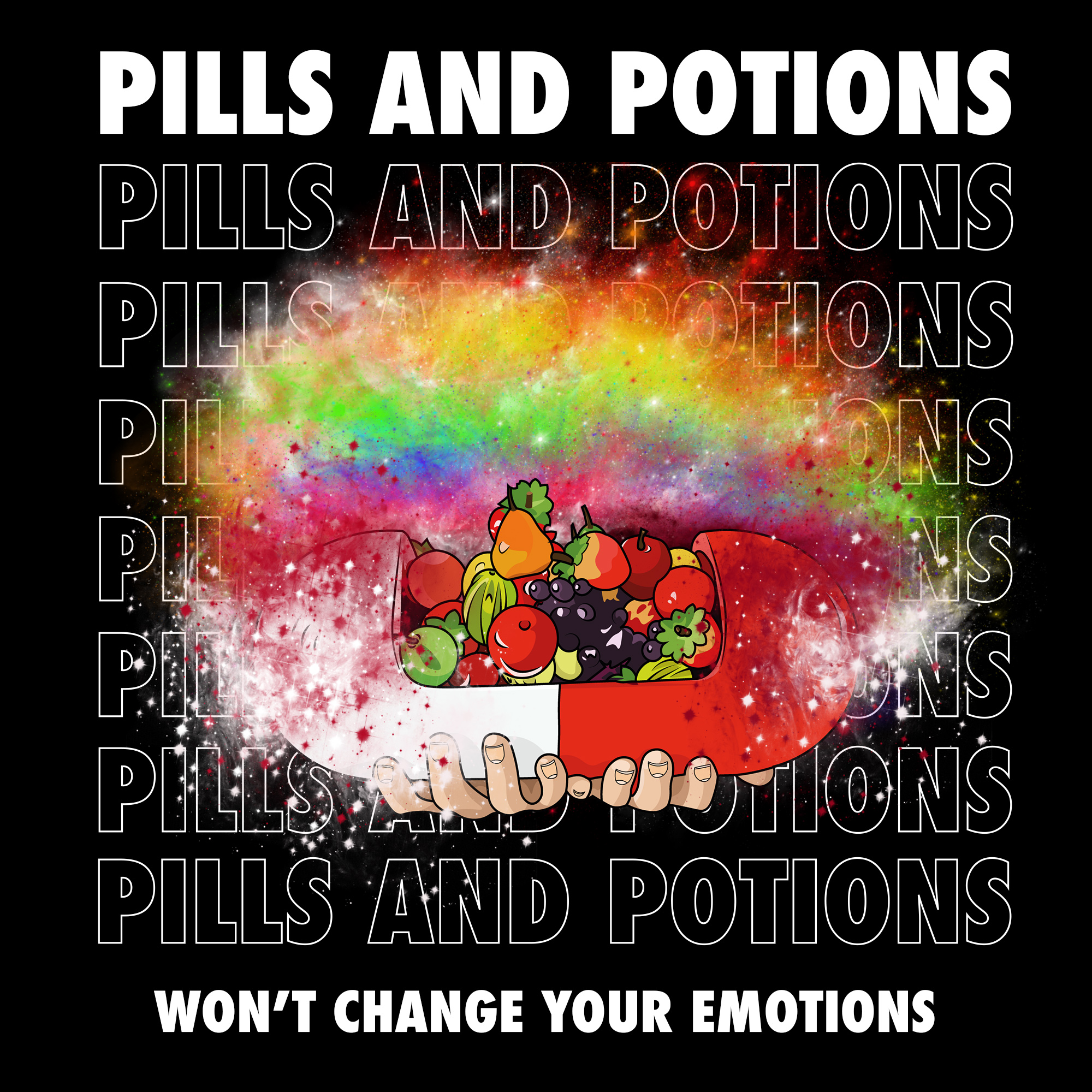
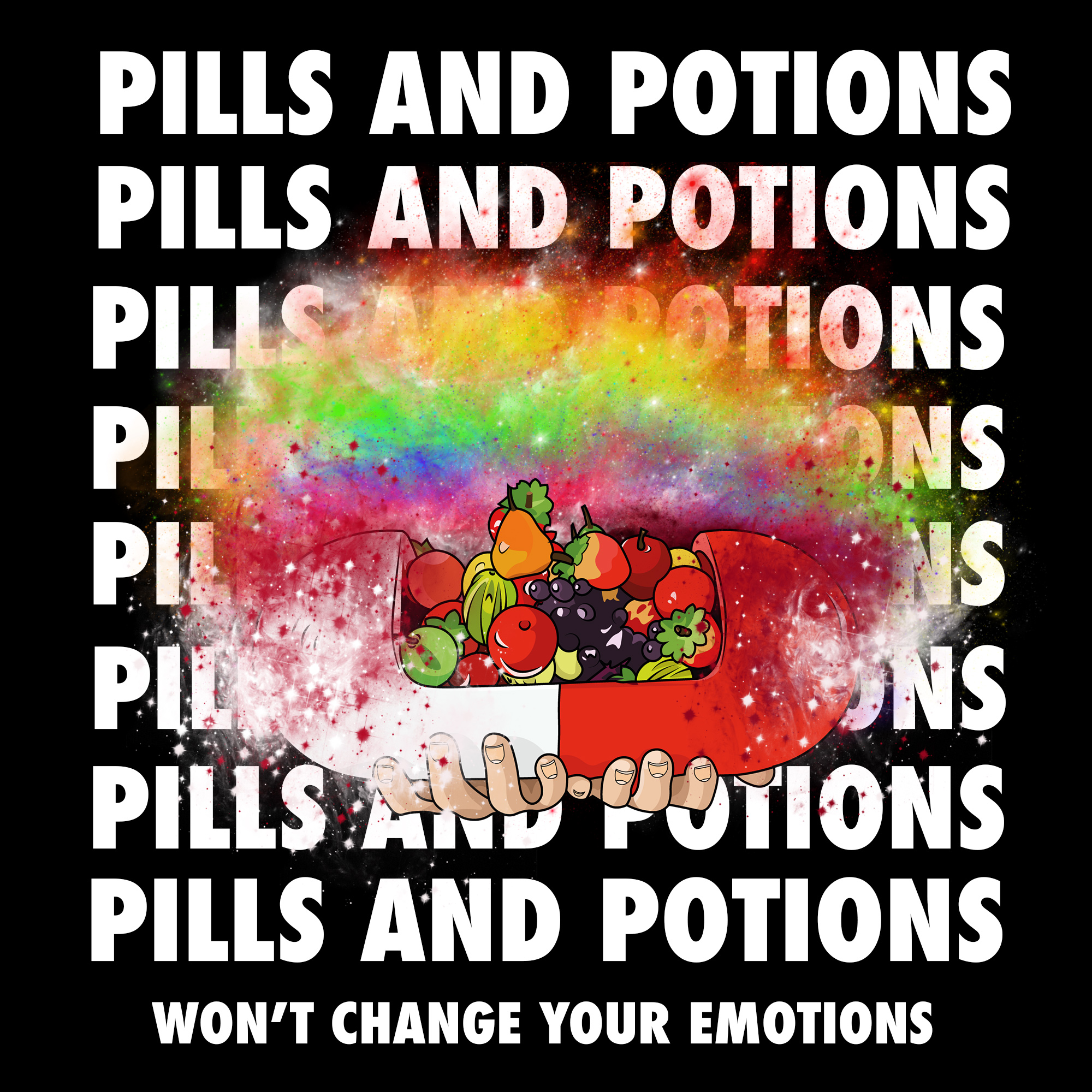
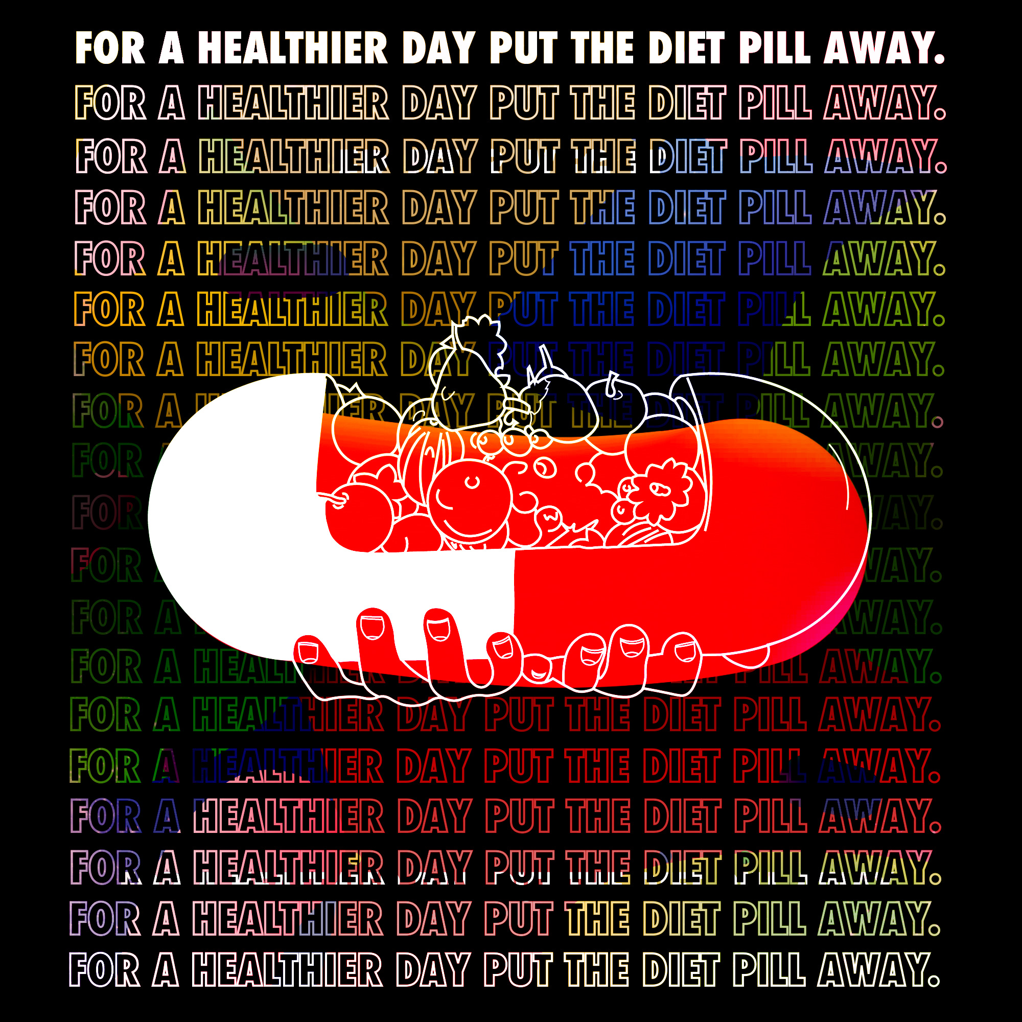
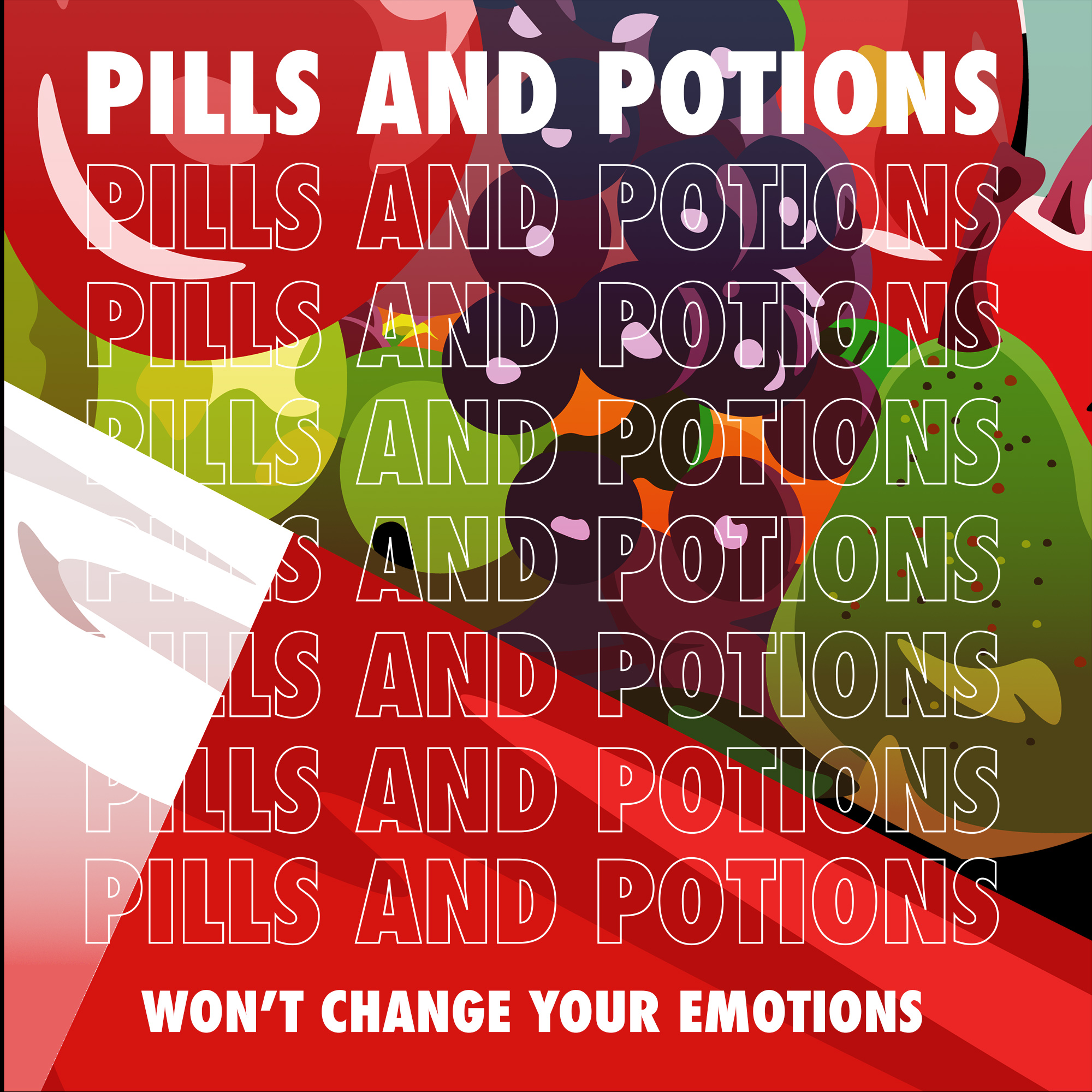
“Advertise and inform realstic normality not unrealstic false expectations.”
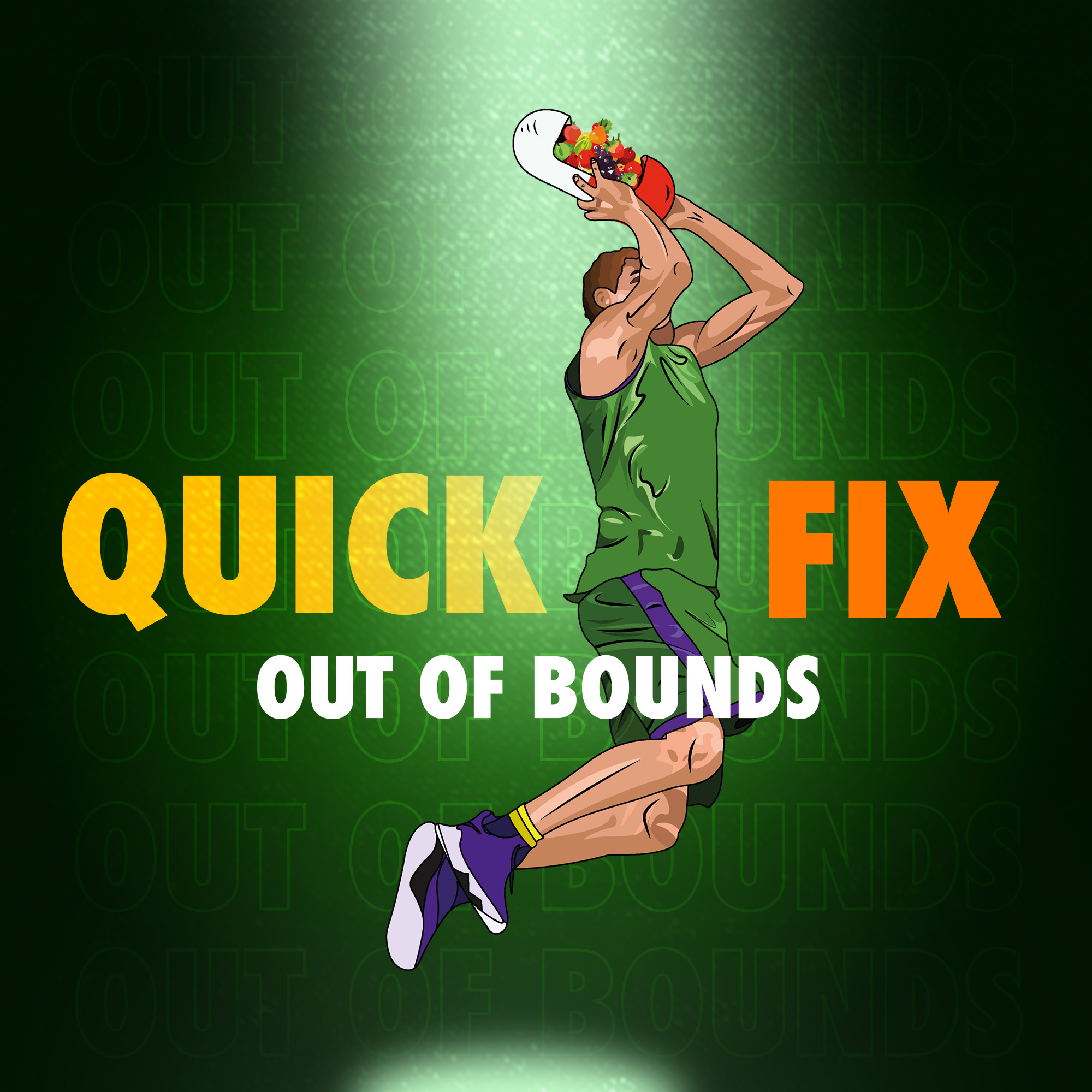
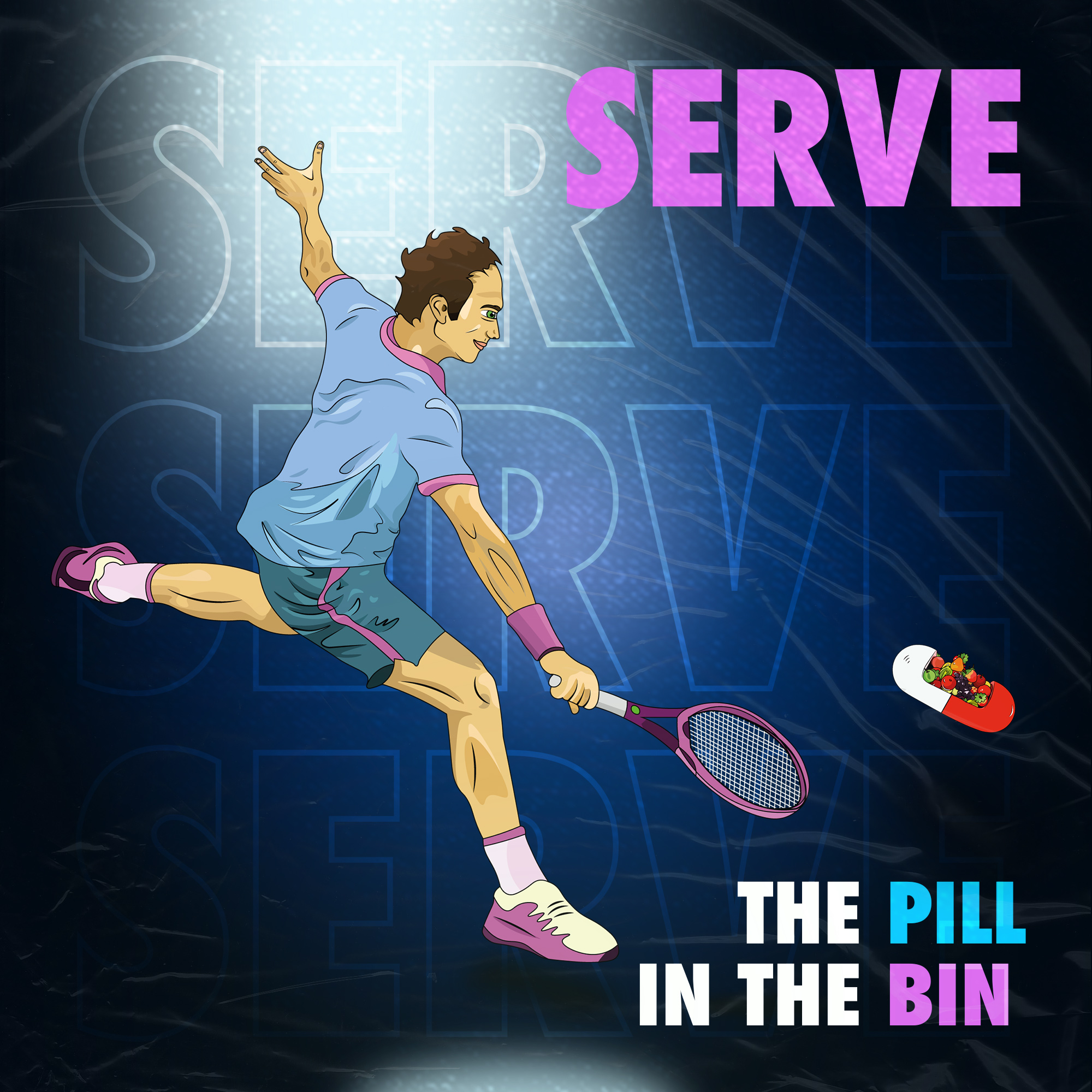
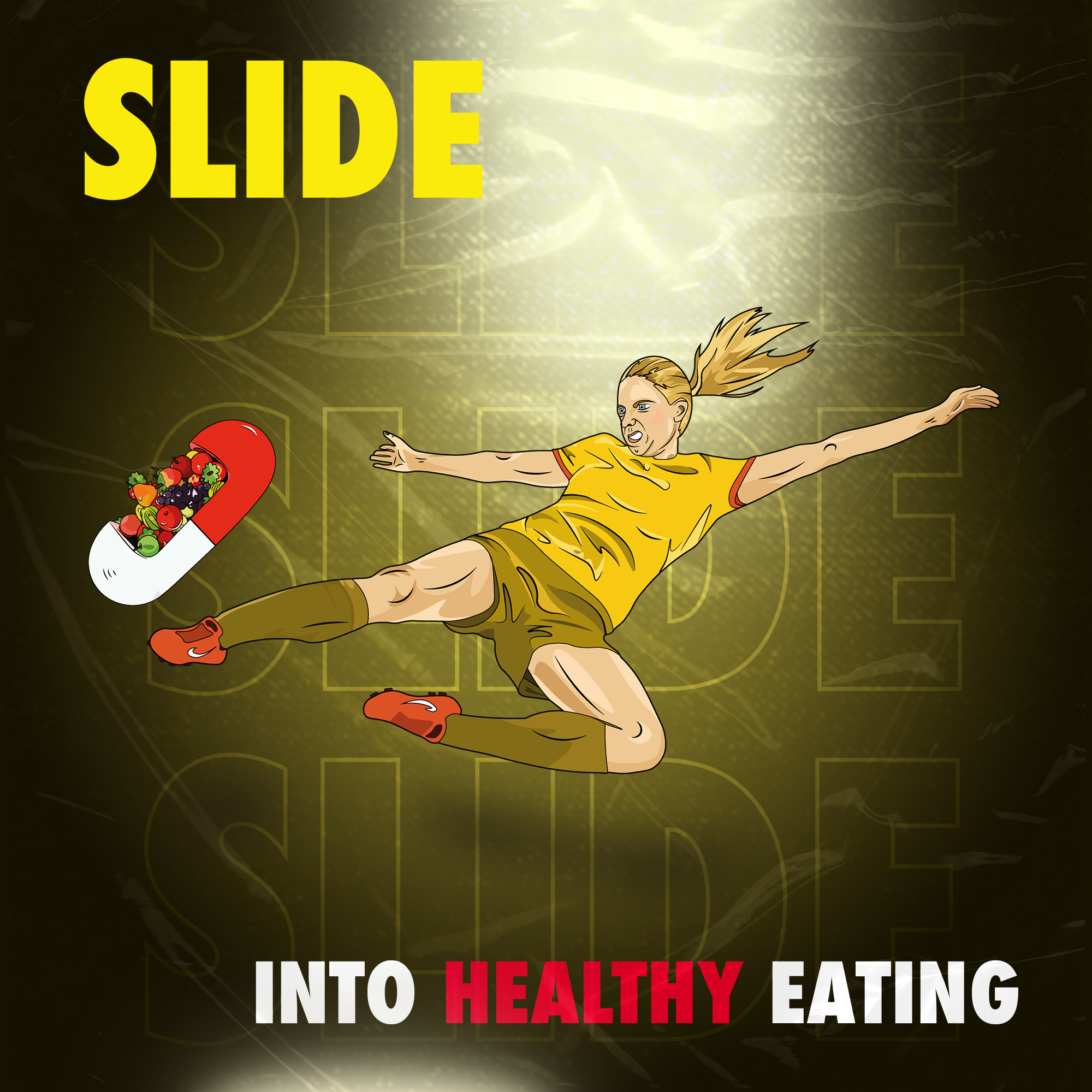
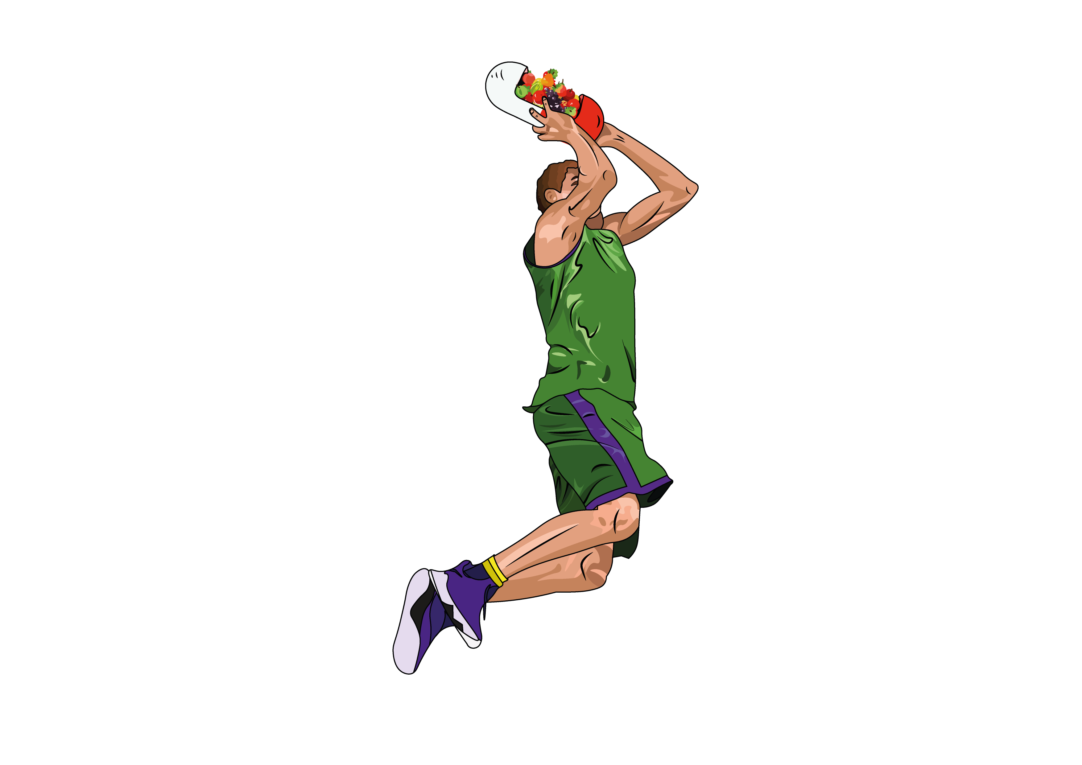
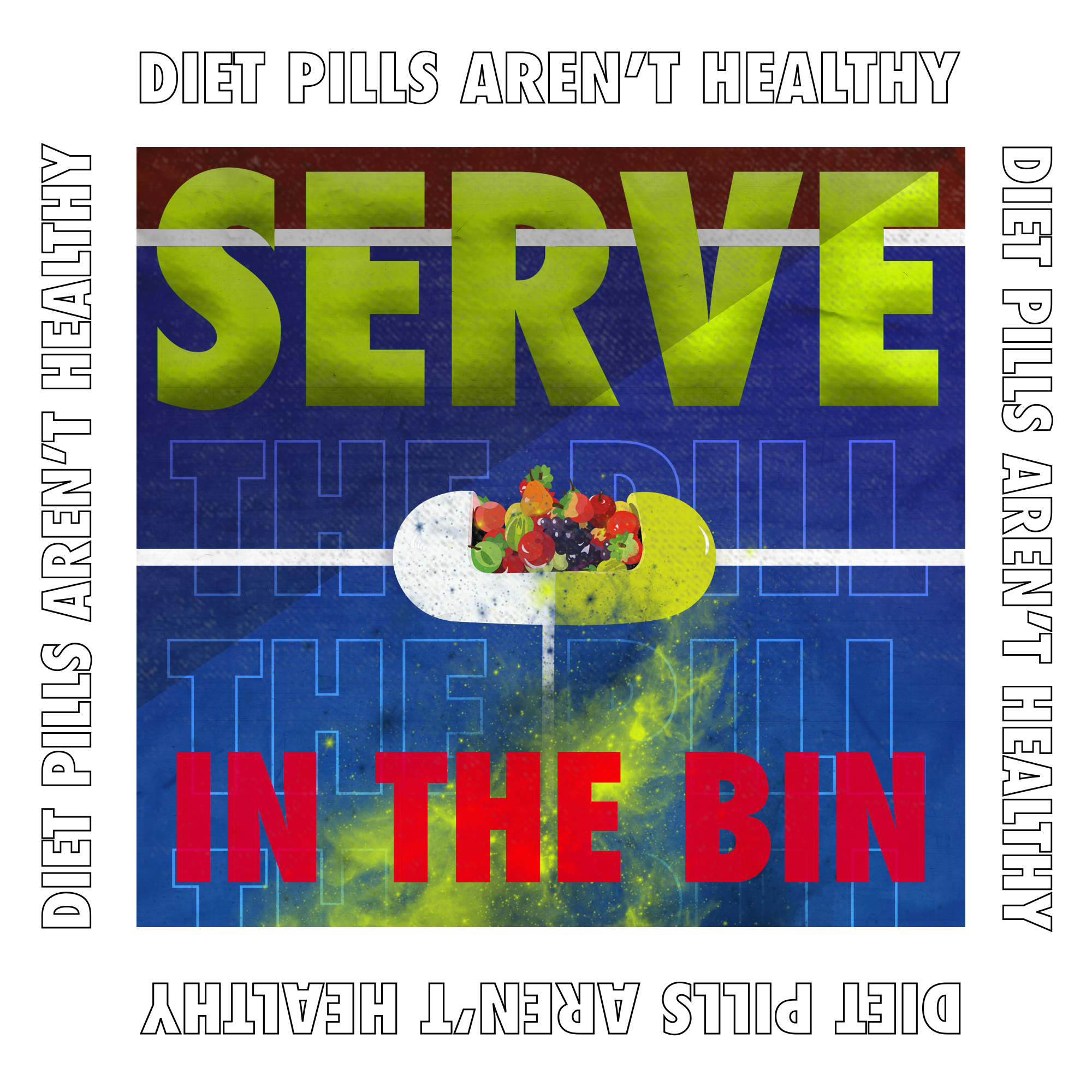
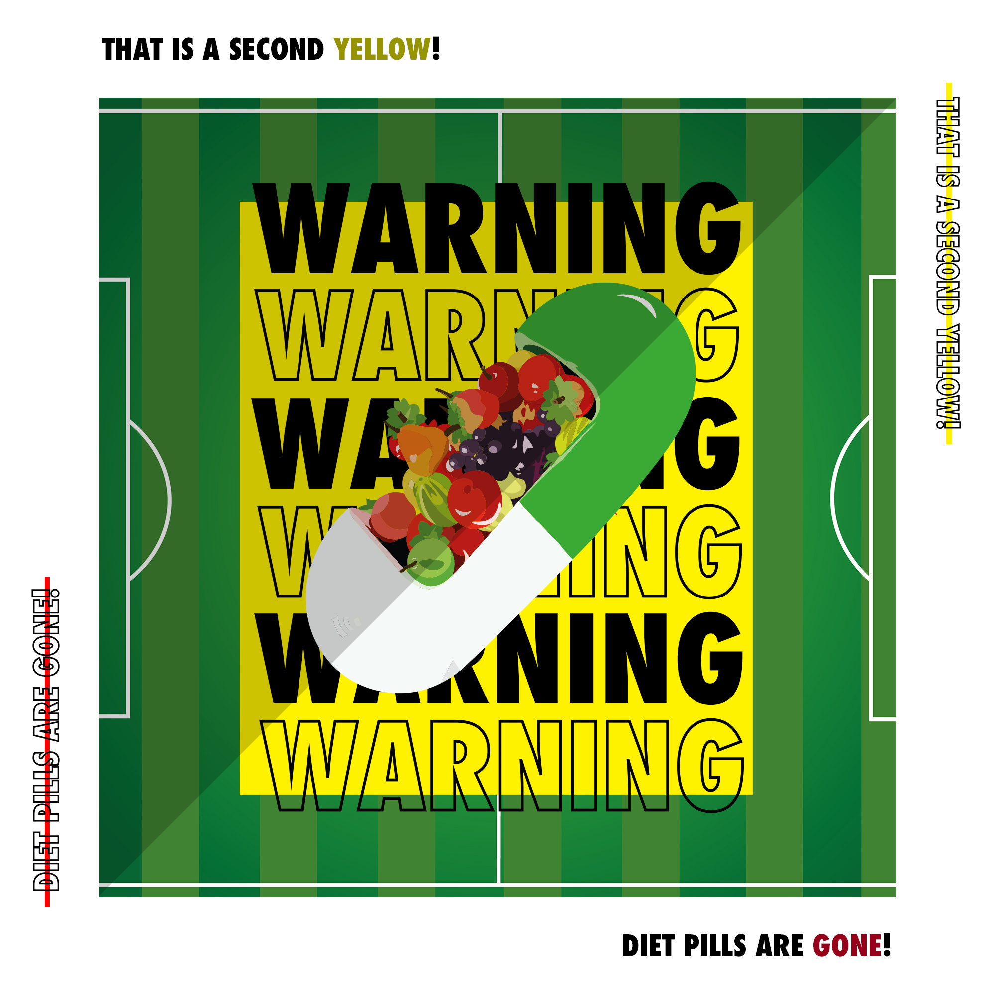
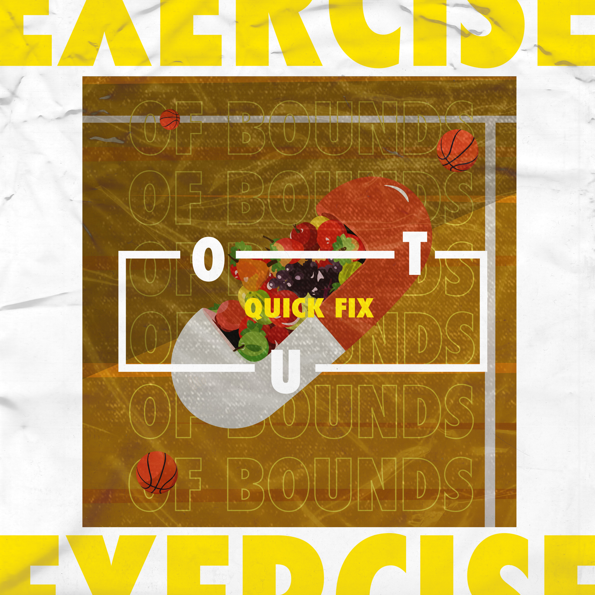
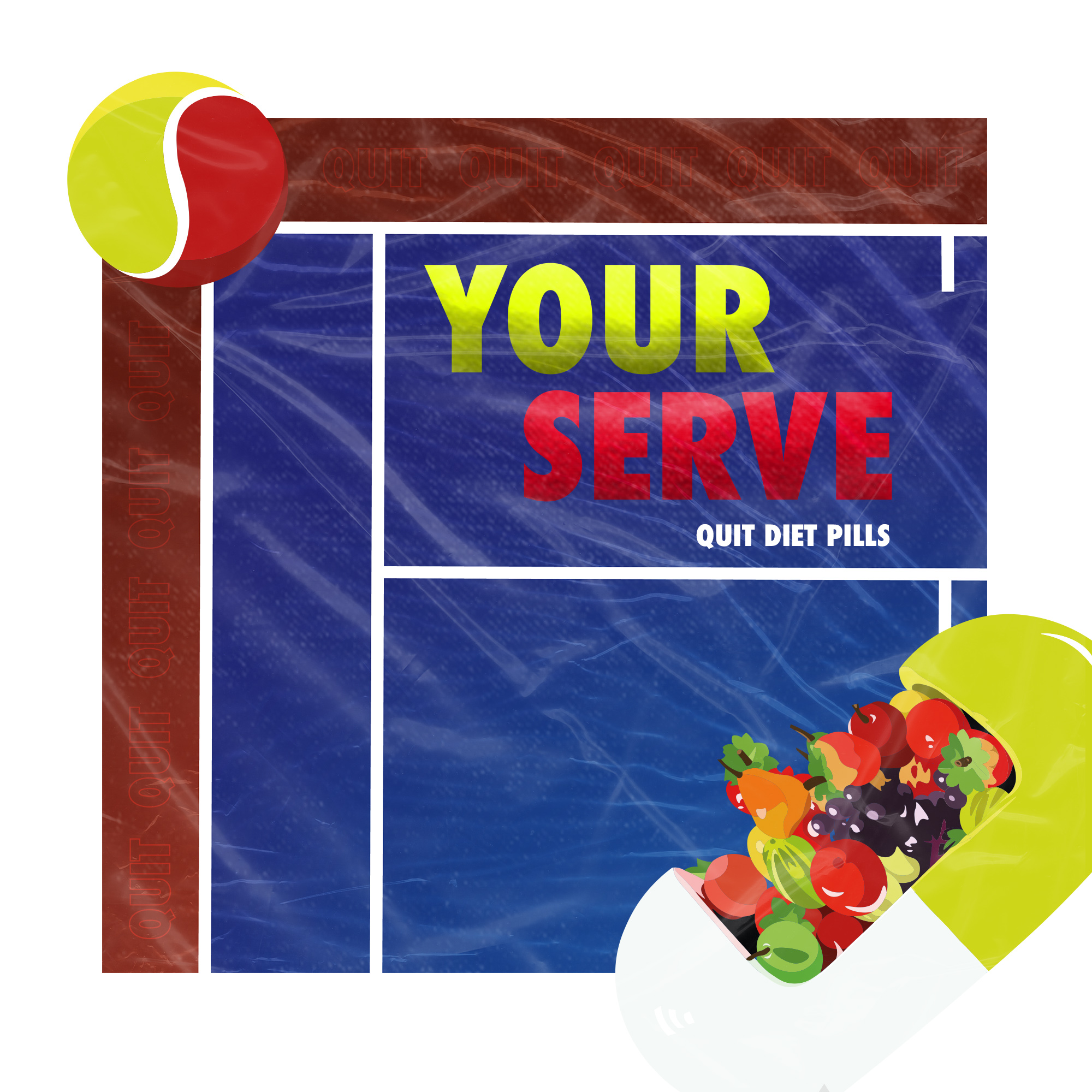
These experiments where made with slogans to encourage throwing diet pills away and turning attention to sport. From my research sport is a relief and it releases chemicals called endorphins. This was inspired from various of Nike adverts that they design and combine typography with photography, however in this case I used illustrations instead of photographs because it is my strength and something I wanted to showcase in my final major project.
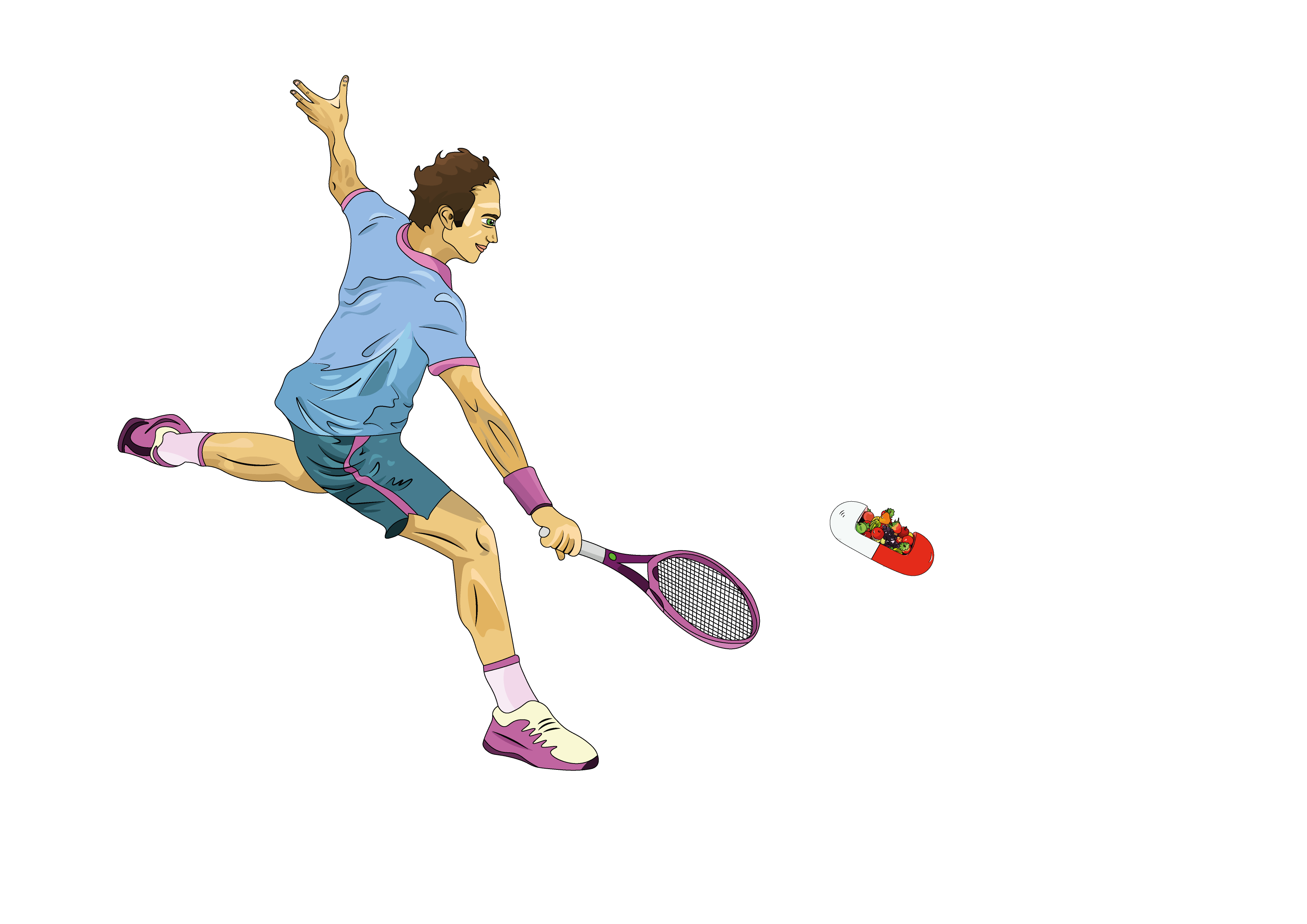
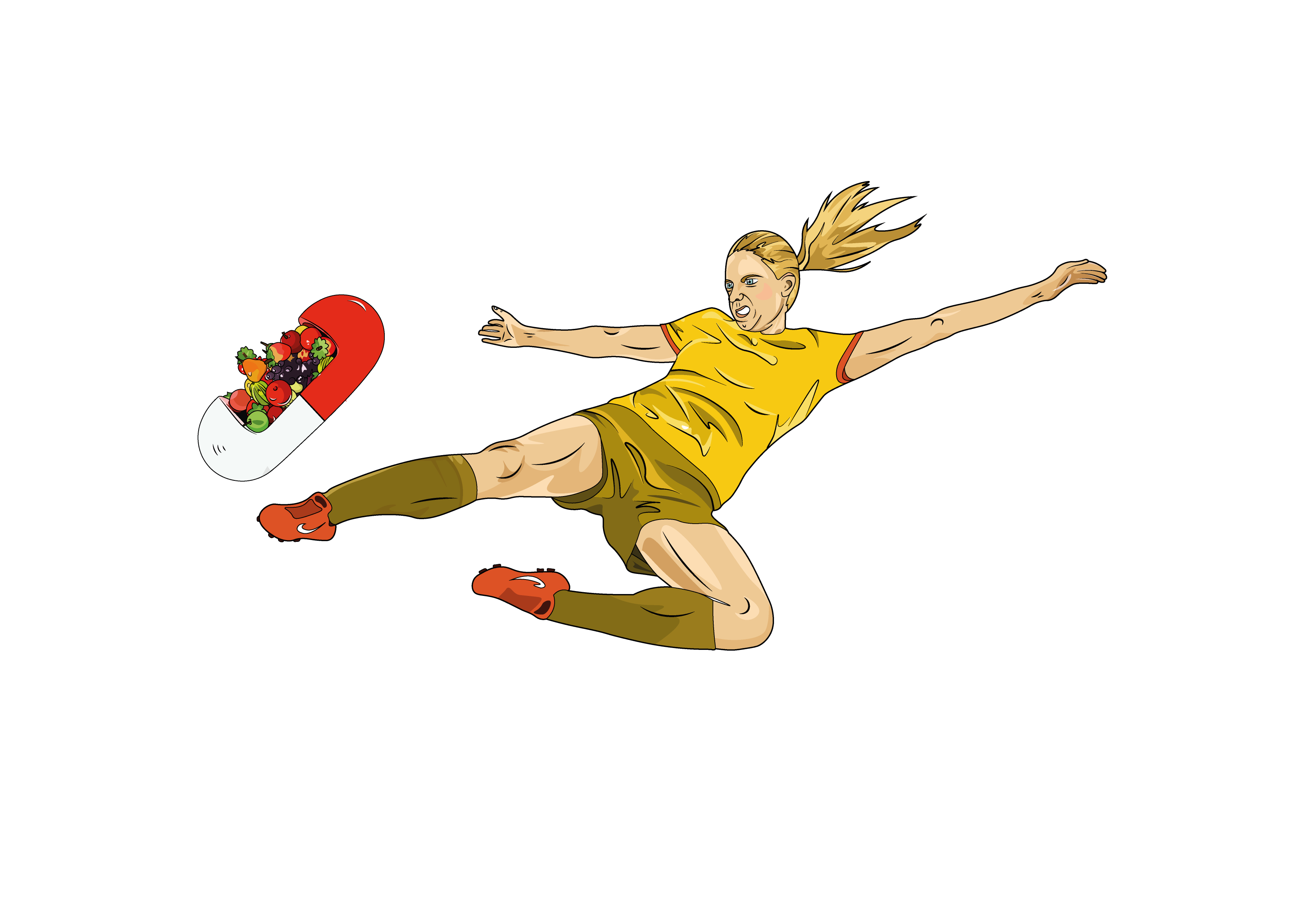
These experimentations are inspired from my artefact that you'll see down below.
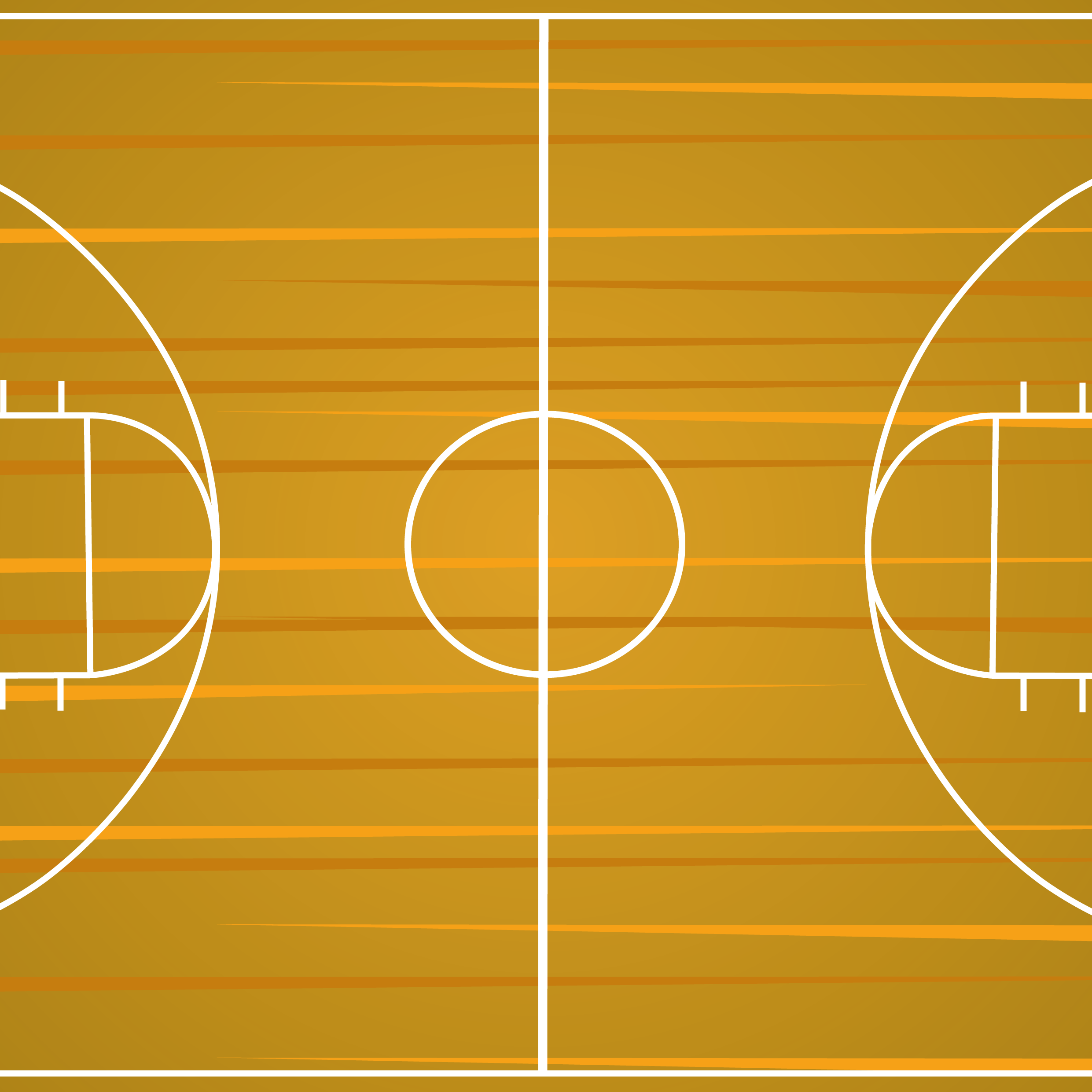
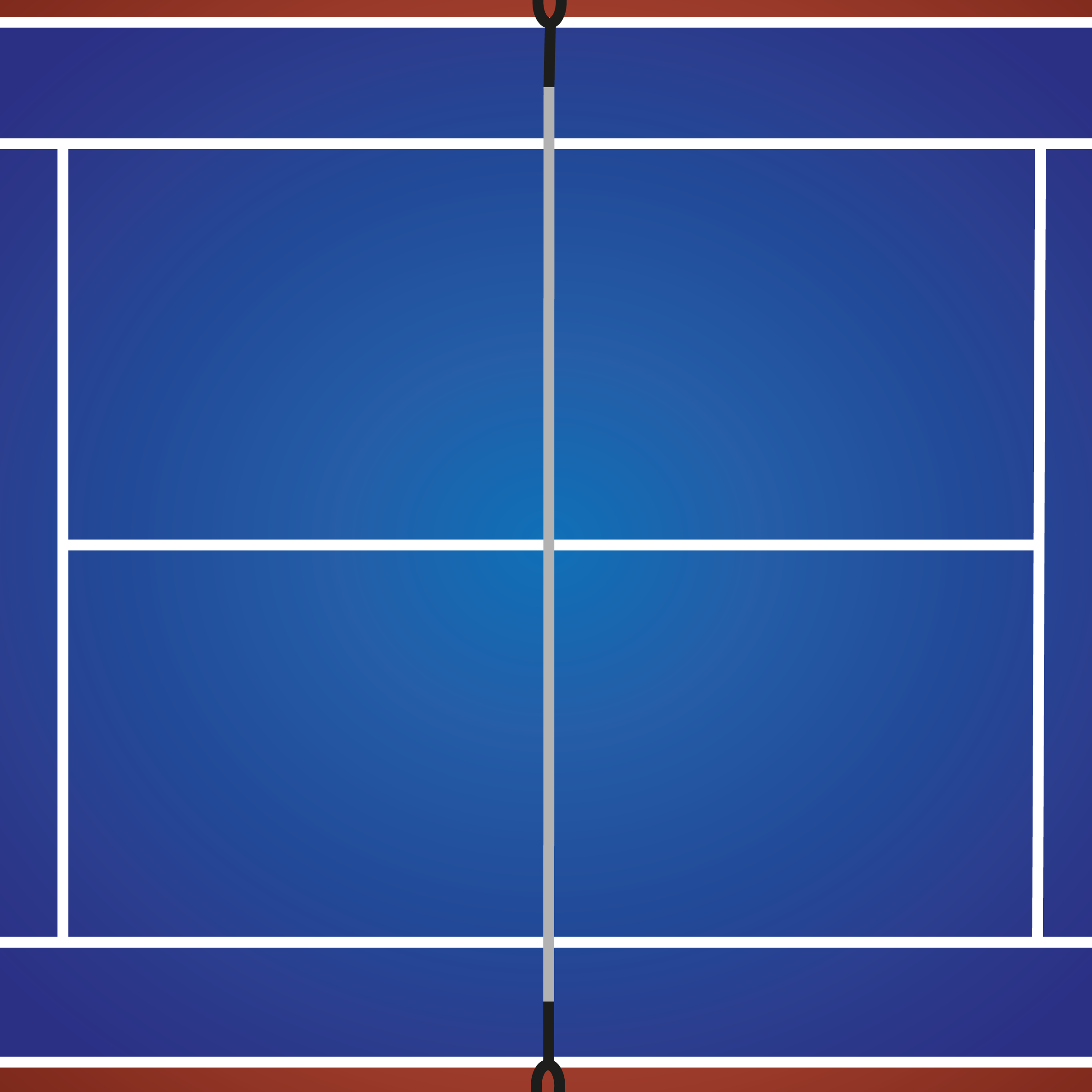
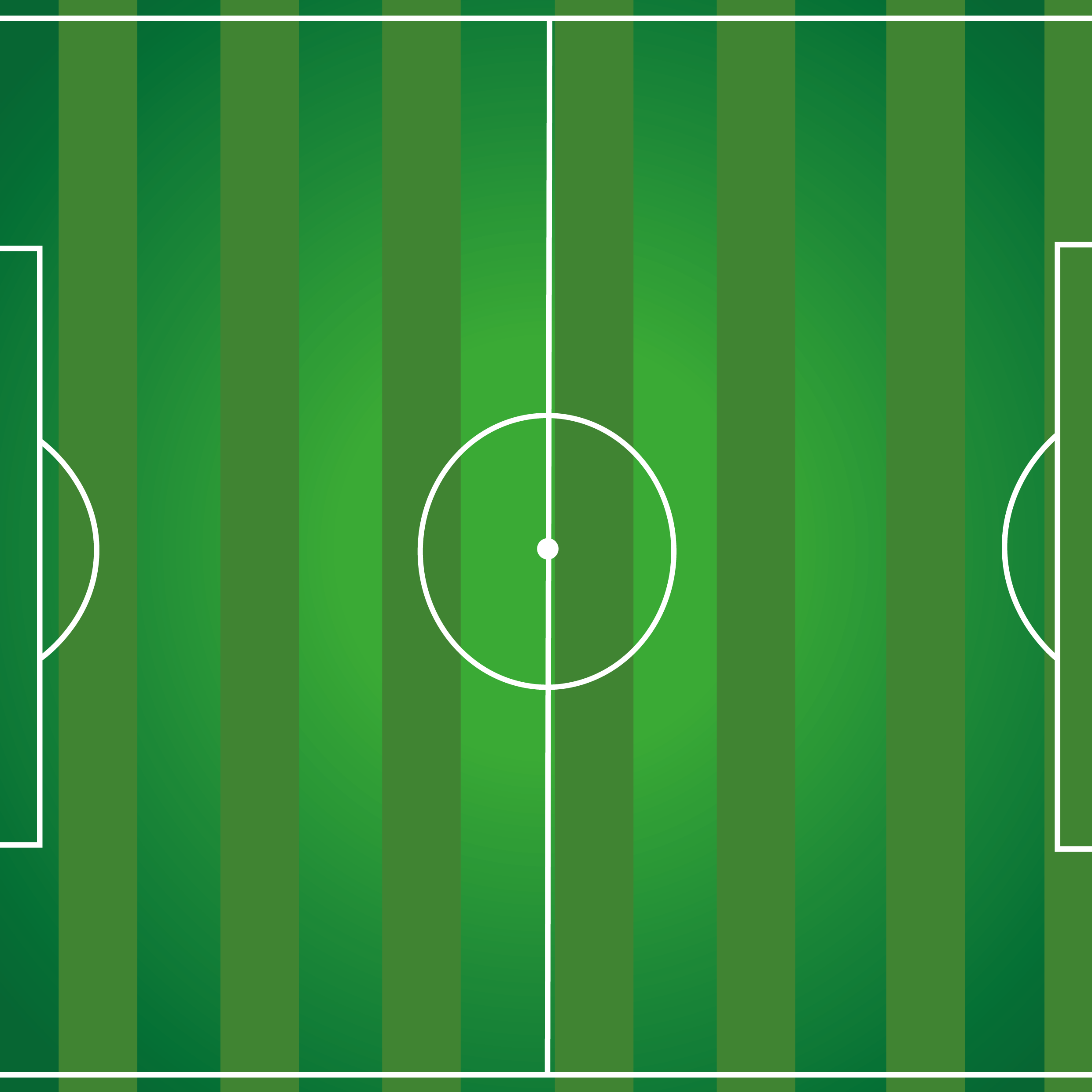
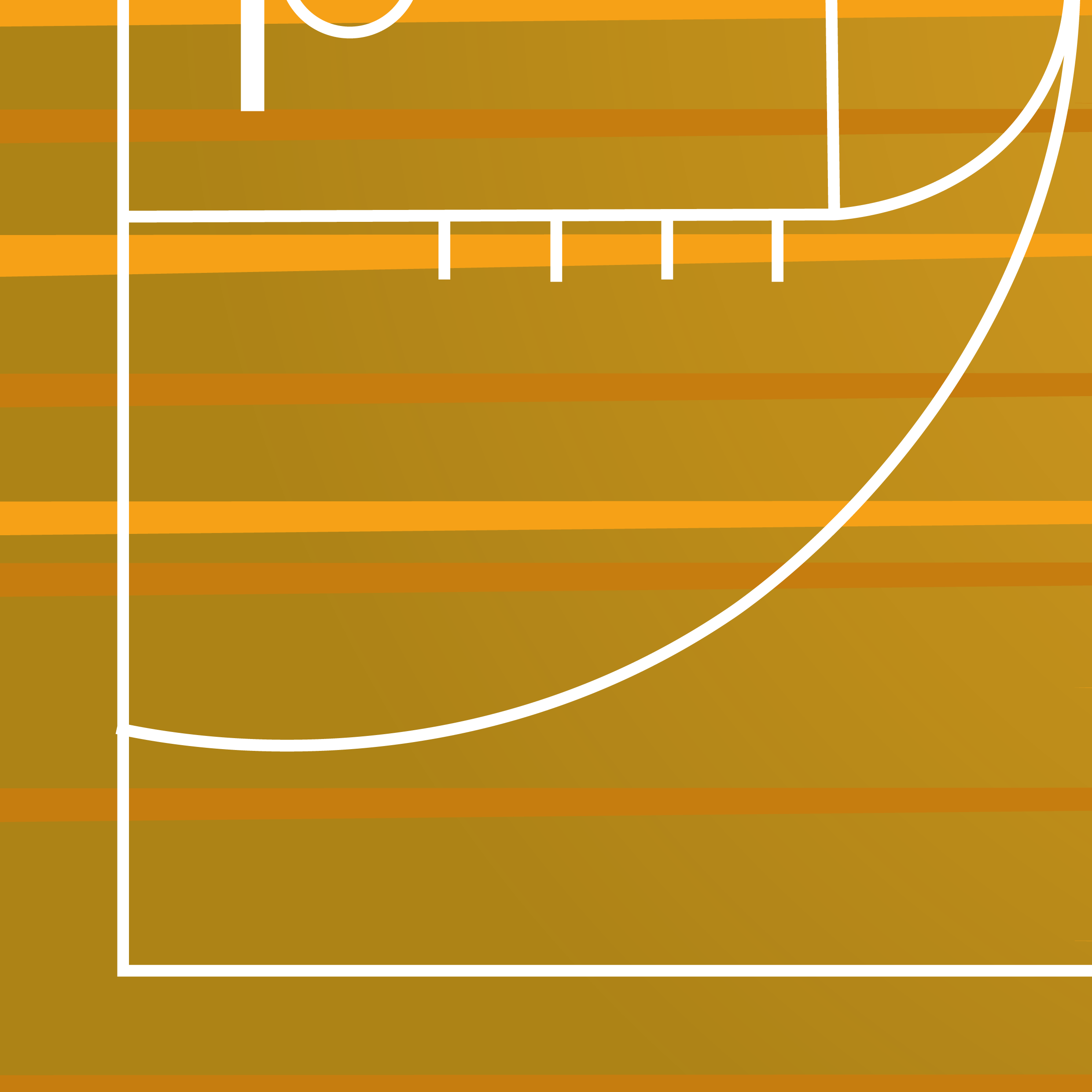
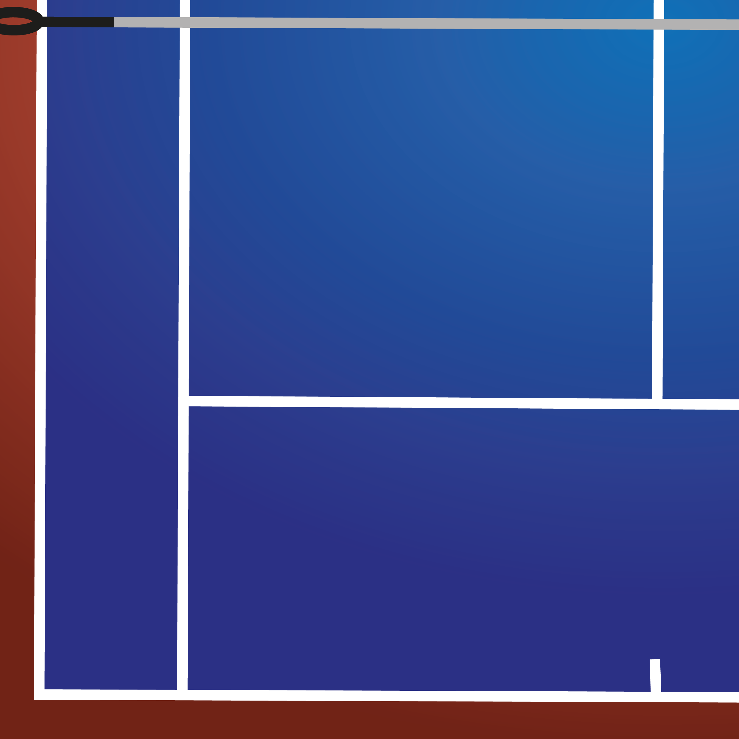
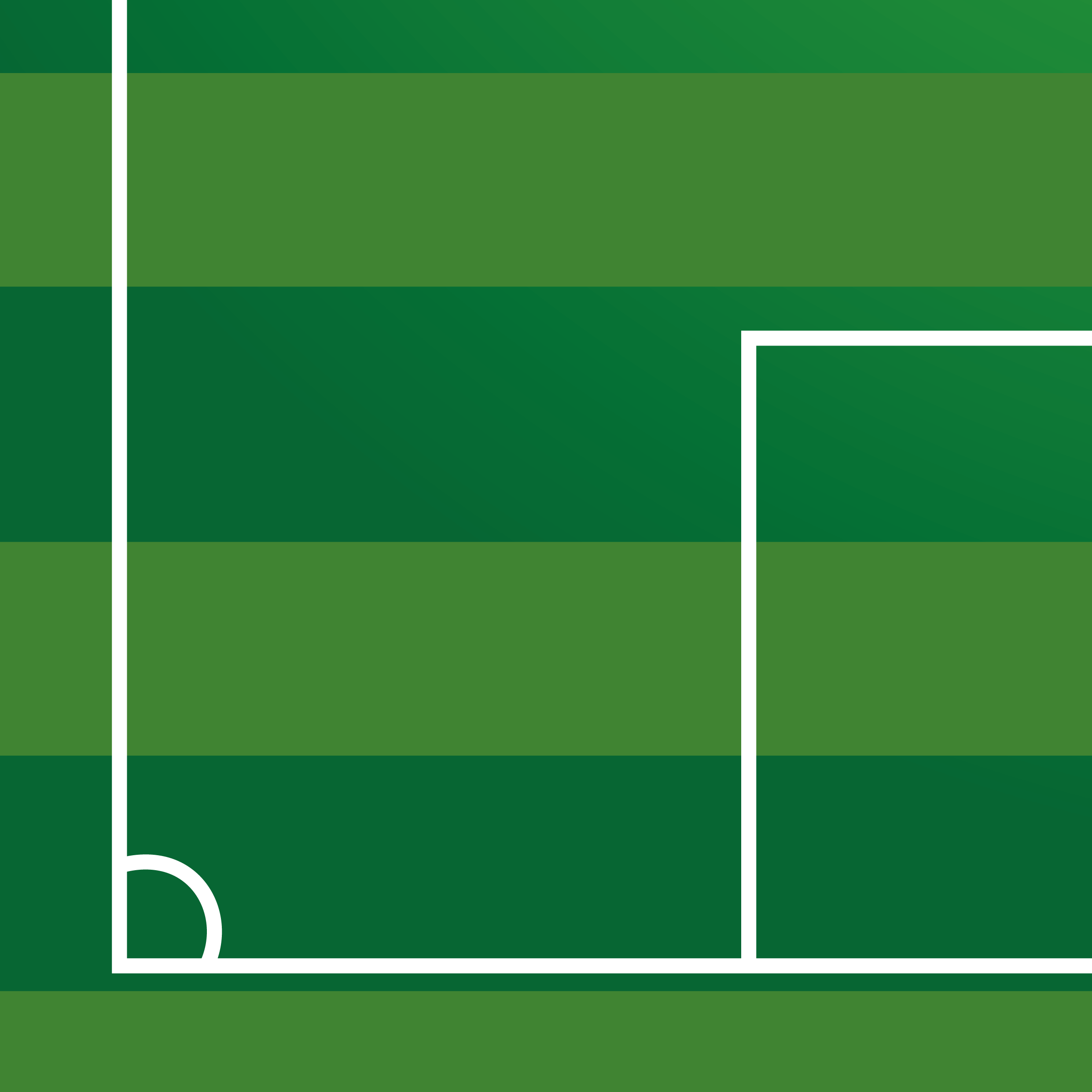
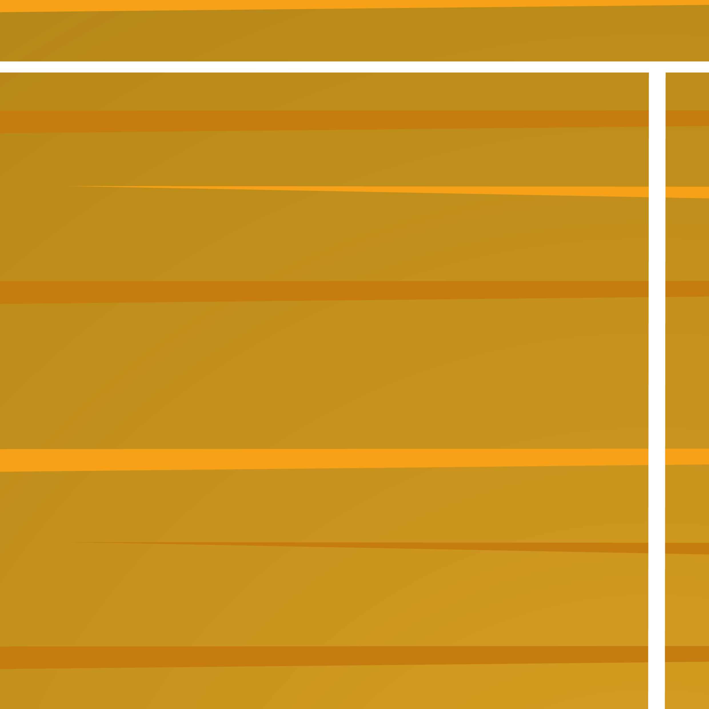
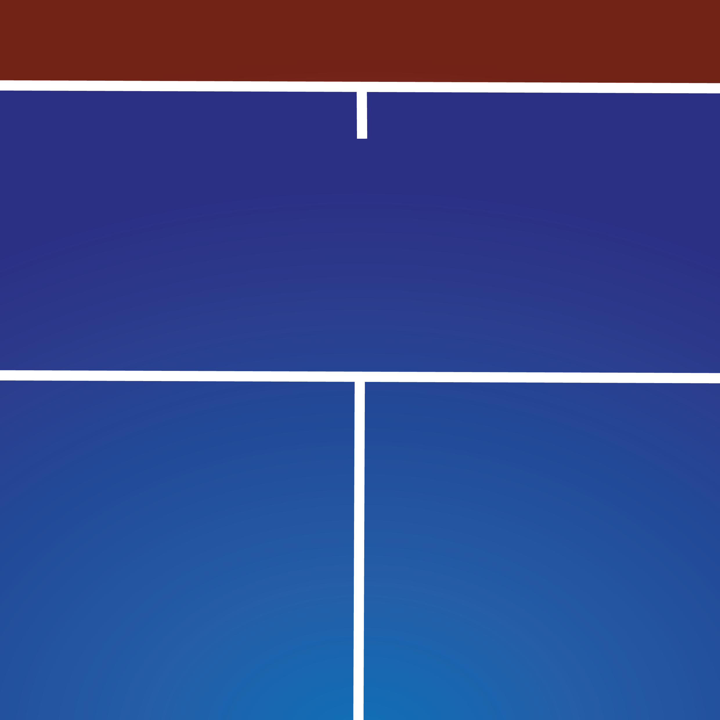
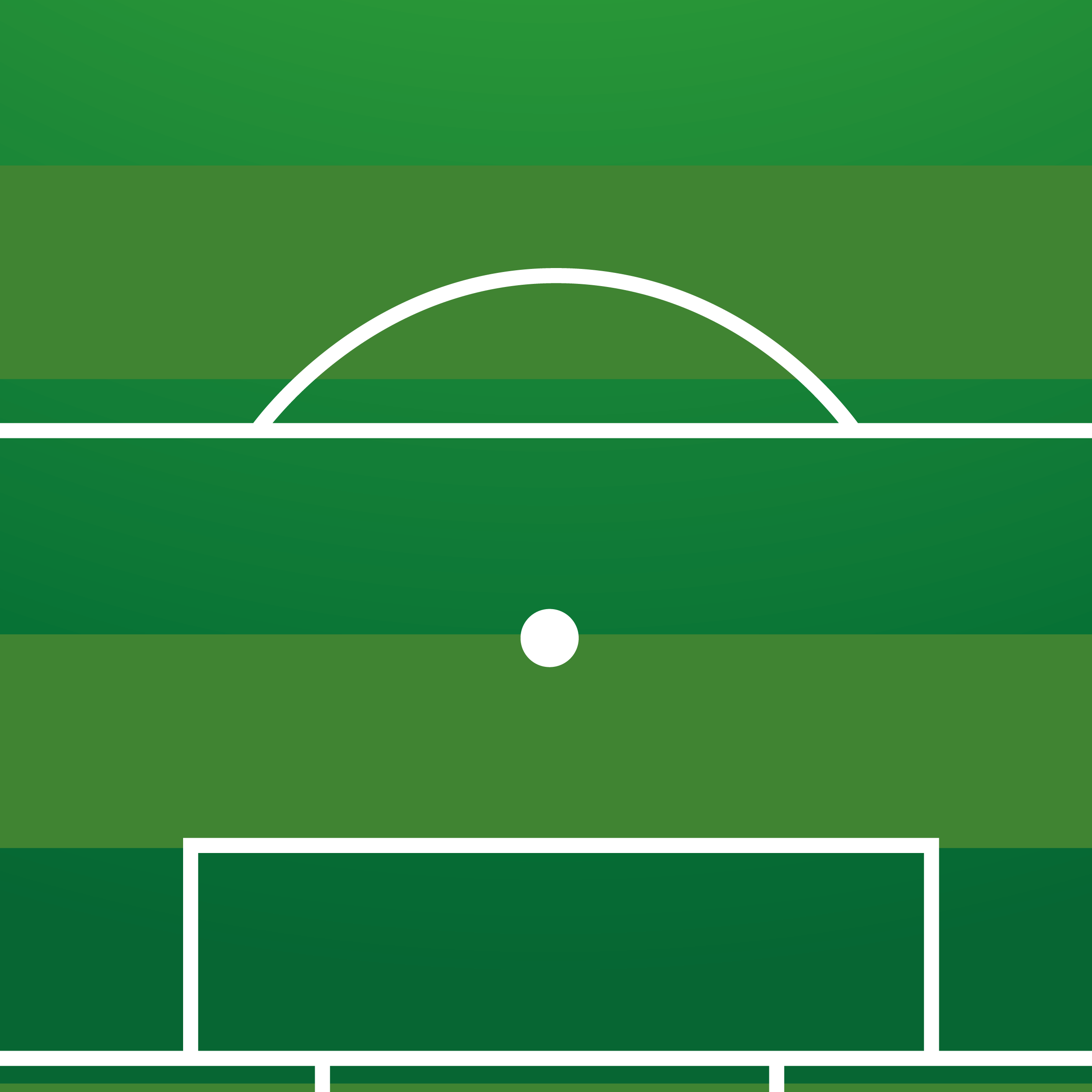
Still linking this theme with basketball, tennis and football sports so it stays consistent. I experimented with Illustrator and Photoshop to combine playing courts and fields with typography and shrinking colours to pass on a message using phrases, quotes and slogans.
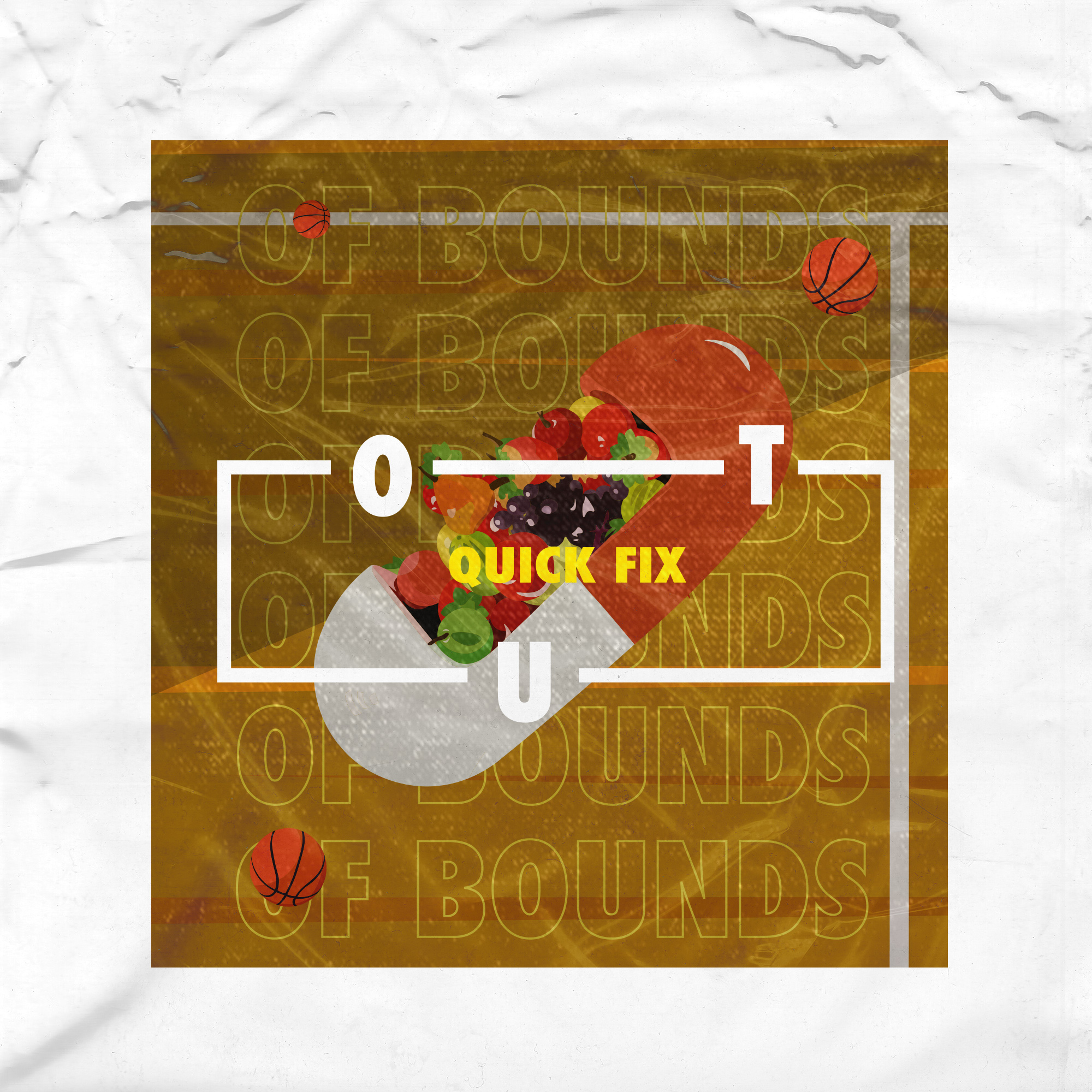
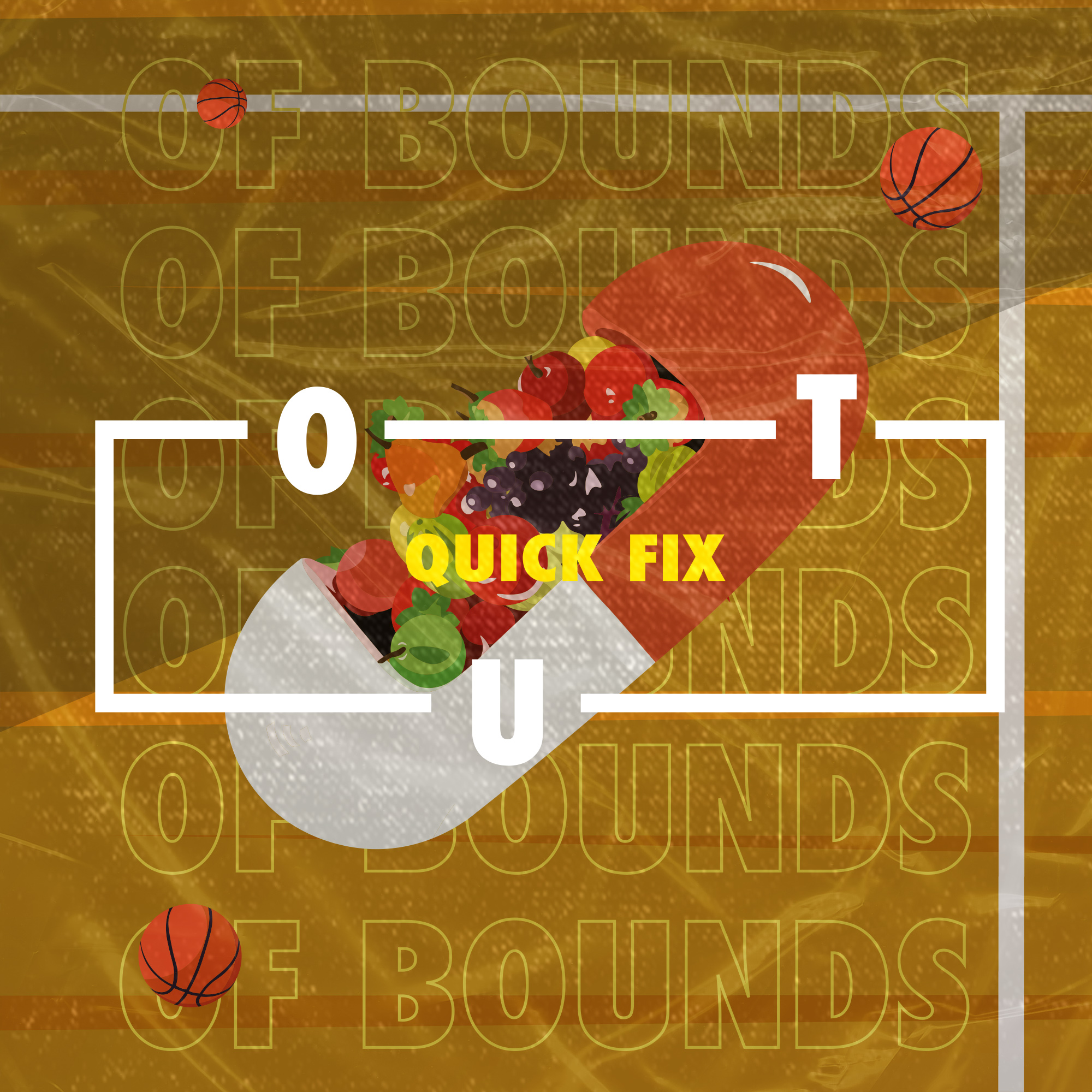
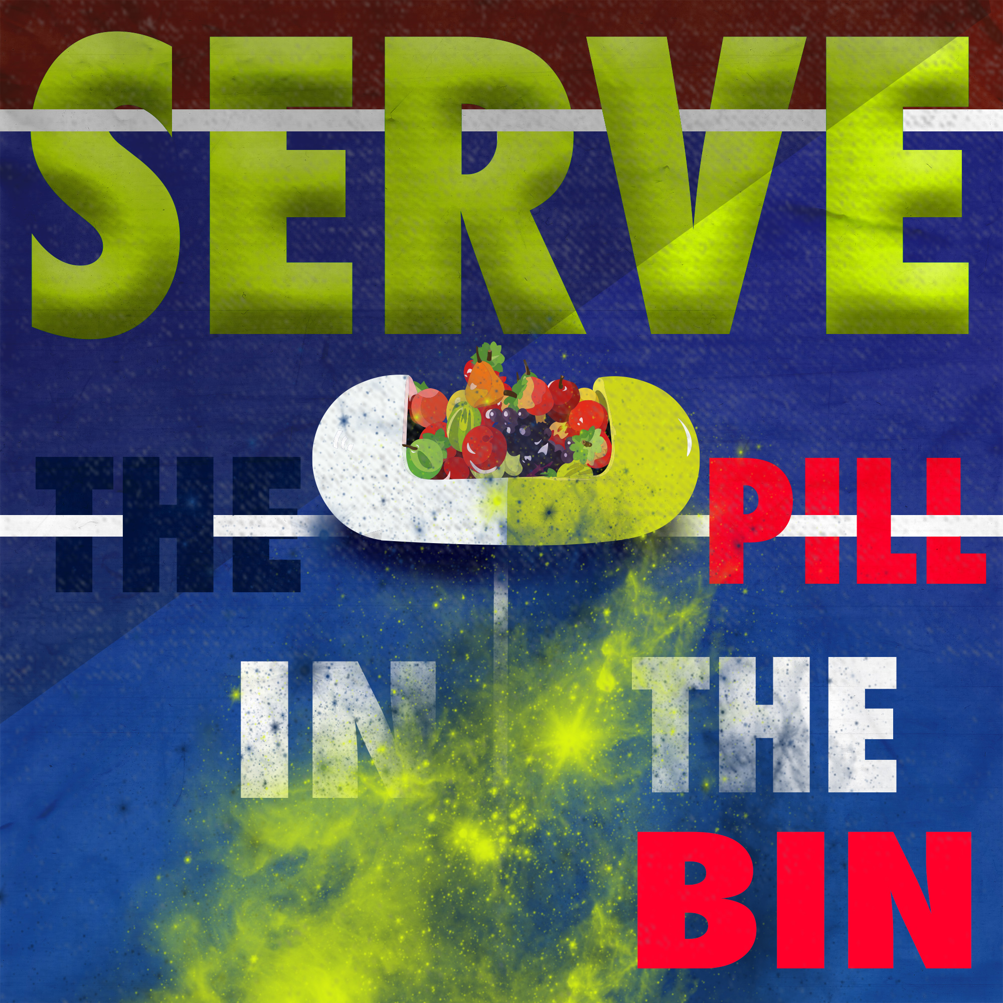
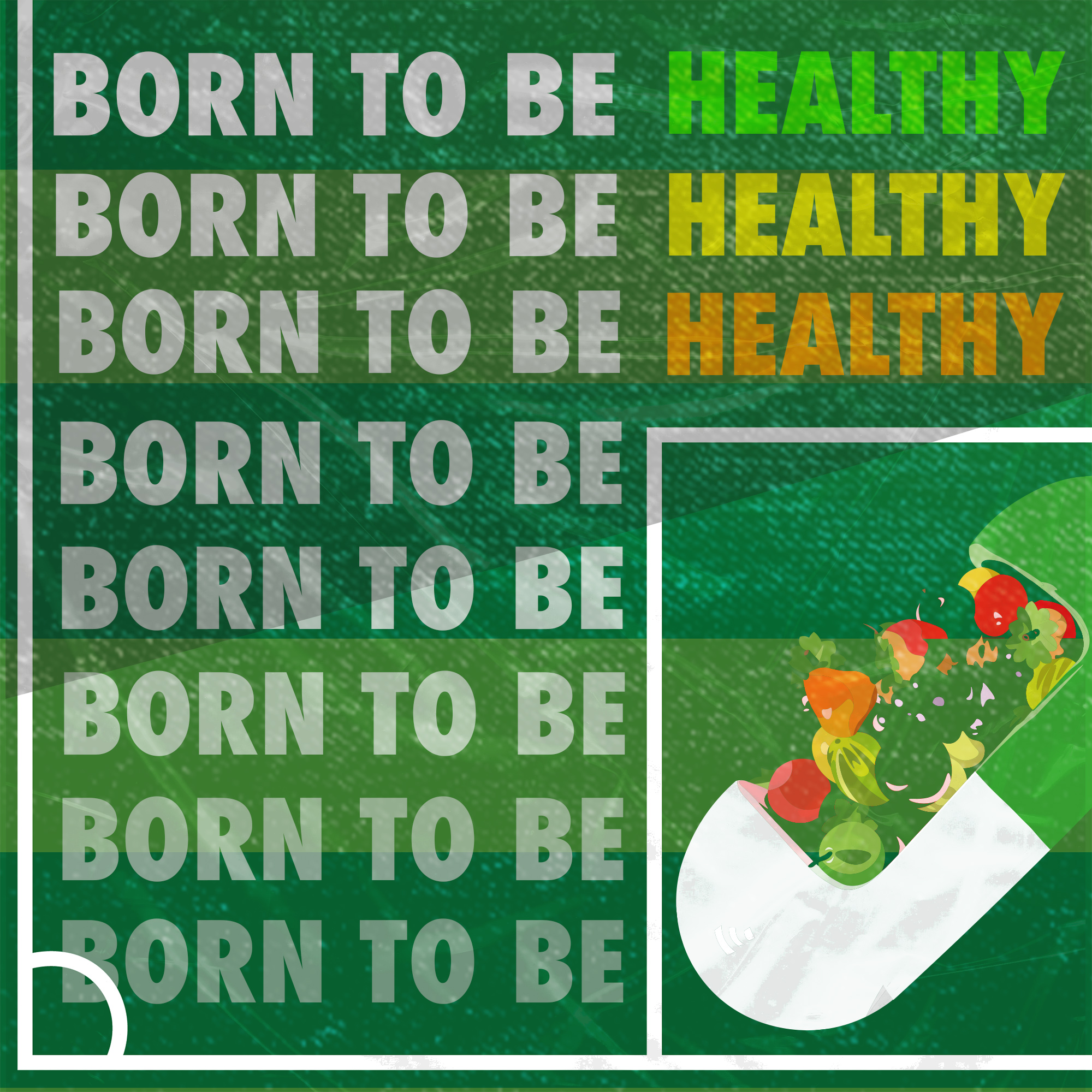
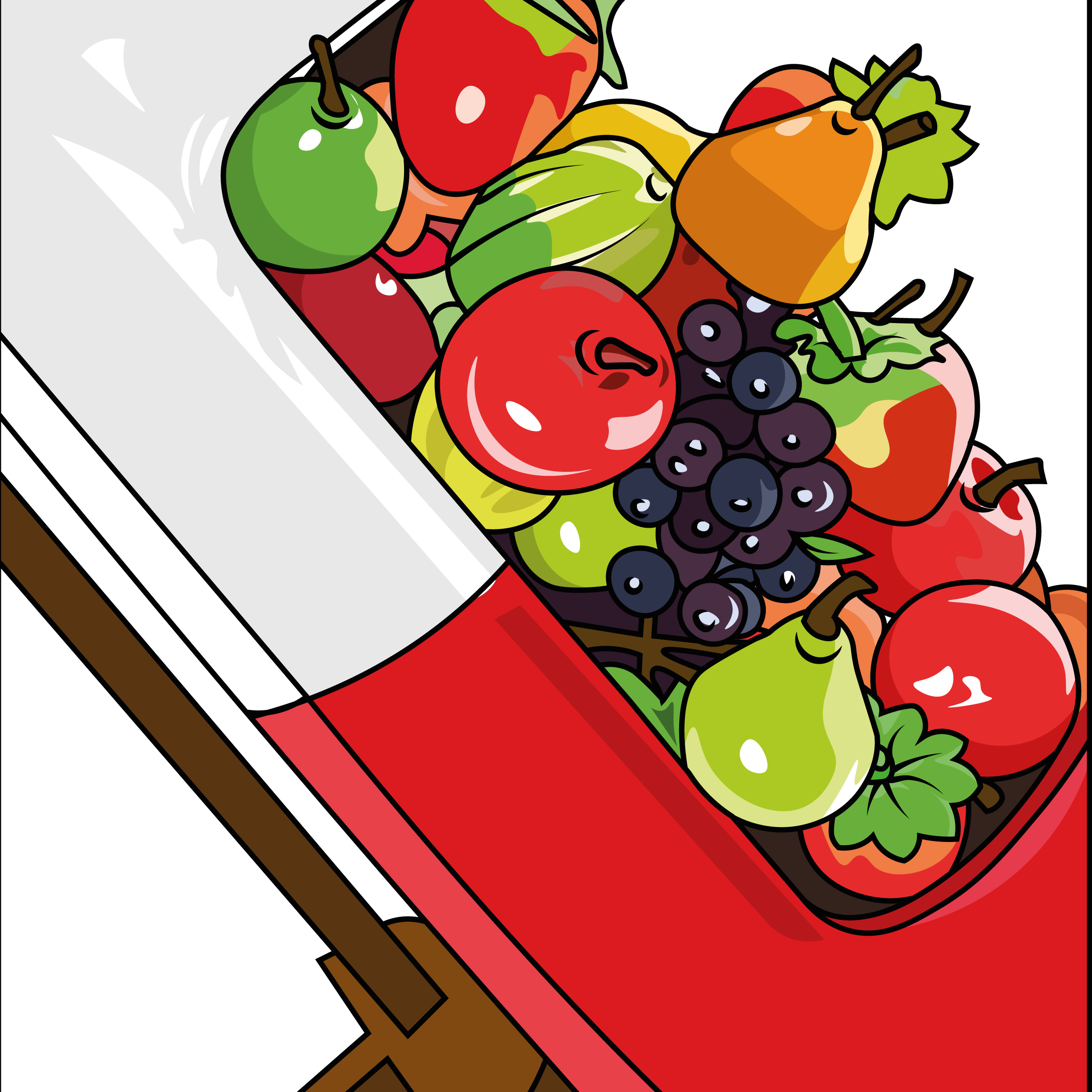
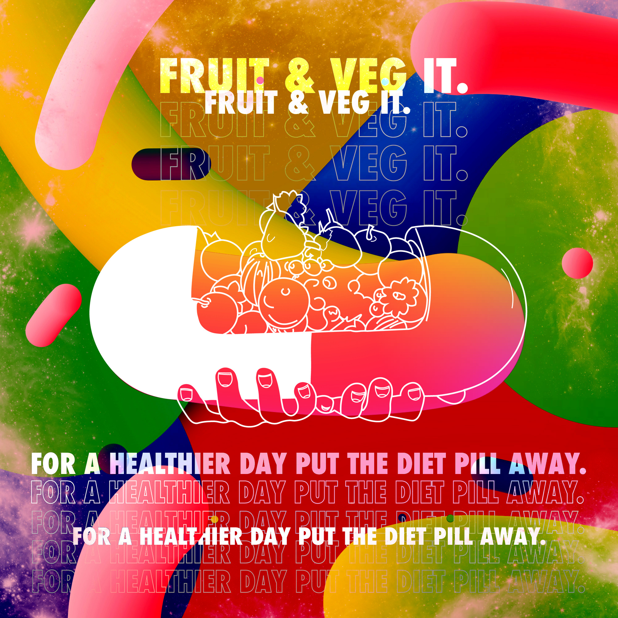
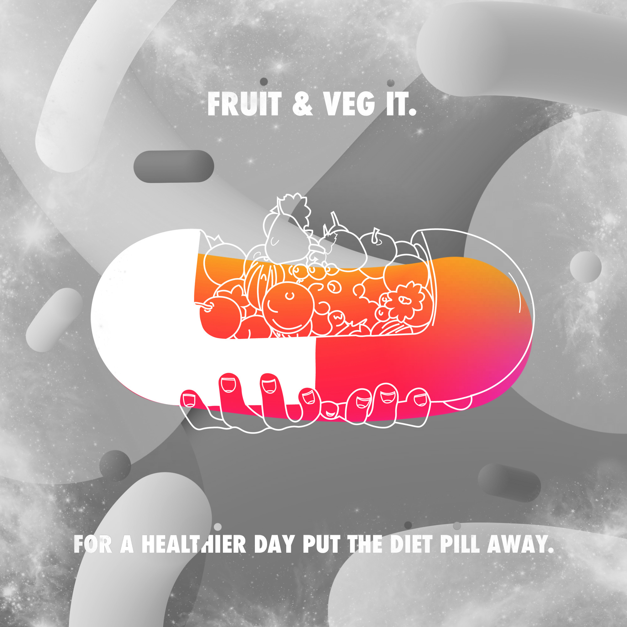
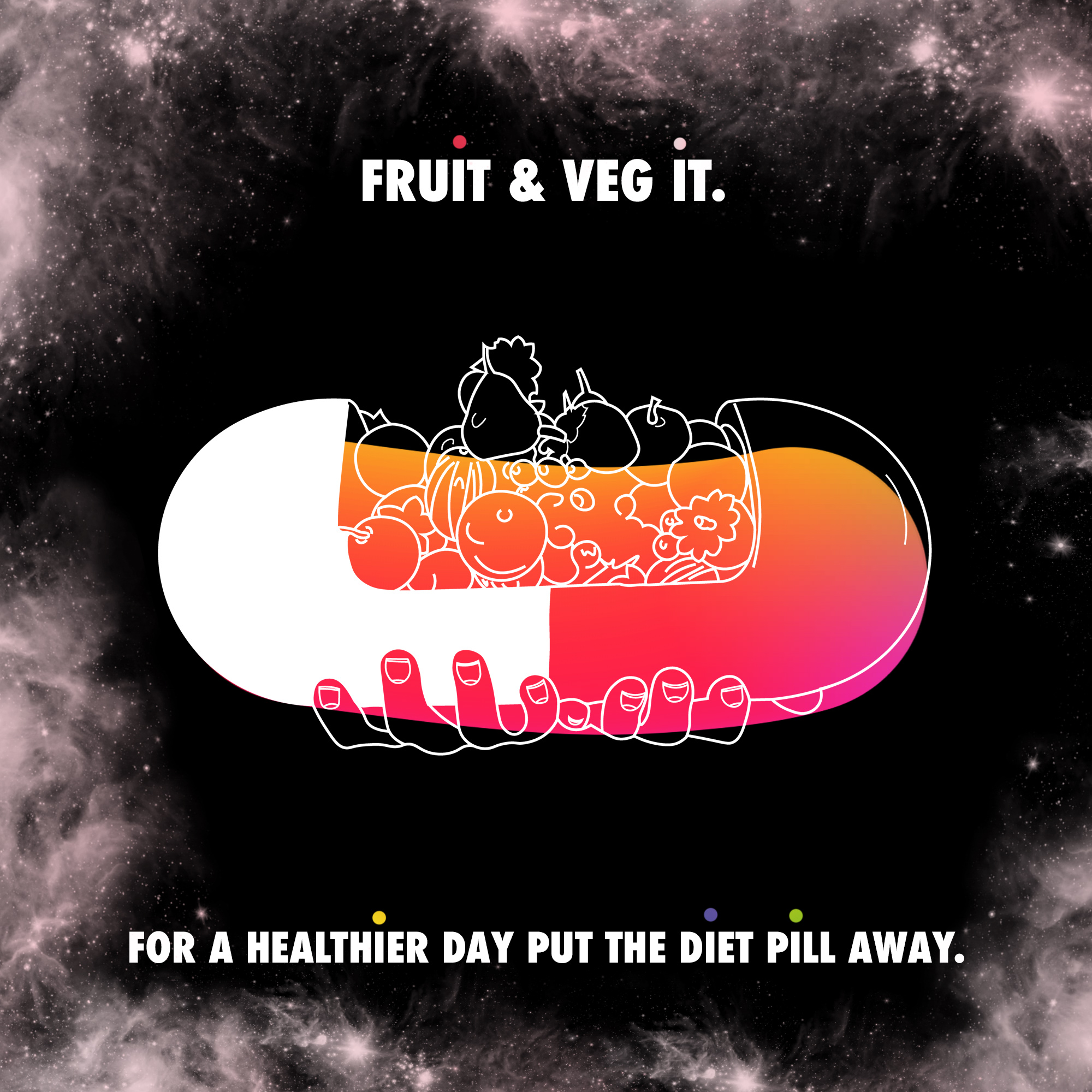
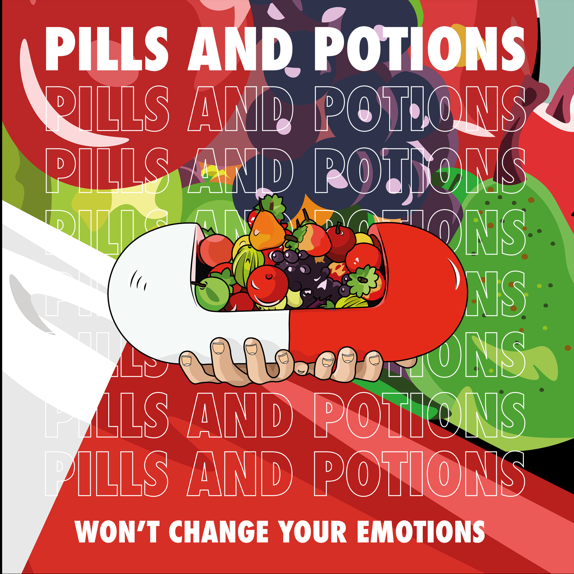
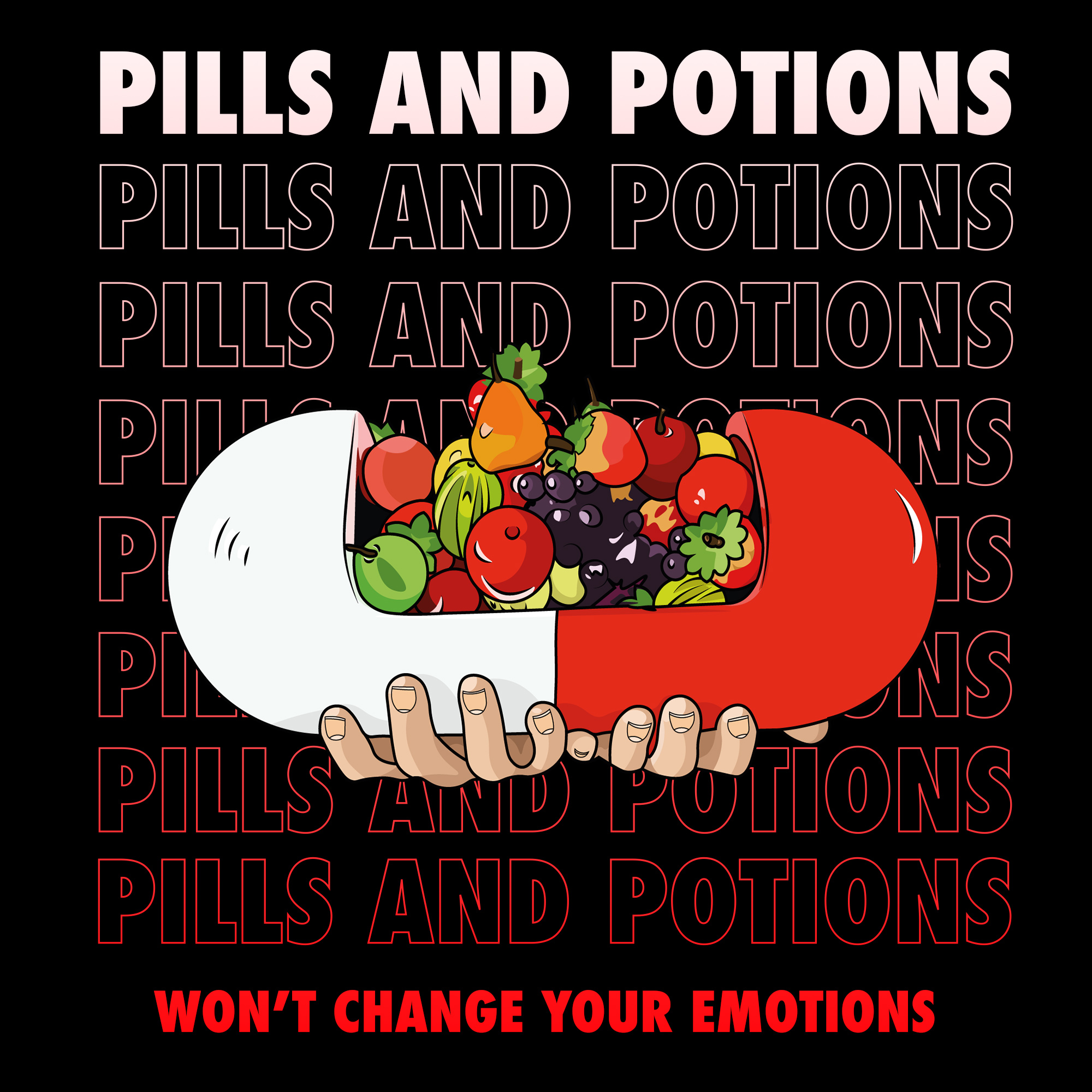
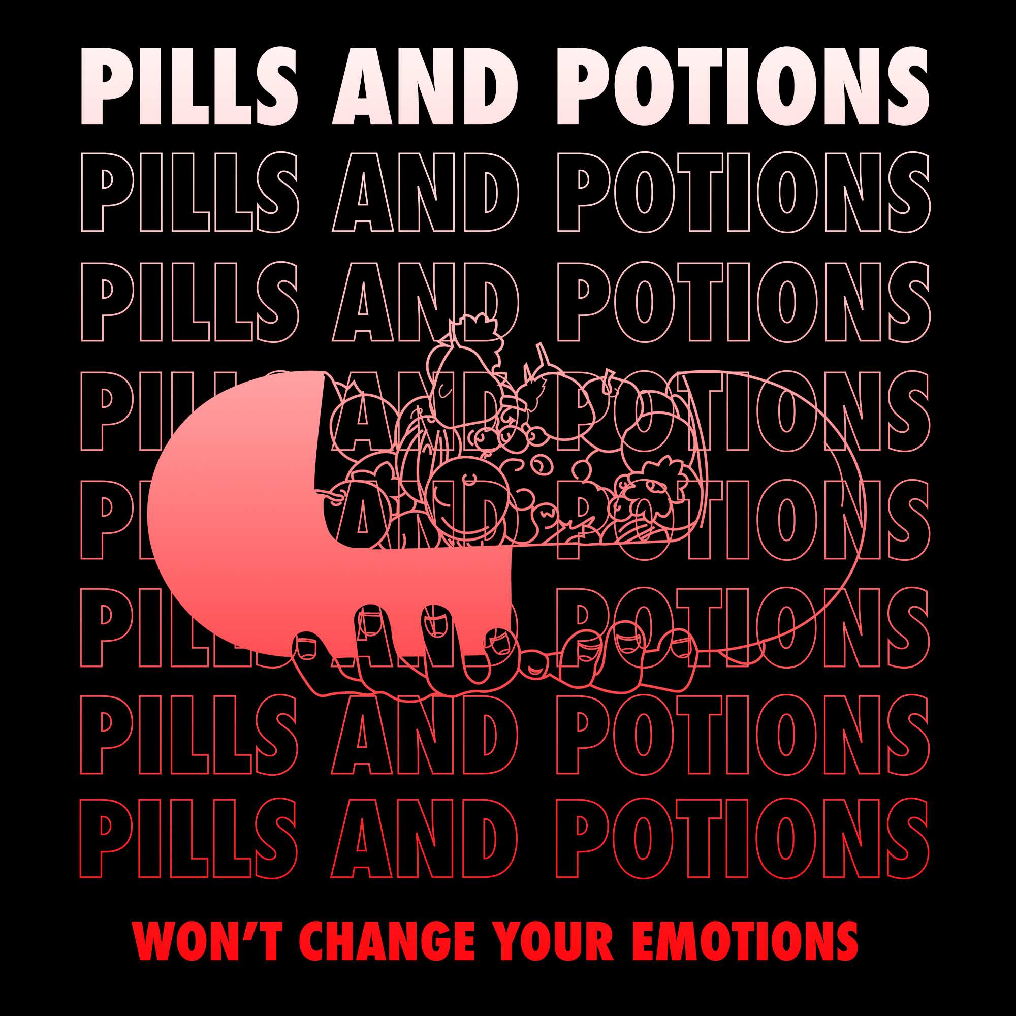
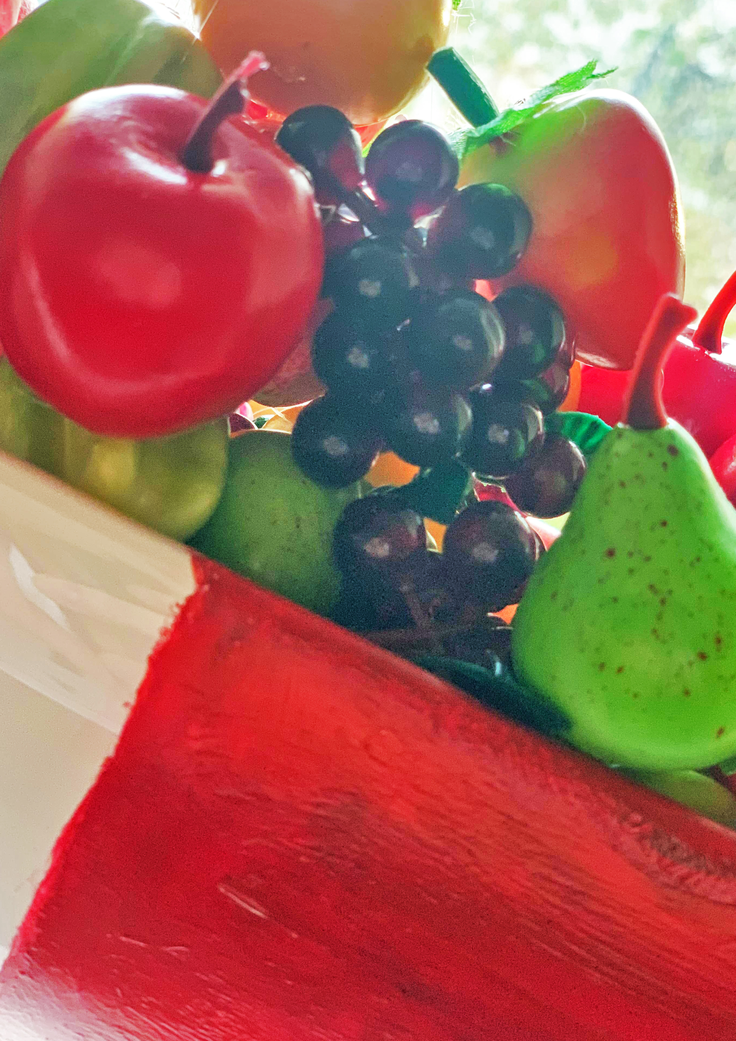
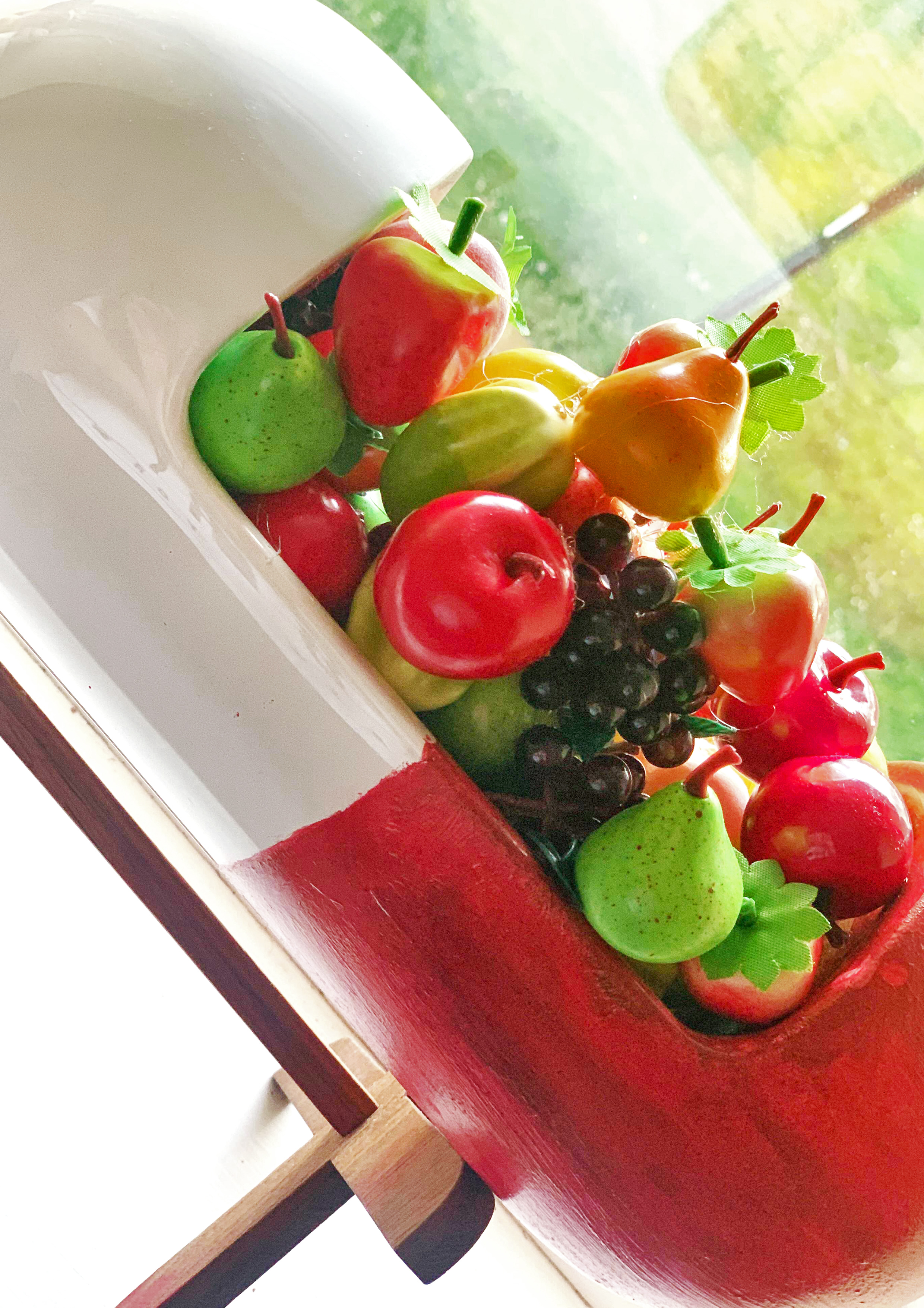
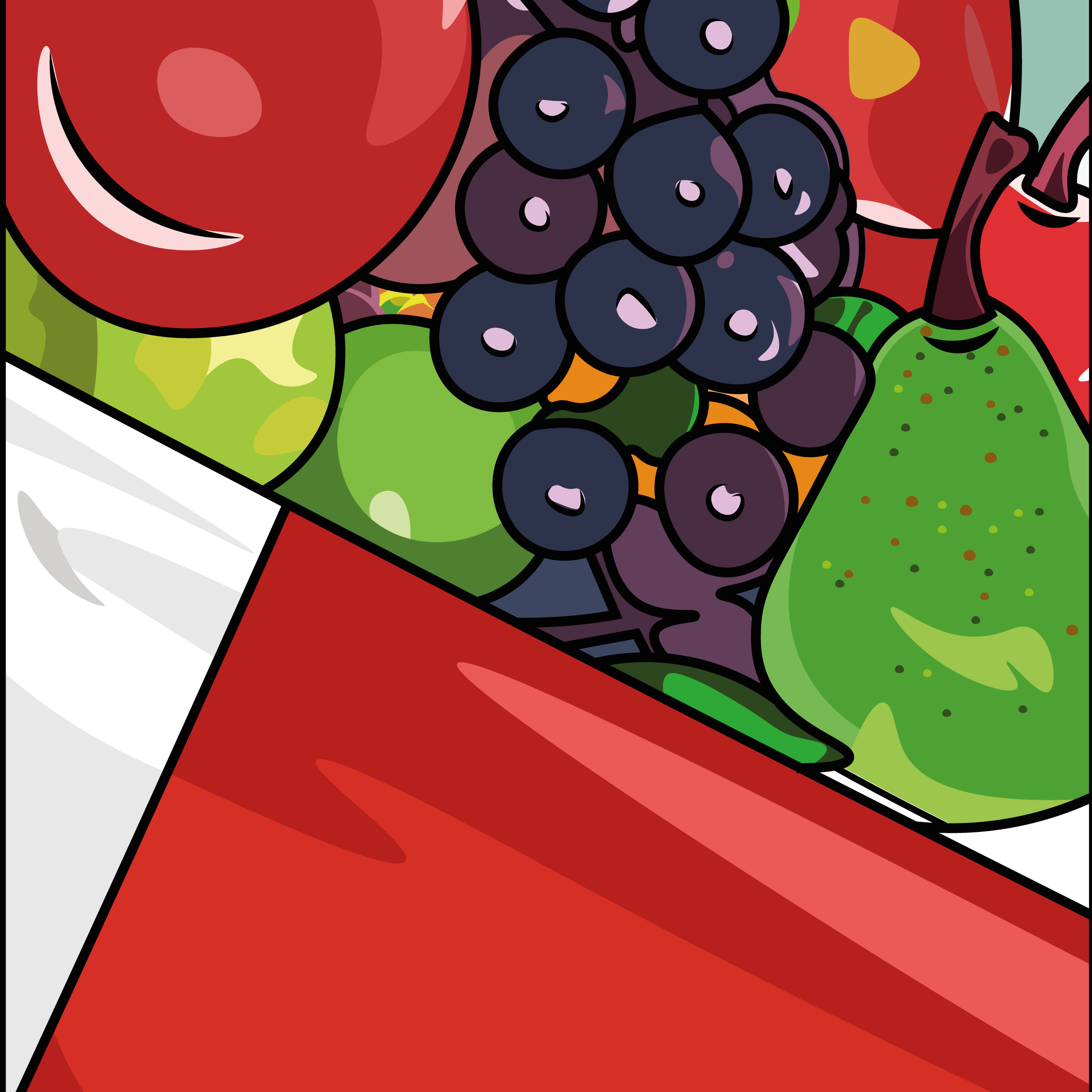
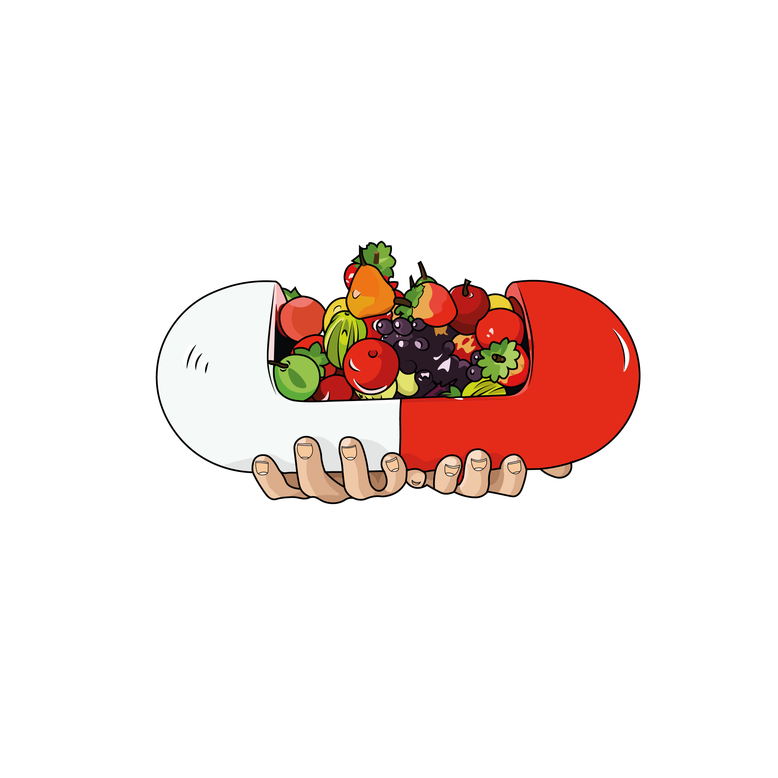
I wanted one of my outcomes to be 3D hands on as my other ones would be printed I wanted to deliver a message by creating a tiny pill into a big pill to really express my metaphor.
Still inspired by Nike adverts. This was a process created on Photoshop playing with typography, colours, shapes, pen strokes and textures and of course using the pill illustrations from my artefact. I wanted the theme to be psychedelic and have the chemicals colours around the pill but have the typography catching your eye with different slogans, similar approach like the other experimentations I did in outcome 2 just focused more about the pill surrounding it with fruit and colours. I really enjoyed creating these pieces and making sure the artefact played a creative part in my advertisement outcomes.
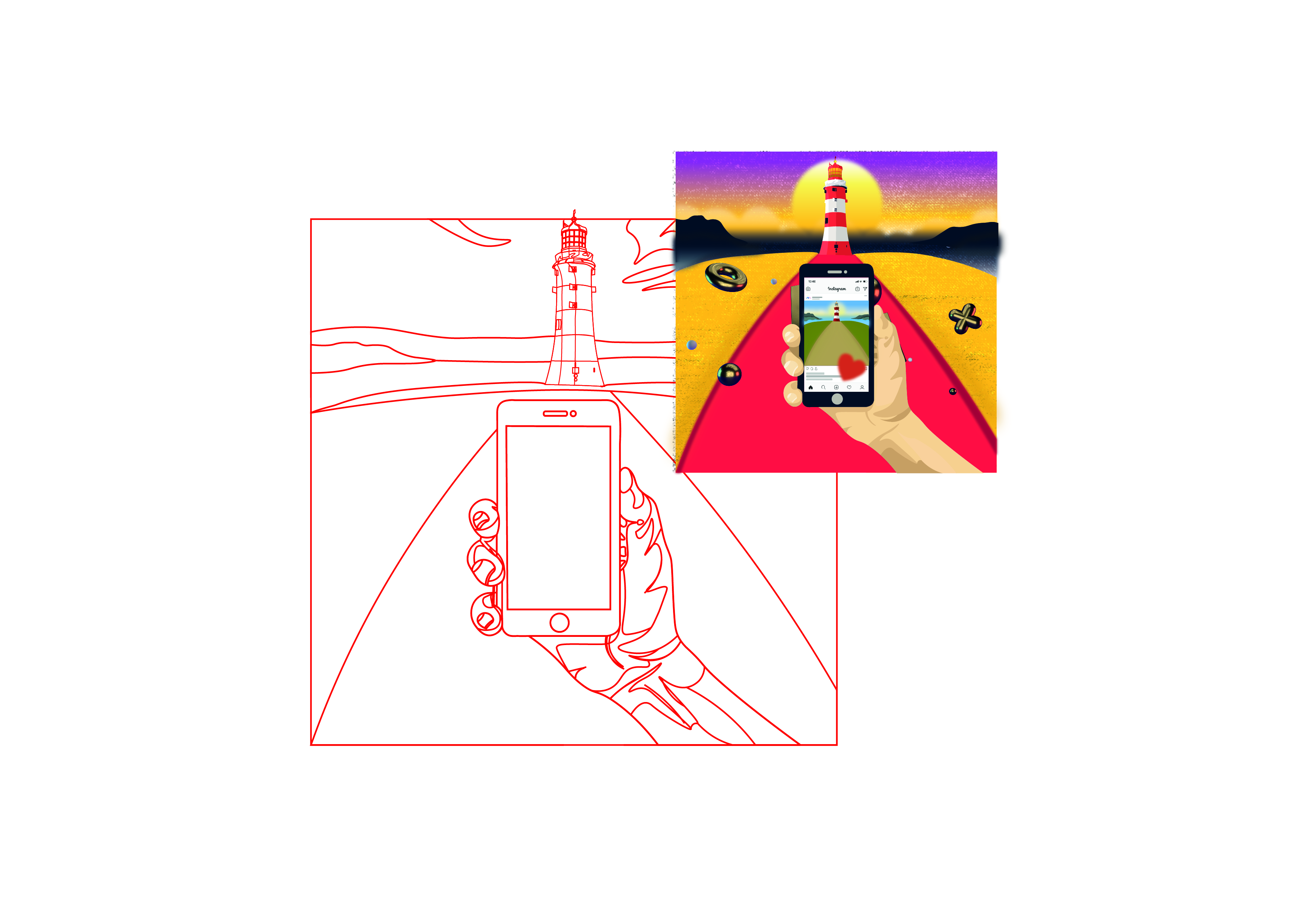
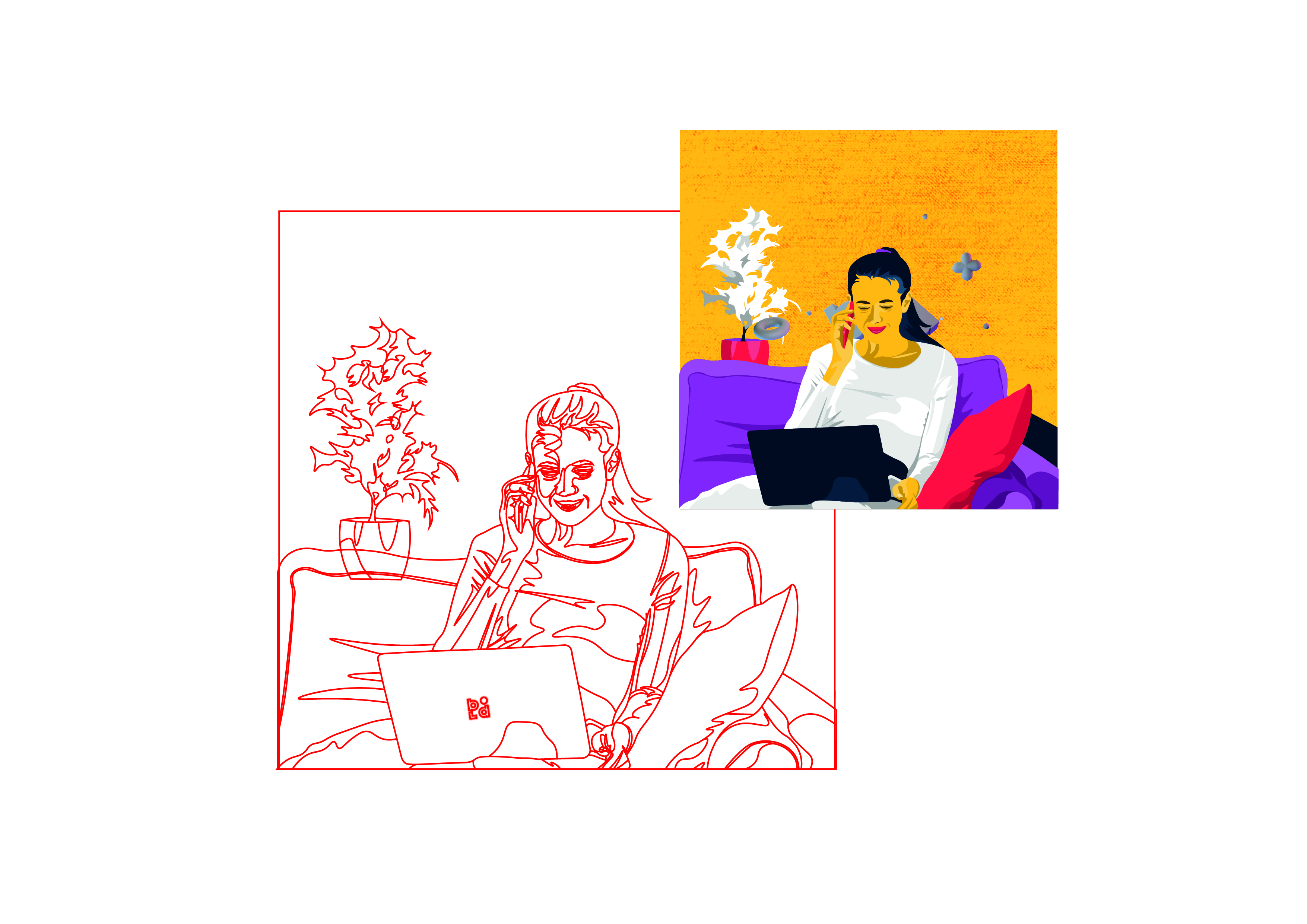
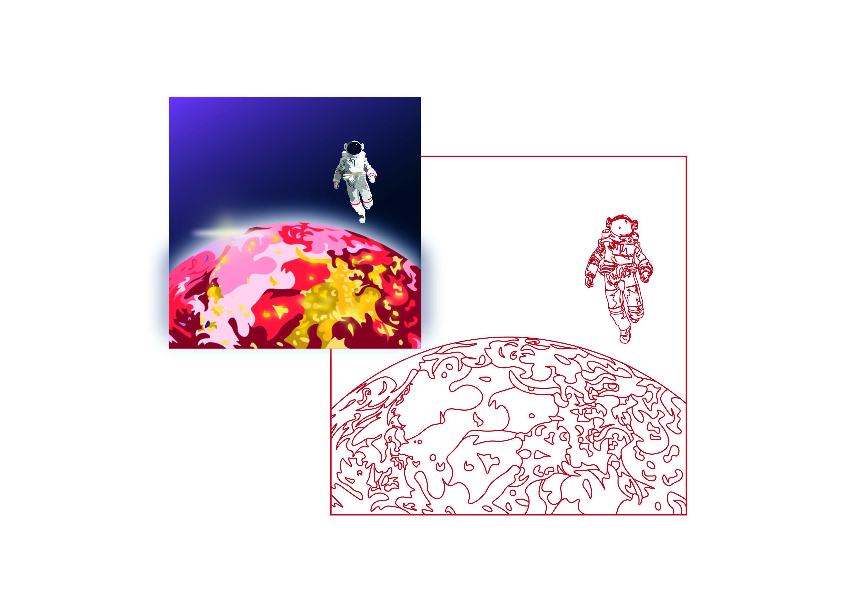
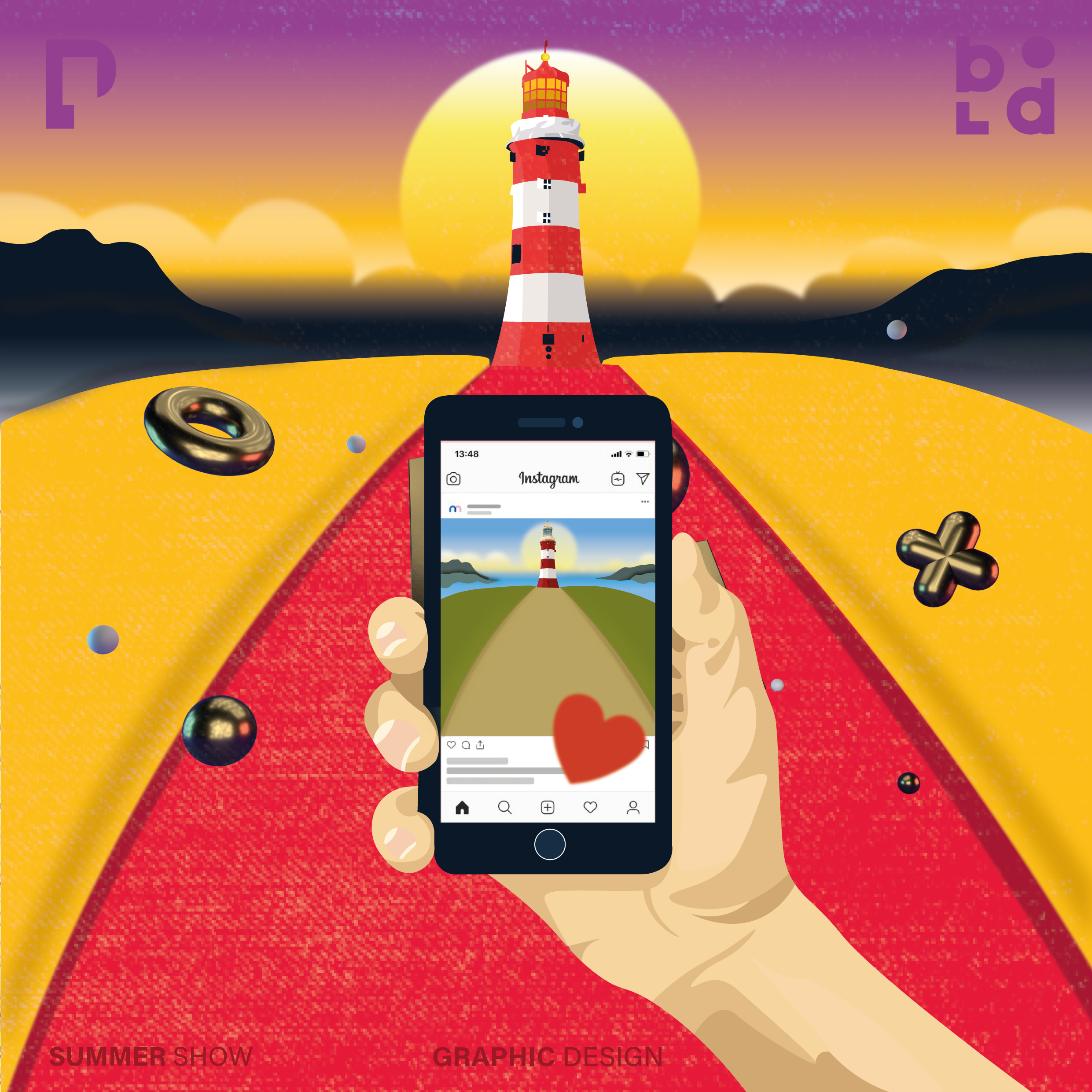
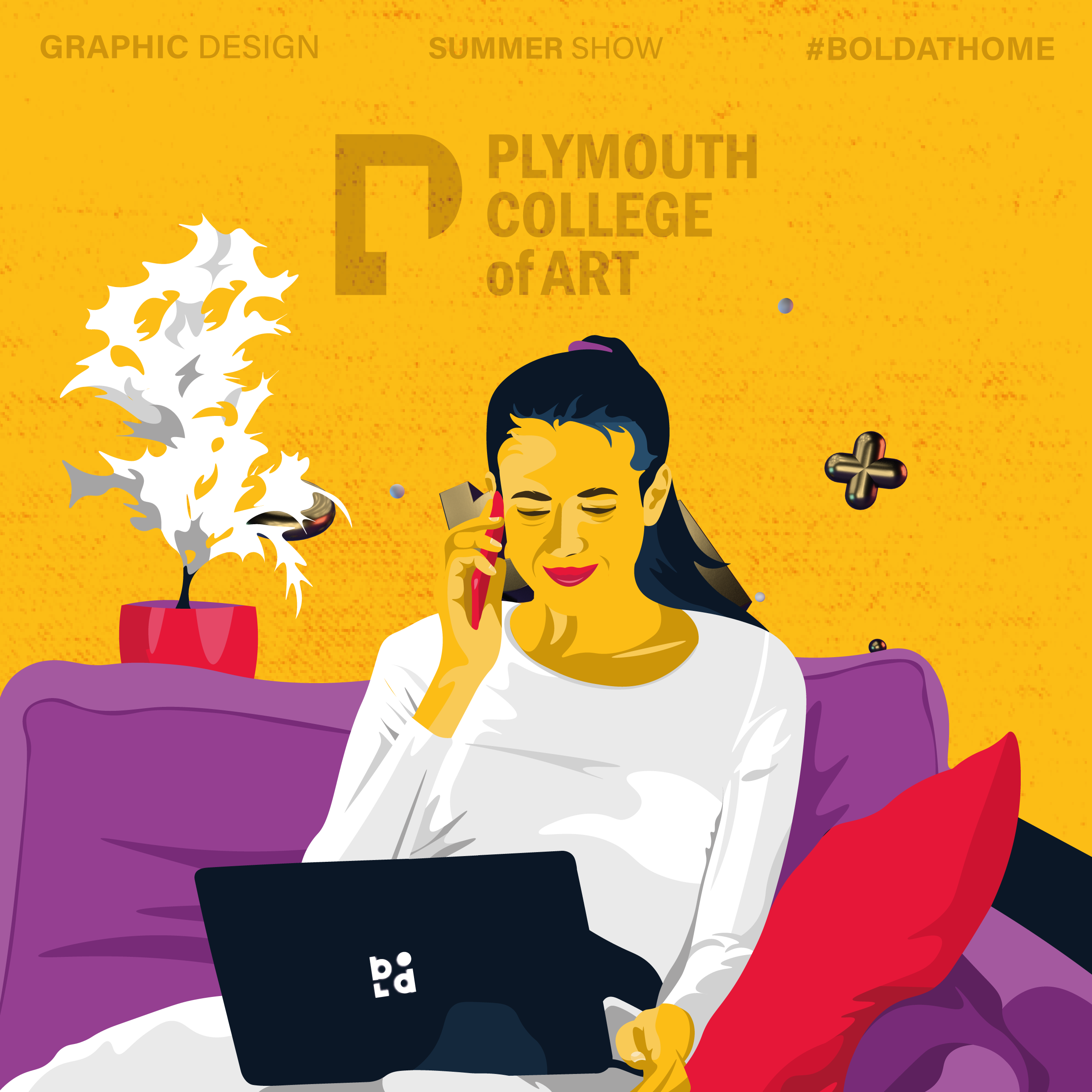
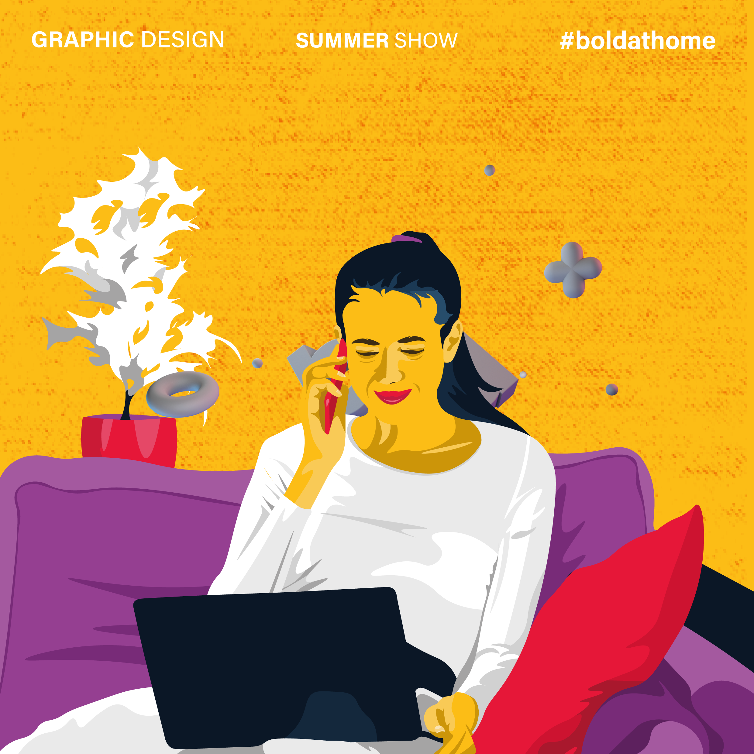
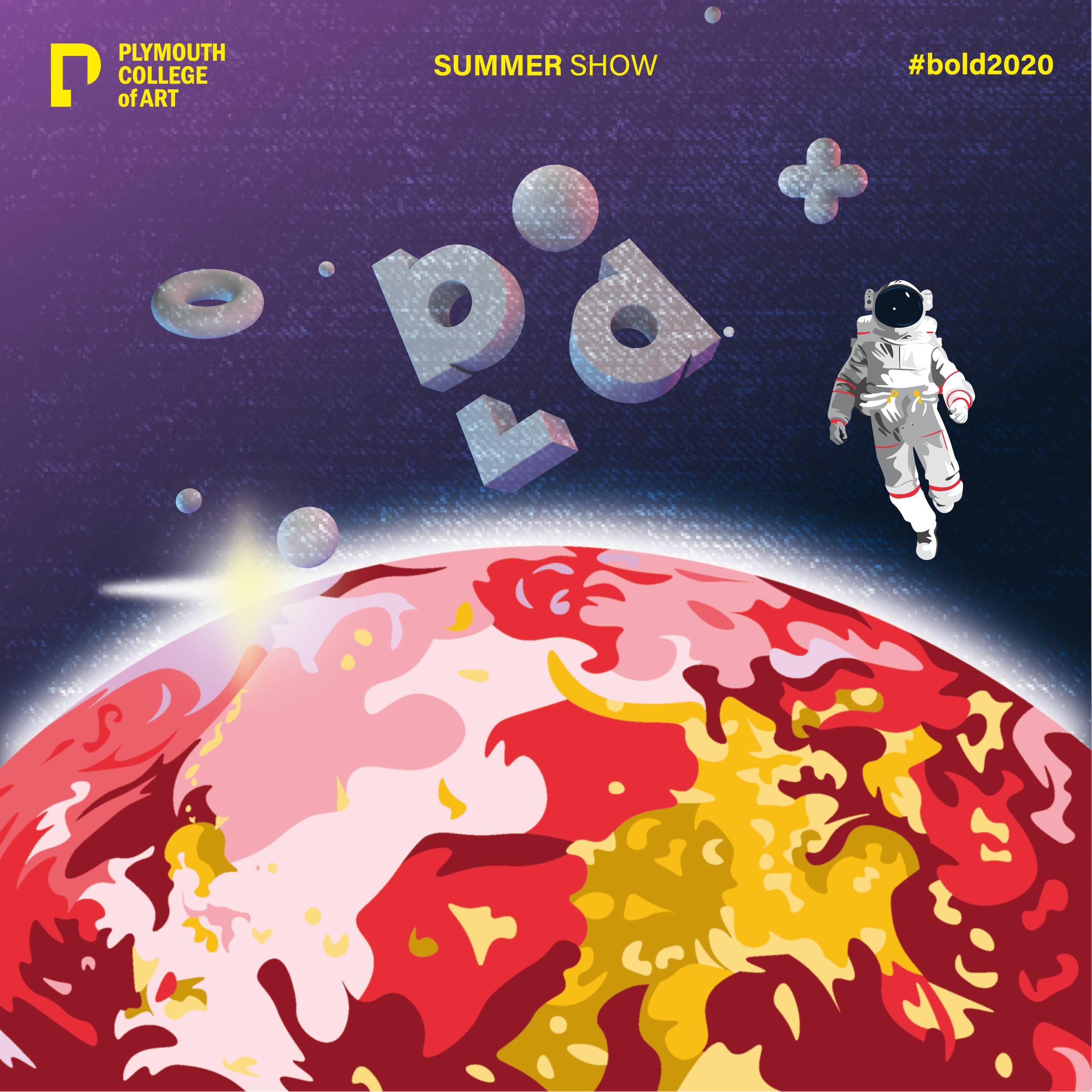
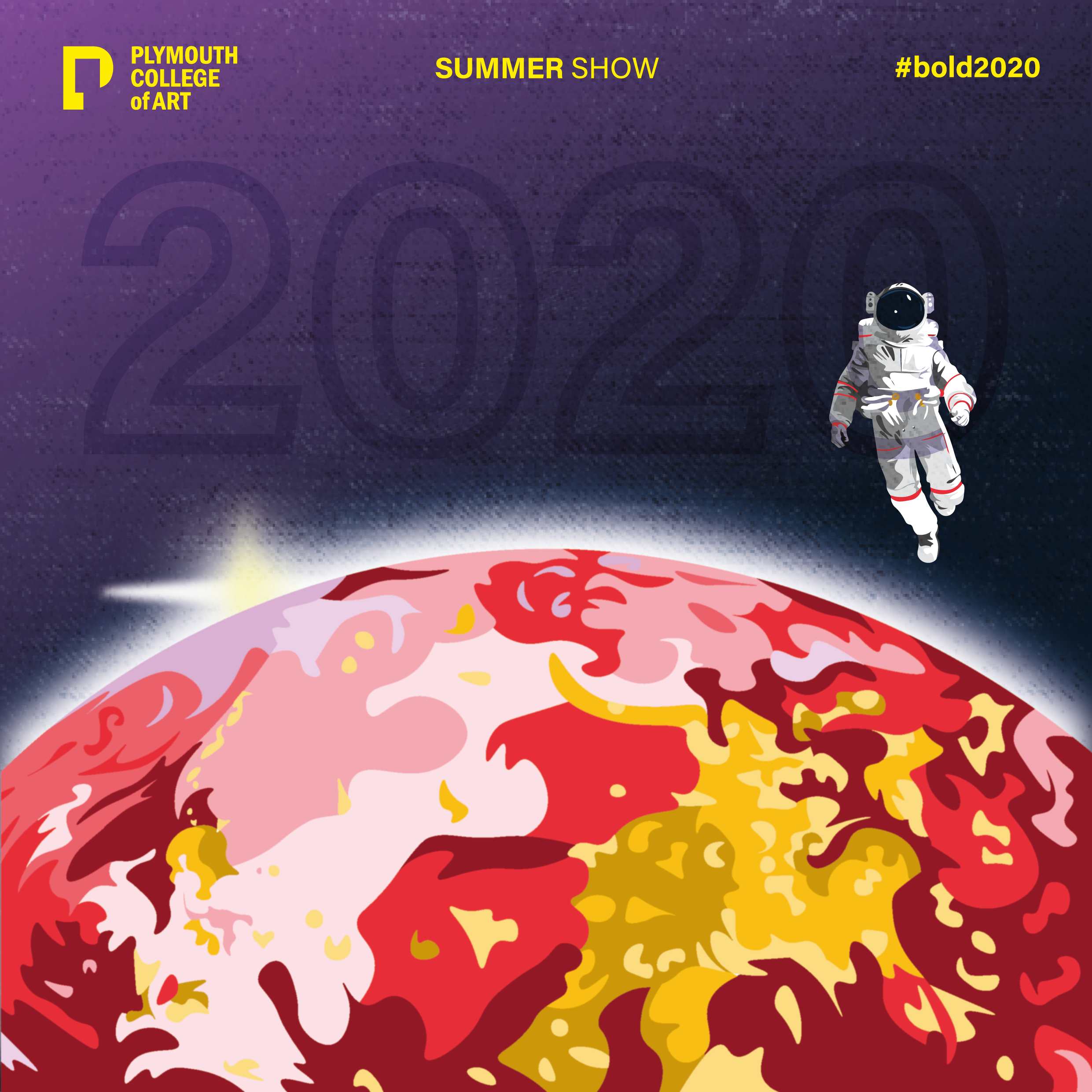
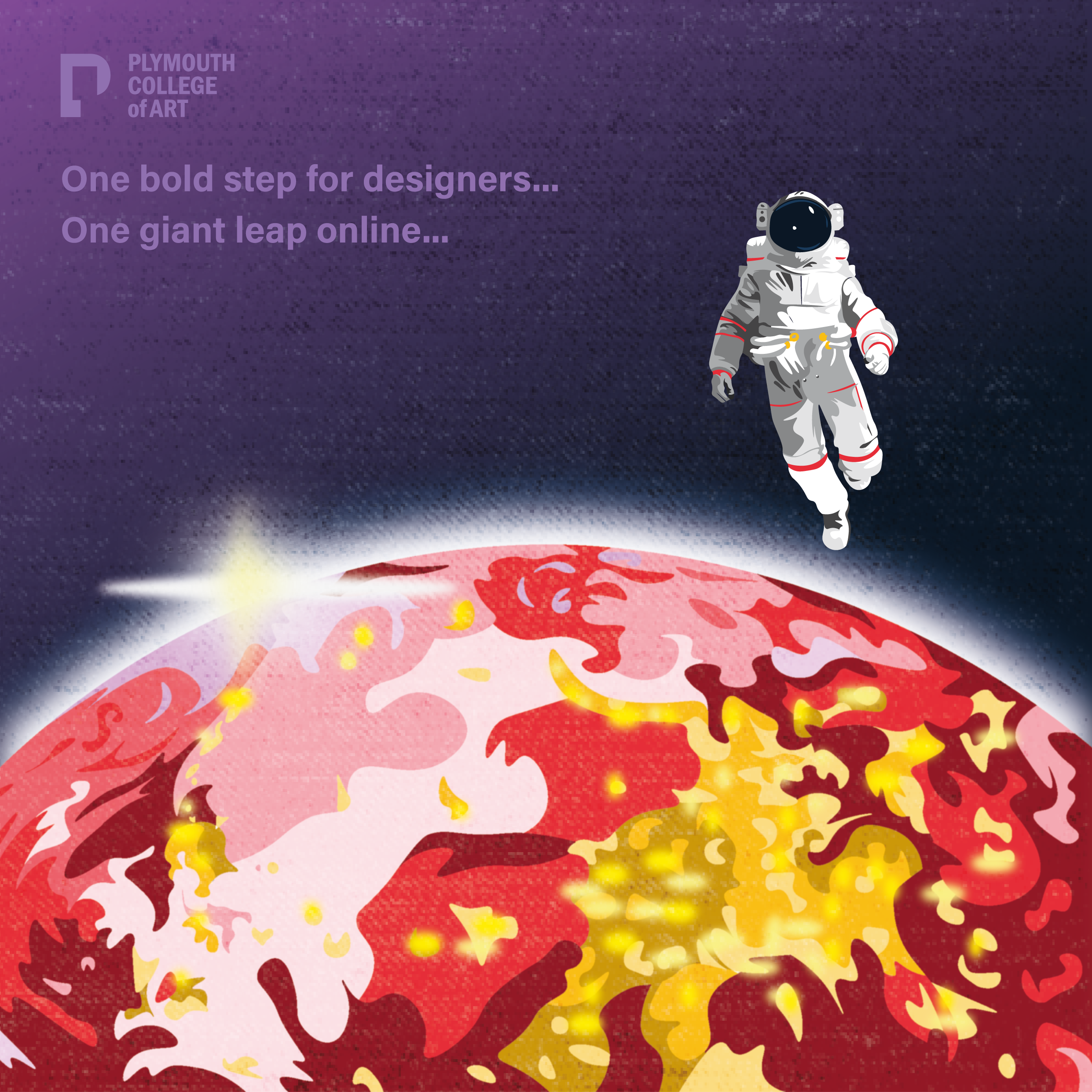
For our final year of University our class has a brief to promote our work and open up opportunities for when we finish our final year. We were separated in groups for example social media had to do their part promoting the work and us individually, there was also motion graphics, web designer, posters, research, design in general etc. My contribution to this was design, I created some illustrations that had the same colours from our logo created by Adam. I wanted to include the colours so that when you look at the pieces you know its to do with the brand which is called BOLD. Due to CVOID-19 we are unable to have a proper show so we had to adjust to the situation and find a different effective way of promoting our work which is online on various of different social media platforms sending out lots of invitations to designers before we laughed out website created by one of our students in the class called Megan.
Lorem ipsum dolor sit amet, consectetur adipiscing elit. Suspendisse varius enim in eros elementum tristique. Duis cursus, mi quis viverra ornare, eros dolor interdum nulla, ut commodo diam libero vitae erat. Aenean faucibus nibh et justo cursus id rutrum lorem imperdiet. Nunc ut sem vitae risus tristique posuere.